12 Best Tech Websites: Consumer Tech Store Examples (2026)
Selling hardware online is hard. The products are expensive, full of specs, and people research them for weeks before they buy. Most lists of the best tech websites show SaaS landing pages. This one shows consumer tech brands with real stores.
These are 12 sites our design team keeps coming back to for tech website design, including a few we built ourselves. We went through each store and noted what works and what doesn't. Every entry covers the brand, the tech stack it runs on, and the decisions worth copying. The best ones sell the result first, show the product working, and put proof right next to the buy button.
A note before we start: a few of these stores are clients we’ve had the privilege to work with. We think they deserve a spot here.
Contents
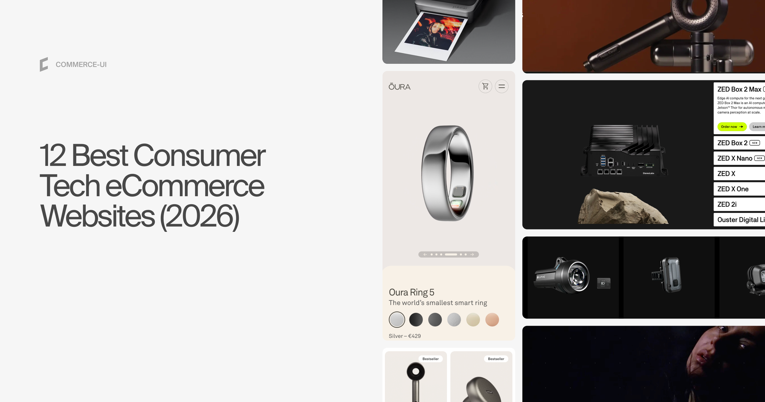

1. Oura: smart ring
Visit site · Tech stack: Next.js, custom commerce backend
Oura makes a smart ring that tracks sleep, activity and heart health, sold together with a membership for the app.
What stands out:
- Wellness, not gadgetry: Lots of white space, a serif headline font and a “Shop Now” button right in the hero. Many tech brands avoid serifs because they feel formal. Here the serif moves a feature-heavy device toward premium wellness, built for real life rather than for tech enthusiasts.
- Shop by health goal: A “Your Health” tab in the mega menu lets you start from what you care about: activity and movement, sleep and rest, heart health, metabolic health, women's health or stress. Each one opens its own landing page, so a pro athlete and a retiree both find their way in.
- Proof for a cautious buyer: People who track their health want accurate data and safe data. A science and research page links to the studies and a research database. The Trust Center opens with a letter from the CEO: “Your health data is deeply personal.”
- Buy now, size later: You can order before you know your ring size. Pick “Size Later”, a free sizing kit arrives first, and you confirm your size before the ring ships.
Our full case study here.
2. Eight Sleep: smart mattress cover
Visit site · Tech stack: Next.js on Vercel, Medusa.js
Eight Sleep sells the Pod, a cover and hub that cool or heat your bed and track your sleep.
What stands out:
- A mattress cover sold like aerospace: The hero shows the product floating on a sky-blue background, an Apple move that still works. 3D visuals, animation and video then show the temperature control, the layers and real use, so it never feels like buying furniture.
- Depth on demand: Features sit in small cards under the hero, and you click one only if you want more. No walls of text. The “How it works” page uses video to show the product at real scale.
- A gallery that explains itself: On the configurator page, each image highlights which parts come in the box (the hub and the cover) and which you supply yourself (the mattress and the bed frame). Every image has a short caption, which matters for a product most people have never seen.
- Membership inside the configurator: You pick the Pod and your bed size, then “Enhance your Pod” with the cover and the membership. The subscription is one more step in the configuration, not a separate product. We used the same pattern for Uneekor (number 7).
3. Lupine: high-performance bike and outdoor lights
Visit site · Tech stack: Shopify Plus, custom Liquid theme
Lupine is a German maker of high-end lights for mountain bikers, climbers and rescue teams, with over 35 years in the business.
What stands out:
- One configurable product instead of ten: Customers build their own set from light, battery, mount and strap. The configurator runs on native Shopify (Metaobjects, no apps), enforces the required parts, and updates price and inventory across every component as you choose.
- “Shine On” toggle on the collection page: A sticky switch turns the product images into real night scenes, so you compare beams, not housings. Róbert Toman, our Head of Design, calls it “the proudest moment of the redesign”.
- Specs you can see: Product pages are two-thirds editorial and one-third sticky decision panel, with charts for beam distance, intensity and light spill.
- Retail, B2B and road rules on one catalog: 15+ customer groups see their own prices on the same products. Checkout blocks lights that aren't road-legal in Germany (StVZO) for standard customers shipping there.
More in the Lupine case study.
Lupine won the 2026 Shopify Build Award for Best Shopify Liquid Build, presented at Shopify DotDev in Toronto. Read more in our press release.
4. Therabody: recovery and wellness devices
Visit site · Tech stack: Shopify Liquid
Therabody makes the Theragun and other recovery, sleep and skincare devices.
What stands out:
- Two ways in: “Shop” groups products by goal first (fitness and recovery, aches and tension, sleep) and then by device. “Explore” is a lighter path by who you are: “For Beauty” leads to a PLP with only the devices made for skin, like the LED face mask.
- A gift center built like a store: Gifts for men, women, athletes and beauty lovers, gifts by budget, and corporate gifts for teams. The devices aren't cheap, but they make good gifts, and this gives gift buyers their own way in.
- A buy box that answers doubts: Two chips sit right where you buy: “30-day returns” and “2-year limited warranty”. Below the options, a line like “21 people added this to bag in 24 hours” adds urgency without being pushy.
- Proof on the first scroll: On the face mask PDP, the first thing below the buy box is a before and after of a real face, followed by clinically proven benefits linked to the studies.
Watch out for: The visual design looks dated in places. The store works because every conversion element makes sense, not because the design is current.
5. Whoop: health and fitness wearable
Visit site · Tech stack: commercetools, Next.js
Whoop makes a screenless fitness and health band that you get through a membership.
What stands out:
- “Join now”, not “Add to cart”: There is no buy button. You choose one of three membership tiers (One, Peak, Life) and the band comes with it, so it feels like joining a team, not buying a gadget.
- The middle tier stands out: The Peak card sits slightly raised above the other two, the classic way to steer buyers to the plan you most want to sell. Each tier lists the hardware (WHOOP 5.0, 14+ days of battery) next to the features, so device and membership read as one package.
- A path for existing members: A link under the tiers lets current members get the new device without paying for another membership. A free trial month lowers the barrier for everyone else.
- Member quotes inside feature cards: Open the Healthspan card and you get the details plus a member spotlight from a non-athlete who uses it to track healthy aging. The proof sits next to the feature it proves.
6. Daylight: calm computer with a paper-like screen
Visit site · Tech stack: Headless Shopify, Next.js on Vercel
Daylight makes the DC-1, a tablet-sized computer with a paper-like screen built for focus.
What stands out:
- The product explained in the hero: “A new kind of computer, designed for deep focus and wellbeing”, next to a clear shot of the device. When a product challenges a familiar category, you need to know what it is and what it fixes before the first scroll.
- A feature shown by scrolling: As you scroll, the screen dims and turns orange, showing how it adapts to the light without a word of copy. Then comes the problem (“We refuse to accept a future where our devices are exhausting, addictive, and distracting”) and the answer (“Introducing Daylight”).
- Real people, analog feel: Photos show people using it outdoors, with a film grain overlay. The colors, type and images all say human first, technology second.
- A short PDP with proof under the button: The PDP opens with a video, not an endless gallery. Under Add to cart, a customer quote links to the original post on X, with the customer's own phone photo. Six key features sit in the buy box, and “View full specs” jumps to the full sheet.
Watch out for: No price, returns or warranty on the homepage, so the shopper has to go to the PDP or cart for the basics.
7. Uneekor: golf launch monitors and simulators
Visit site · Tech stack: Headless Shopify, Hydrogen, Sanity CMS
Uneekor makes launch monitors and golf simulators for home golfers and commercial venues.
What stands out:
- One main action: “Build Your Own Golf Simulator” repeats through the site and leads into the SimKit configurator. Kits carry tier badges (Essential, Popular, Flagship) and show the saving.
- Choose by setup first: “Compare Models” sits next to “Shop All”. Launch monitors are split into overhead units (EYE XO2, XO, XR) and ground units (the EYE MINI range), because where the monitor goes decides everything else.
- Two buyer paths: Home golfers shop. Businesses get their own section by venue type (golf lounges, coaching facilities, hotels, bars, universities) and a Partner Locator.
- Community inside the store: An Events & Tournaments Hub, a Junior Academy, a Help Center, quick-start guides and a trade-in program all sit inside the store.
8. Polaroid: instant cameras and film
Visit site · Tech stack: Headless Shopify, Next.js on Vercel, Sanity CMS
Polaroid makes instant cameras, printers and the film that goes with them.
What stands out:
- Emotion first: The holiday homepage opens with Polaroid photos of gifts and Christmas trees. Further down, real, grainy, slightly pixelated photos show that a picture doesn't need to be perfect to be worth keeping.
- A PLP you can shop by look: With eight cameras to choose from, visual filters let you pick by design. Full-image editorial cards of real moments break up the product grid, and a Camera Finder helps first-time buyers.
- The camera and its photos side by side: The PDP gallery starts with a 360-degree view of the camera you can turn around. The next image is a photo taken with it, so you see the product and the result together. A side menu jumps to photography, scan and share, compatible film and compatible accessories.
- Refills mapped to cameras: The Film menu lists film by camera family (Go, i-Type, 600, SX-70), so you buy the right refills without checking compatibility. Starter sets bundle camera, film and accessories with “Bundle Savings” labels.
9. reMarkable: paper tablets
Visit site · Tech stack: Next.js on Vercel, custom commerce backend, Sanity CMS
reMarkable makes paper tablets for writing, reading and taking notes.
What stands out:
- The feel of paper first: A warm, earthy palette, elevated type and real people. The homepage leads with how writing on it feels and brings in features (reading, note-taking, pen tips) only gradually.
- Three tablets, one compare: Paper Pure, Paper Pro Move and Paper Pro each get a one-line role, with a direct link to the compare page. When the differences aren't obvious, a compare page is the fastest way to a decision.
- A day in the life, by profession: Cards for Managers, Lawyers, Creatives and Academics open their own pages. The Creatives page walks through a day: ideas at 9:15, refining briefs imported from Google Drive at 13:30, screen sharing a presentation at 16:00. Then come stories from a director, a photographer and a creative lead.
- Risk removed up front: “Try for 50 days risk free”, free shipping and pay later sit right under the product cards.
10. Nothing: phones and audio
Visit site · Tech stack: Headless Shopify, Hydrogen on Oxygen, Sanity CMS
Nothing makes phones, earbuds and headphones with a transparent, exposed-component design.
What stands out:
- Familiar products, sci-fi presentation: Phones and headphones aren't a new category, but even the PLP feels like a futuristic control panel. The look of the hardware sets the visual language of the whole site, and campaigns with V and Charli xcx sit next to the launches.
- A PDP built like a desktop: A clean buy box floats in the center and stays with you as you scroll: product type, three key features, color, storage and trade-in. Behind it, photos, animations and tiles are laid out like a moodboard. One tile is a folder called “Specs” that opens the full spec sheet.
- You never lose the buy box: Everything opens in an overlay you can close, so you can explore as much as you want and land back where you were.
- Type that matches the hardware: The dot-matrix typography echoes the light patterns on the back of the phones, so it reads as a digital brand at a glance.
11. Stereolabs: 3D cameras for robotics and AI vision
Visit site · Tech stack: Headless Shopify, Next.js on Vercel, Sanity CMS
Stereolabs makes stereo 3D cameras and vision kits that help robots and machines see.
What stands out:
- Start from the machine, not the camera: Solutions are grouped by machine type (robotic arms, humanoids, forklifts, AMRs, tractors) and by industry. An engineer finds the setup for their robot before reading a spec.
- Learn or Order, side by side: Every product in the menu has two buttons. Researchers go to the product story, buyers go straight to the store, which sells cameras, lidar, embedded PCs, accessories and kits.
- Starter kits for any team: Priced kits bundle the cameras and parts a team needs to get started, and every part is also sold on its own.
- Video that does the explaining: Mux-streamed sections such as “Redefining autonomy with AI vision” show the cameras working in the field, which says more than a datasheet. The marketing team builds new pages from the page builder in hours, without developers.
More in the Stereolabs case study.
12. Hello Klean: smart shower and skin filters
Visit site · Tech stack: Shopify, Liquid theme
Hello Klean makes filtered shower heads and the refill filters that go with them.
What stands out:
- Clean first, technical on request: The shower head is shown the way Apple would show it. You can tell it's a high-tech product at a glance, and the filter tech is there if you want it. A quiz asks about your water and suggests the right products.
- A numbered configurator: On the Shower Head 2.0 page, numbered steps take you through the device, the color and the filter supply. Choose six months of filters and the image shows how many you get. Under Add to cart: express shipping, 100-day returns, scheduled refills.
- Real use, then real results: Small cards show installing it, unboxing it for scale and changing a filter. The PDP ends with clinical results and a day 0 vs day 30 comparison from a real user.
- A compare table that trims itself: A “Display differences only” toggle cuts the comparison down to what actually differs between the three models.
What the best ones have in common
- Start from the problem, then the spec. Oura and Therabody let you shop by health goal. Daylight names what it fixes in the hero.
- Show the product working, at real scale. Eight Sleep uses video for scale, Polaroid puts a photo taken with the camera next to it, Lupine lights up the product grid.
- Make the choice small. Compare pages, configurators, quizzes and a “differences only” toggle cut a big catalog down to the one product that fits.
- Sell the membership inside the purchase. Whoop says “Join now” instead of “Add to cart”. Eight Sleep makes the membership one step of the configurator.
- Put proof and reassurance next to the button. A real customer post under Add to cart, returns and warranty chips, a before and after on the first scroll.


