Top 13 Beauty Stores on Shopify
From 2018 to 2023, the beauty industry market has grown by 19.9%, and in 2024 the global beauty industry was valued at approximately $670.8 million. What were the main drivers of this growth? Apart from the new emerging trends, such as rising demand for natural and organic ingredients or addressing needs of new market segments (for example, men’s grooming products have been gaining traction in the last couple of years) the main driver for growth was eCommerce expansion. Digital sales channels have made beauty products more accessible and sometimes cheaper.
So, what makes or breaks a great Shopify beauty store experience? I analyzed 13 top Shopify beauty stores and gathered sometimes hidden, and sometimes not gems that can be an inspiration for you. Let’s explore the world of beauty stores!


Kylie Cosmetics
Kylie Cosmetics needs no introduction. Run by Kylie Jenner, the brand leverages celebrity influence and smart design. You can spot smart tags, for example, “Kylie’s favorite” or “how to use from Kylie” that sets an aspirational tone for the whole website.
↑ Kylie Cosmetics leverages the owner celebrity status when promoting their products.
Visit site: Kylie Cosmetics
What is especially eye-catching are the high-quality hero images showcasing products and models used on this website.
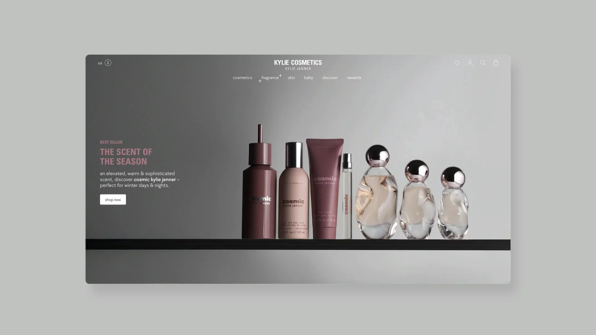
↑ Hero images on this Shopify beauty store are always top-notch.
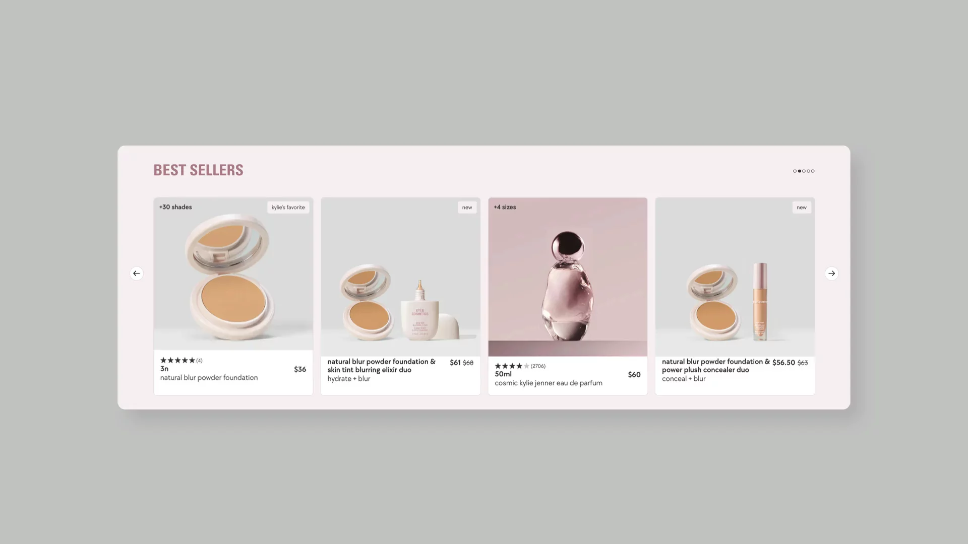
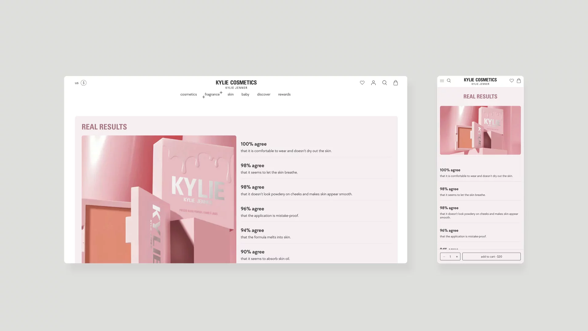
The Shopify beauty brand excels through strategic features like "Shop Our IG" sections that blend social proof with shopping functionality. What sets them apart is their innovative product presentation, including before/after effect hover states on product cards and a "Real Results" section in their Shopify product detail page that builds credibility through concrete customer satisfaction metrics.
↑ Kylie Cosmetics list productingredients on the product detail pages
The Ordinary
The Ordinary has transformed clinical skincare into something approachable without losing its scientific integrity. Their website is a perfect reflection of their "Clinical Formulations with Integrity" philosophy – clean, professional, and refreshingly straightforward.
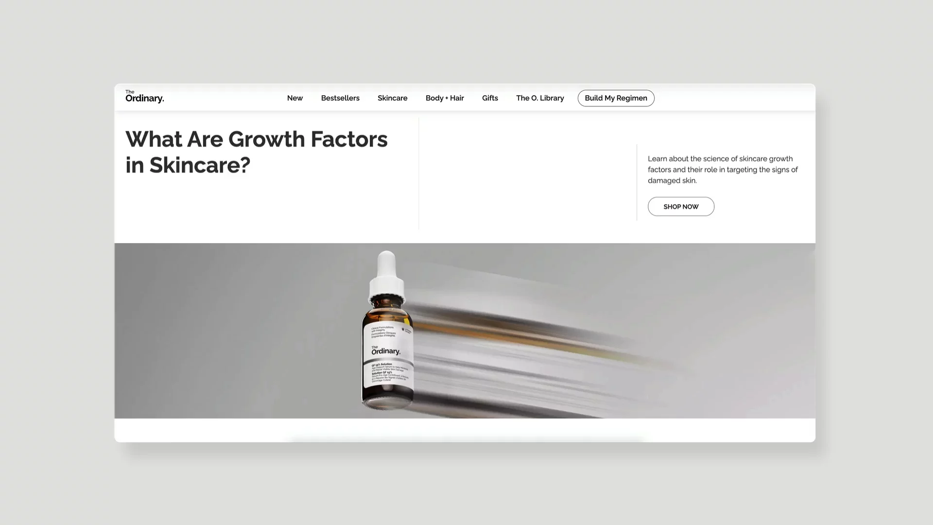
Their Regimen Builder is a standout Shopify feature that I find myself recommending to friends all the time. It's like having a conversation with a knowledgeable skincare consultant who helps you build a routine based on your specific needs. The abundance of white space and professional look of the site makes me feel like I'm in a modern laboratory rather than a typical beauty store.
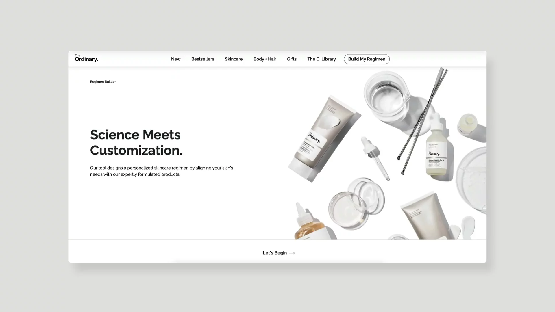
↑ Interactive elements in your beauty store are a great way to activate your potential customers.
Visit site: The Ordinary
I particularly like their About Page and blog content. Instead of fluffy marketing speak, you'll find genuine educational articles that help you understand the science behind skincare. It's clear they're committed to helping customers become informed skincare enthusiasts.
↑ Editorial elements on your website will add more information about the products.
Rhode
Rhode, another celebrity company owned by Hailey Bieber, balances celebrity influence with serious skincare credibility. What caught my eye immediately was their masterful use of Hailey Bieber's presence – you'll find her not just in stunning campaign images, but also in longer-form videos where she personally demonstrates how to use her products.
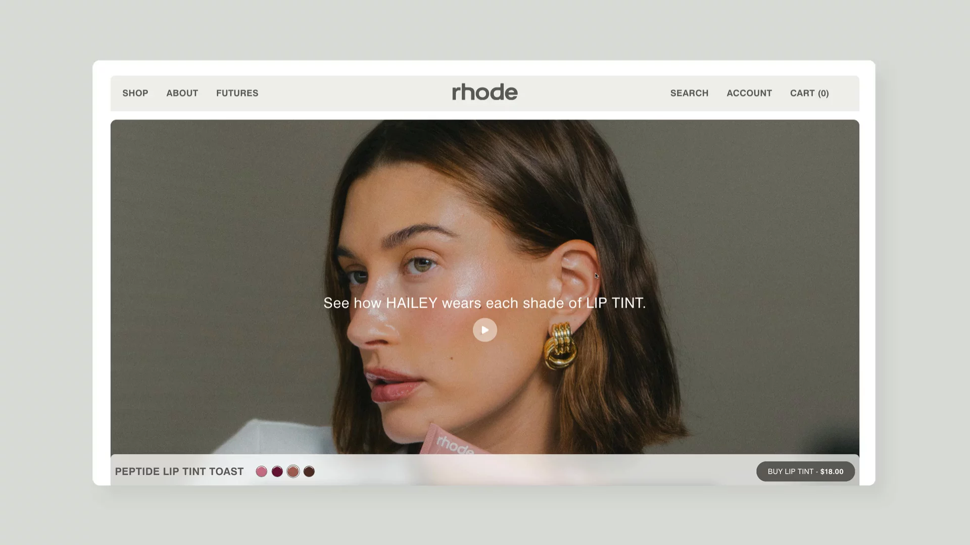
↑ Hailey Biebier Rhode plays an active role in promoting her products.
Visit site: Rhode Skin
The Shopify storefront’s design is minimalist, featuring soft, neutral tones that create a sense of calm and sophistication. I have to say, their art direction for both lifestyle and product photography is absolutely stunning – every image feels intentional and perfectly aligned with their natural beauty ethos.
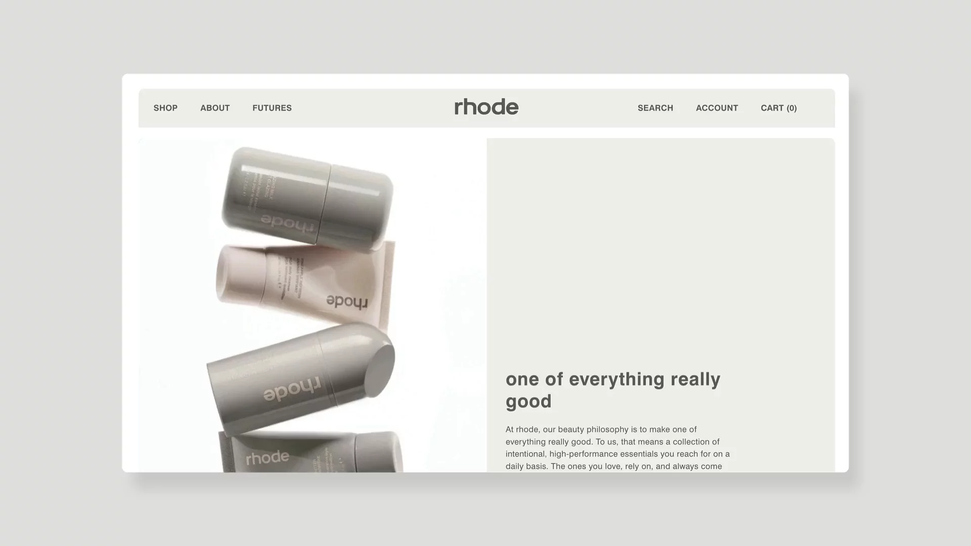
↑ Branding is one of the key elements of a beauty brand, and you can see it looks perfect on Hailey's website.
What really sets Rhode apart is their approach to building trust. Instead of just riding on Hailey's fame, they've assembled an impressive Advisory Board of cosmetic chemists and dermatologists, emphasizing their commitment to "research-backed ingredients." Rhode’s team manages to make science feel accessible without diluting its importance.
Their product detail pages (PDPs) are some of the best I've seen in beauty eCommerce stores. Each page features Hailey's personal video introductions, comprehensive ingredients lists, and – this is particularly noteworthy – detailed information about their eco-friendly packaging initiatives. It's clear they understand that today's beauty consumers care about both efficacy and sustainability.
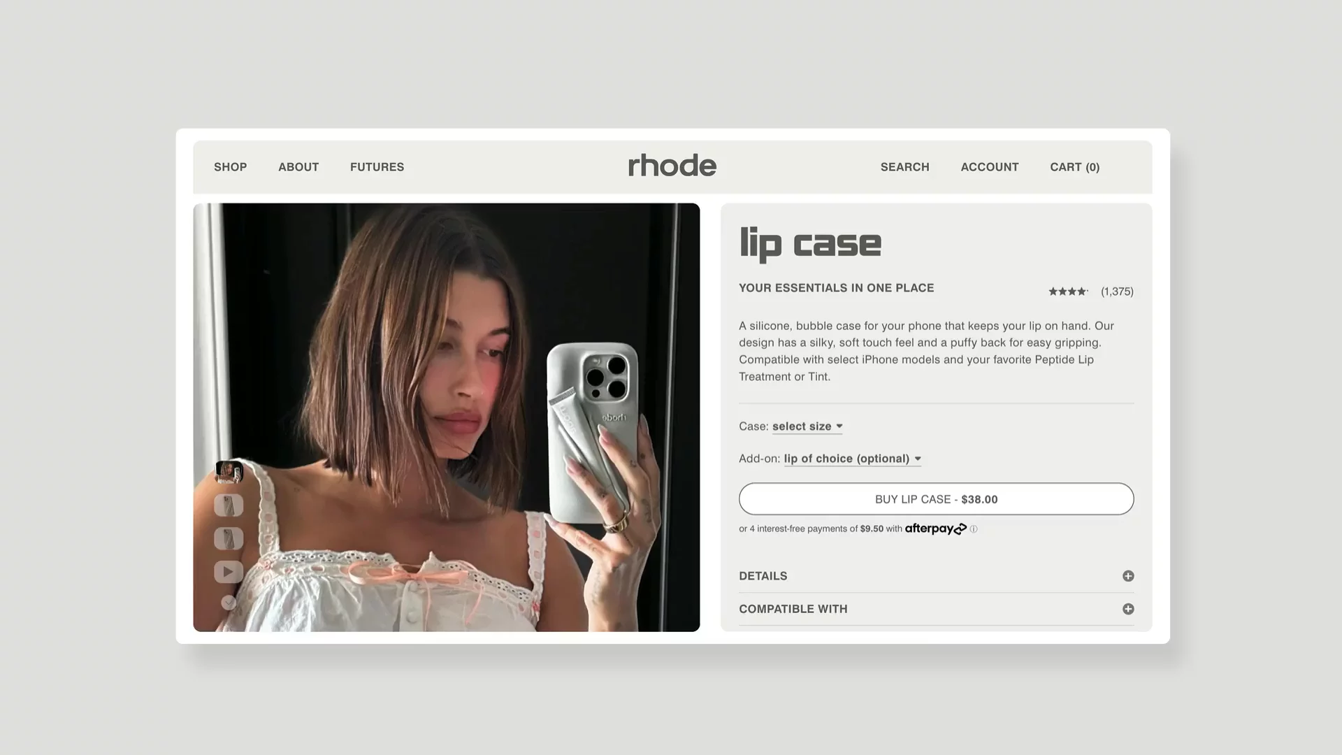
↑ Lip case made by Rhode is a great example of combining two products to make something customers really need.
And here's a great example of marketing – they've introduced a clever Lip Case, essentially an iPhone case with a mountable lip product. It's exactly the kind of innovative thinking that keeps their brand fresh and relevant to their young, tech-savvy audience.
Aesop
Walking into an Aesop store is always a sensory experience, and I'm amazed by how well they've translated that feeling to their website. The elegant motion design and thoughtful layouts mirror the calm, sophisticated vibe of their physical locations.
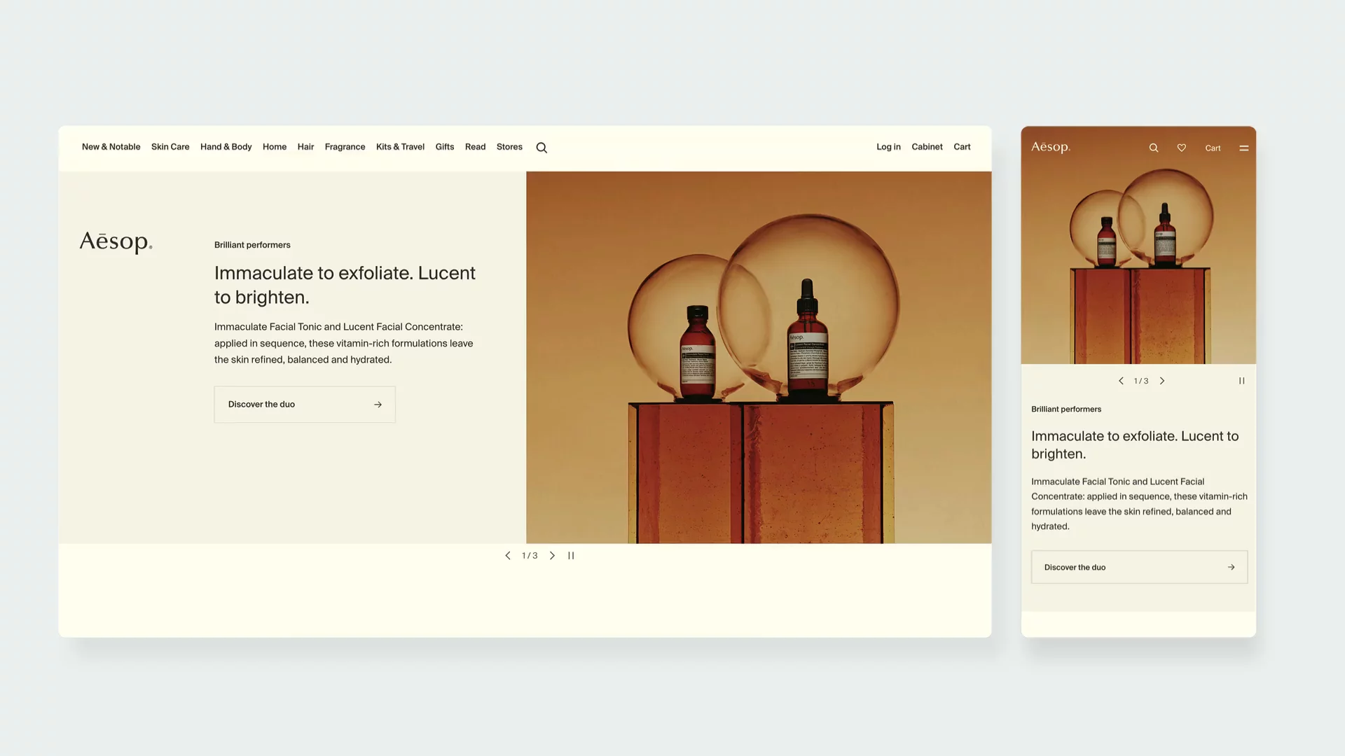
↑ Aesop Shopify store resembles the ambiance of their phisical location.
Visit page: Aesop
What I find particularly effective is their content strategy. Instead of just listing product features, they've created detailed how-to videos that remind me of the personalized consultations you'd get in-store. That’s one of the benefits of including video in your eCommerce strategy. Their product bundles are curated with the same attention to detail as their in-store recommendations.
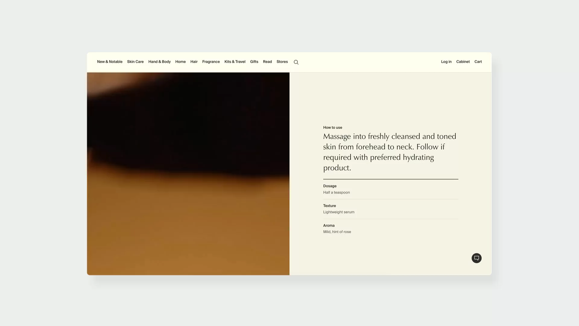
↑ Aesop makes sure their clients get the full benefit of using their products.
Drunk Elephant
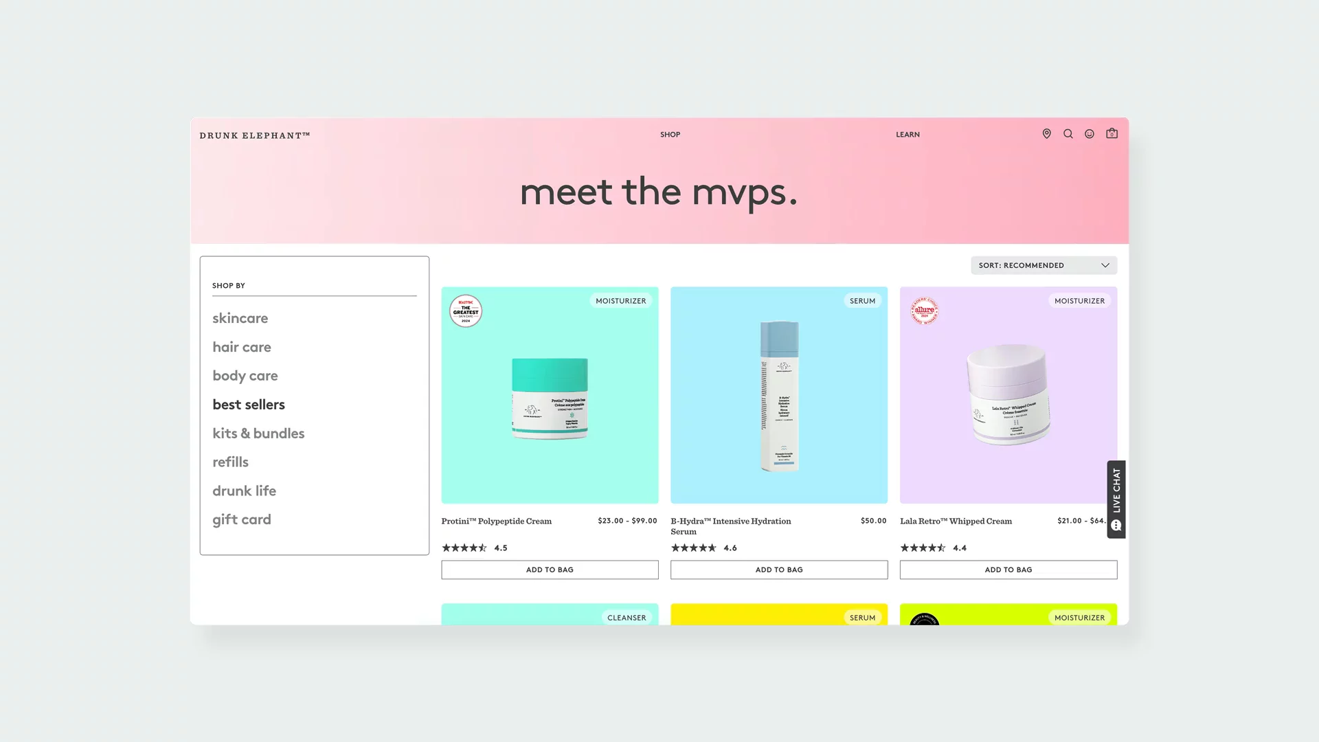
Drunk Elephant is definitely on the other end when it comes down to branding and eCommerce user interface design. Their bold use of neons and pastels creates this playful vibe that makes skincare feel fun rather than intimidating. But don't let the quirky design fool you – there's serious science behind their approach.
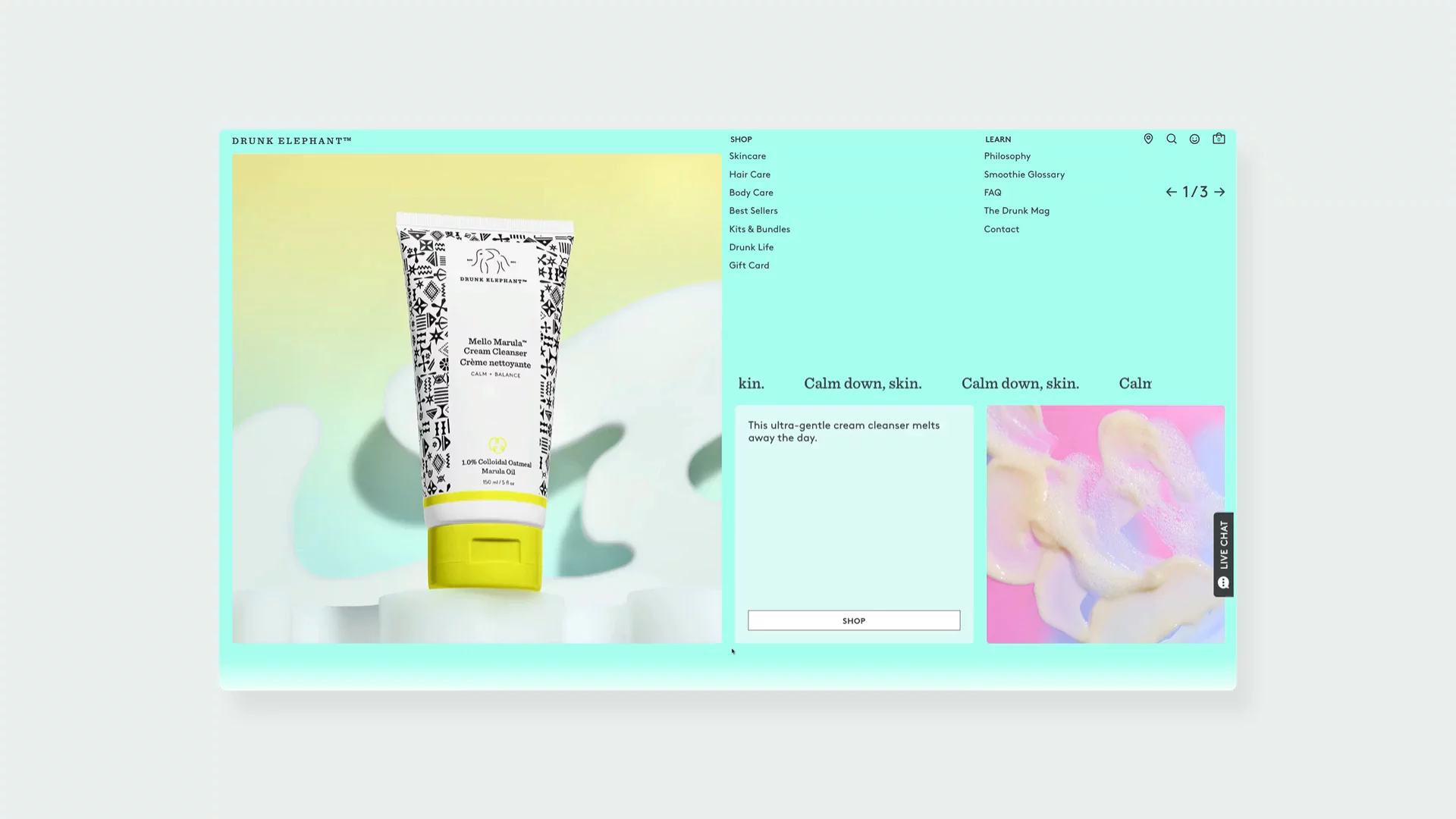
↑ Drunk Elephant uses vivid colors to distinguish their brand from competitors.
Visit site: Drunk Elephant
Their product grid caught my eye. While the product listing page might feel a bit overwhelming at first, I love how they've mixed video content and banners on their Shopify storefront. This design choice makes the layout dynamic and promotes currently running campaigns or their top products.
↑ Grid on Drunk Elephant makes their products pop.
Glossier
The genius of Glossier's Shopify storefront lies in how perfectly it captures their "born from content; fueled by community" ethos. Their signature aesthetic – that soft, millennial pink combined with clean fonts and natural product photography – has practically become a cultural phenomenon.
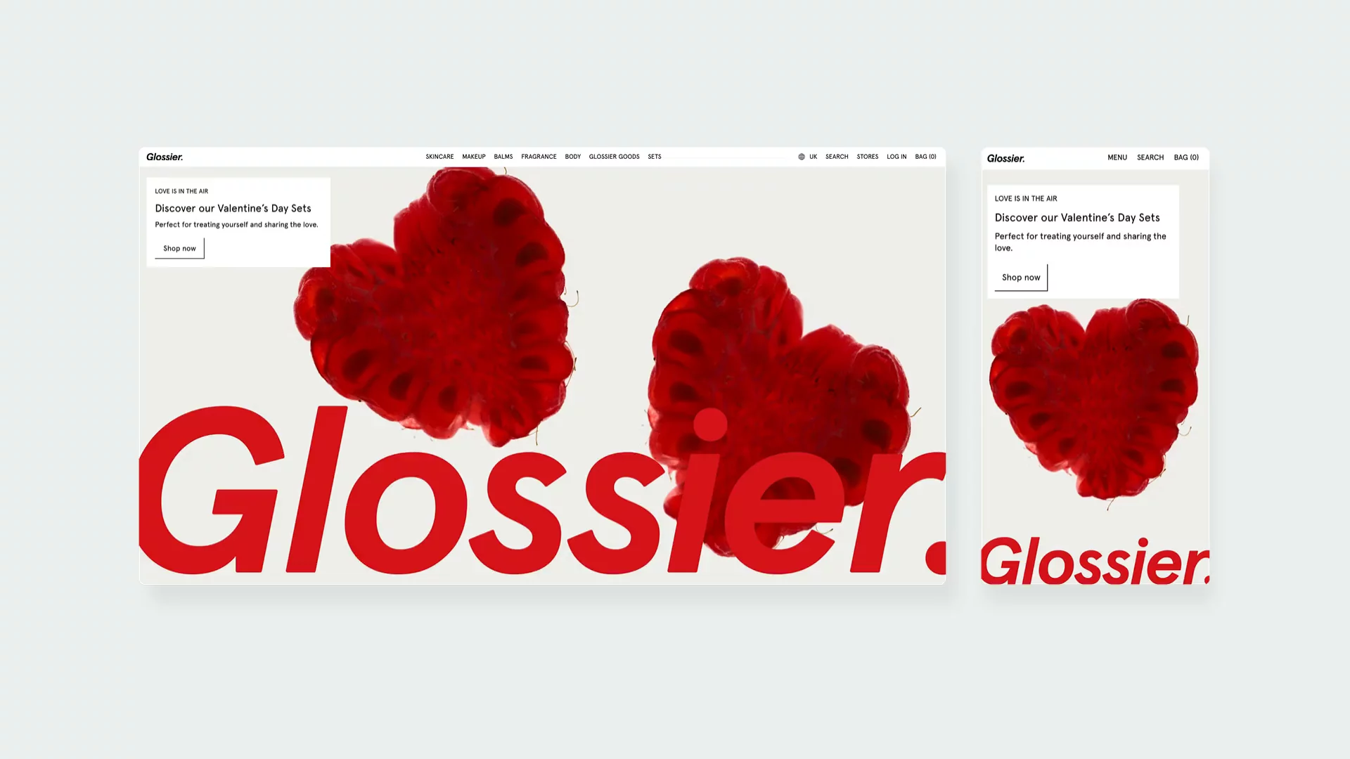
↑ Glossier is another beauty brand with a distinctive branding.
Visit site: Glossier
What I find most compelling is their approach to community content. By featuring real customers and smaller creators from diverse backgrounds, they've created this inclusive atmosphere that makes everyone feel like they could be a "Glossier Girl." Their mobile experience is fantastic too, which makes sense given their social media-savvy audience.
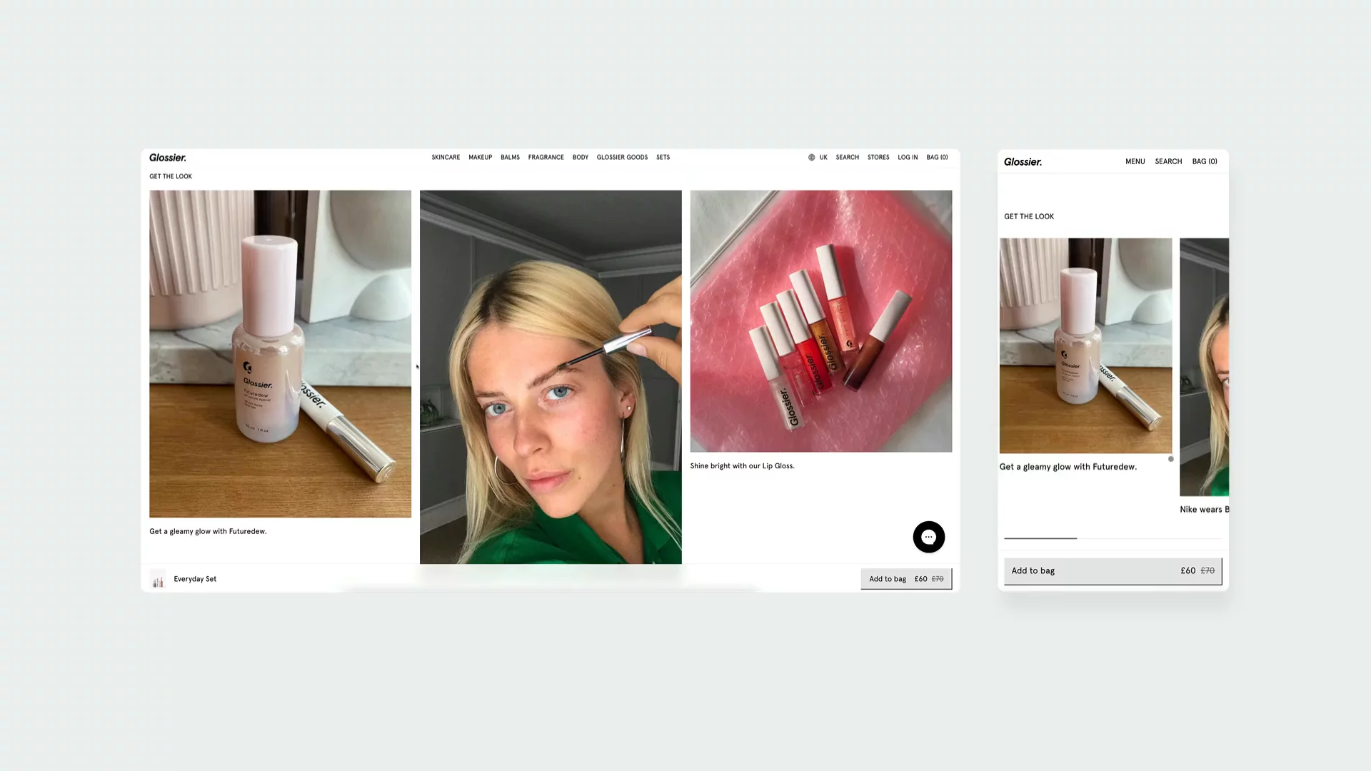
↑ User generated content is one of the best ways to showcase how a product works.
Glossier also implemented tactics that should increase their AOV. They frequently suggest product bundles or complementary products, encouraging customers to build a complete routine.
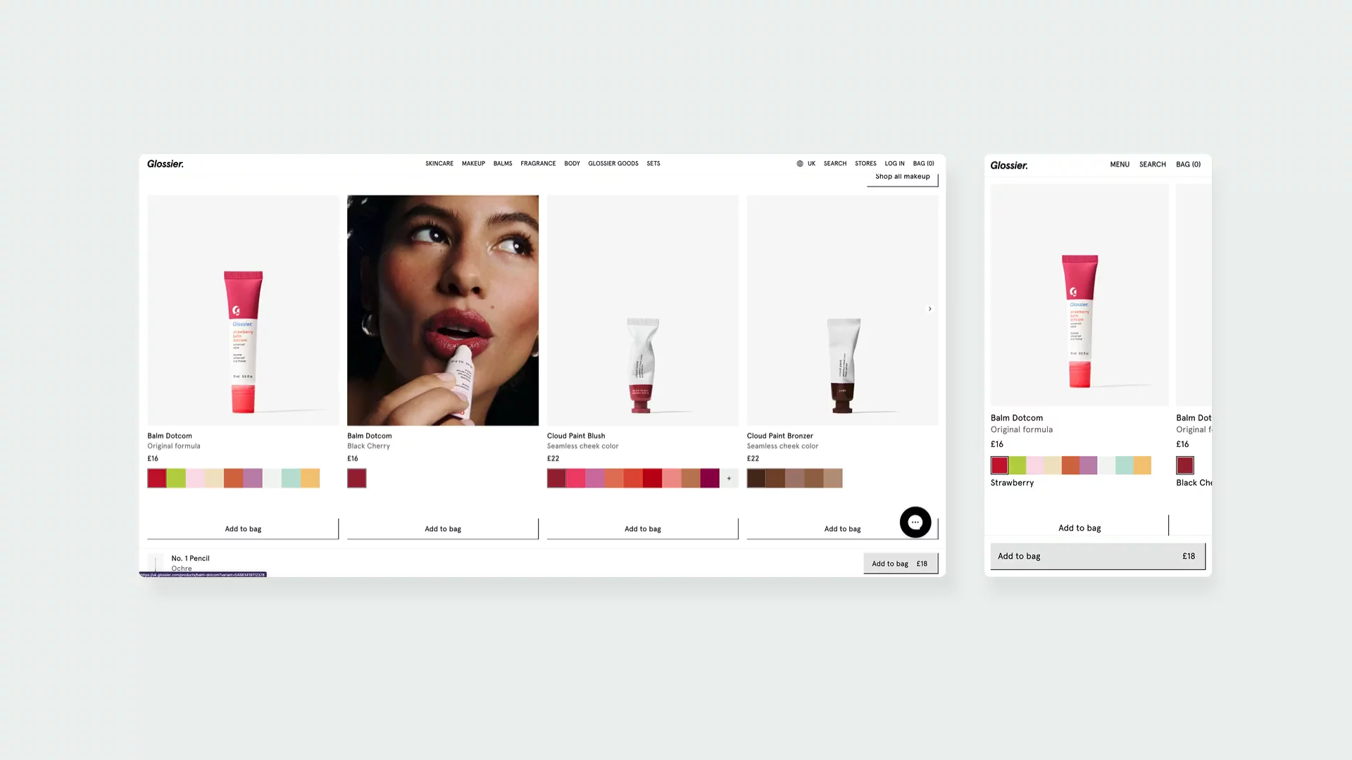
↑ Glossier proposes complementary products to increase their AOV.
Fenty Beauty
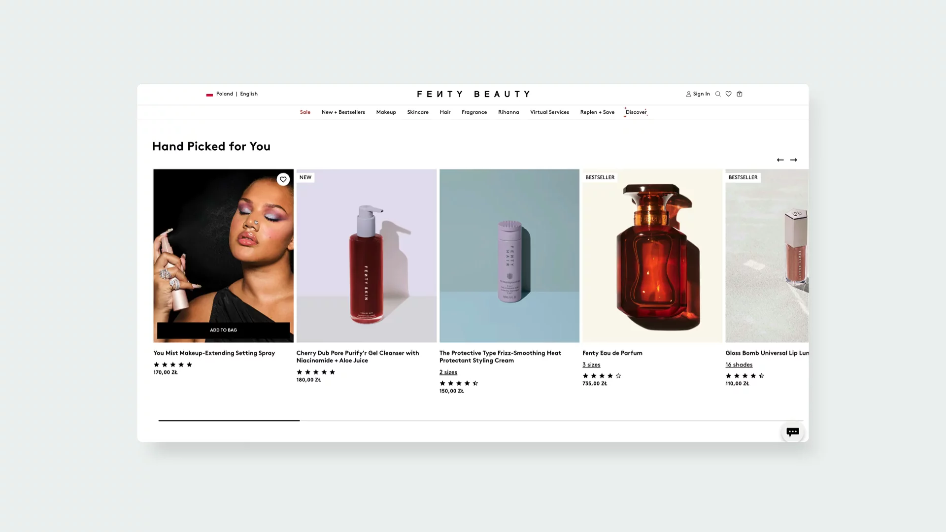
Fenty Beauty is a brand established by Rihanna and, just like Kylie Cosmetics, or Rhode, the owner is actively engaged in product promotion. One of the most interesting features is their "See in Action" section, which presents an interactive grid of videos with a shoppable drawer that slides in from the right. It's so intuitive, you can add products directly while watching application tutorials!
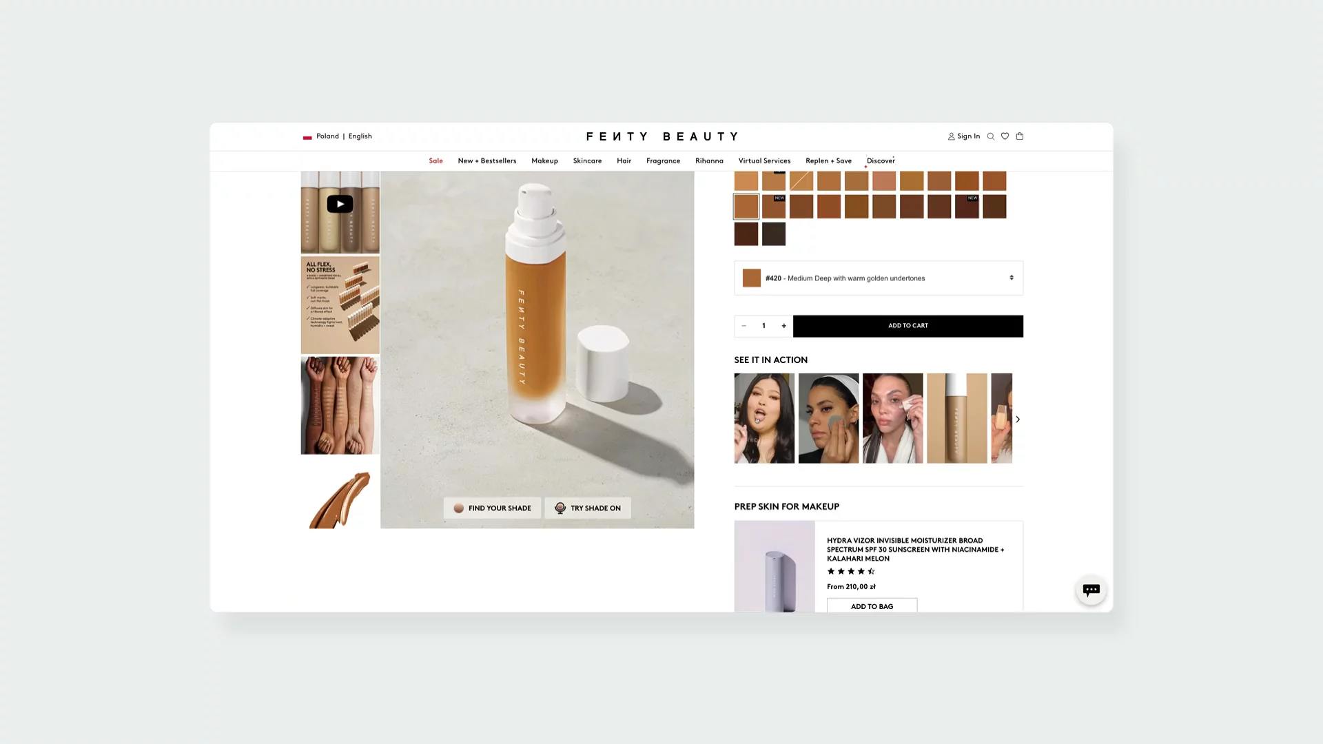
↑ Customers can see the effect of Fenty Beauty products.
Visit site: Fenty Beauty
Their review system is incredibly thoughtful. As someone who's always frustrated by vague product reviews, I appreciate how they've implemented detailed filters for age, skin concerns, skin type, and product value. It helps you find feedback from people who share your specific needs.
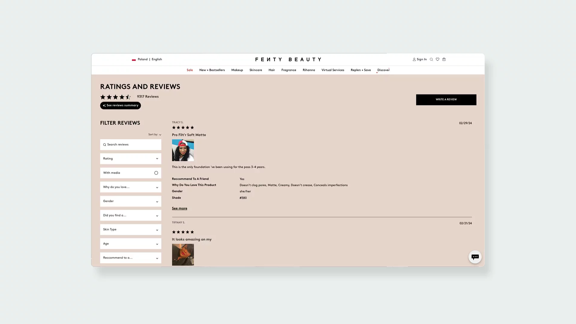
↑ Community reviews can encourage undecided customers to buy beauty products.
What makes the Shopify storefront special is how they blend Rihanna's authentic presence with practical education. You'll find her explaining products and demonstrating techniques, but it never feels gimmicky – it's always focused on helping you understand how to get the best results.
↑ The hoover effect on cards is quite interesting.
ORRIS Paris
ORRIS Paris's vision was simple – to elevate the bar of soap. And they definitely succeeded. Their minimalist, luxury-inspired aesthetic with its careful use of whites and subtle grays, creates this sense of refined elegance that's hard to find in digital spaces. And the hero image on the homepage brings to mind a spa-like feeling, highlighting natural ingredients and an artisanal approach.
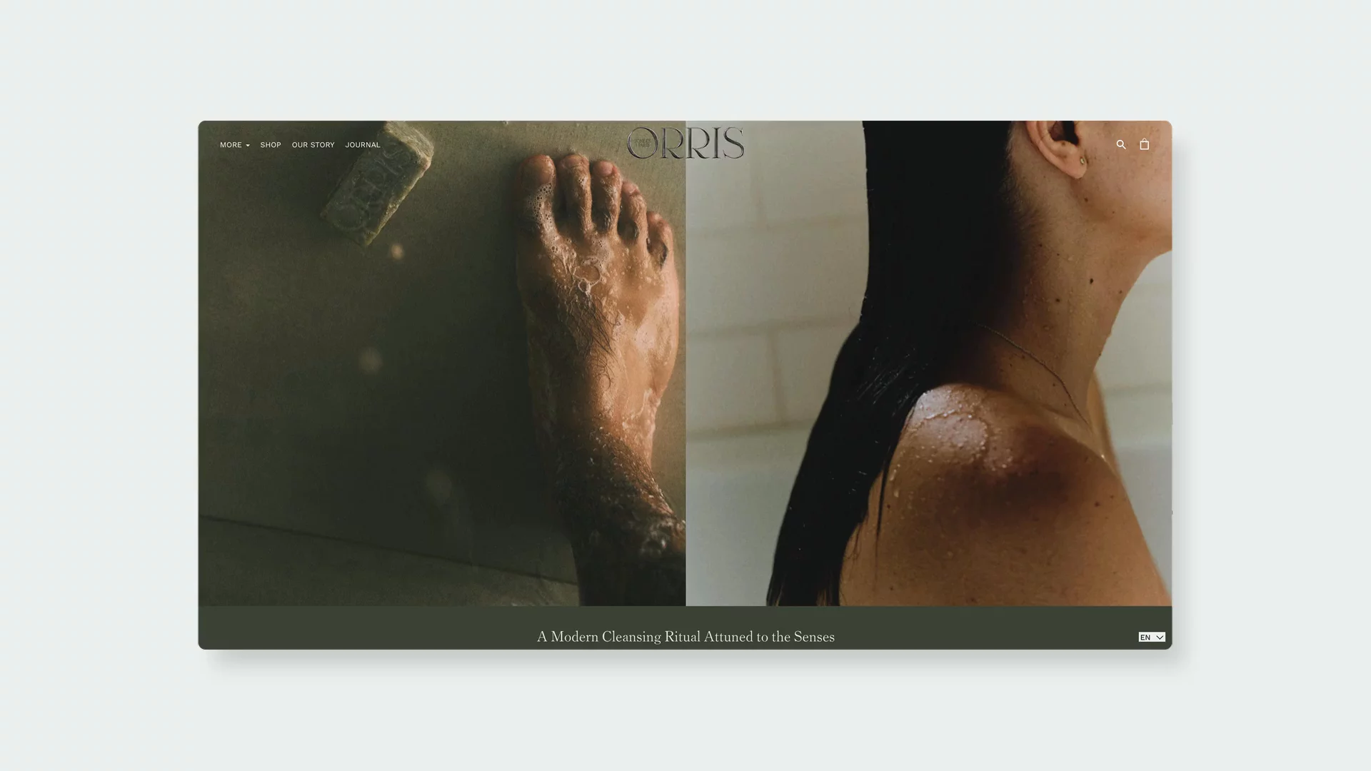
↑ Some of the beauty brands started with a simple product, for example, a soap bar.
Visit site: ORRIS Paris
Their journal section is a particular favorite of mine. The surreal, sculptural art direction transforms simple product photography into gallery-worthy art pieces. I love how they present ingredients on their product detail pages – each component gets its moment to shine with beautiful visuals and clear, informative descriptions.
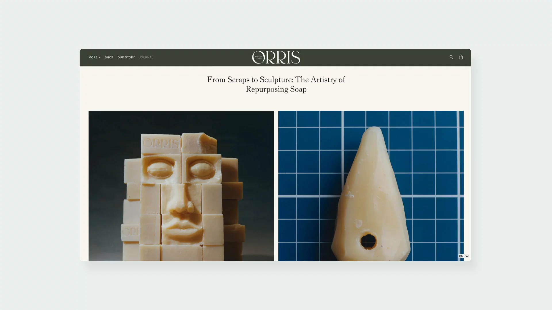
↑ Including a well-designed journal section can boost engagement on your website.
Kits Kind
If there's an eCommerce design that makes me feel like I'm flipping through a high-end fashion magazine, it's Kits Kind. Their bold, editorial-inspired minimalism with that distinctive typewriter-like font creates such a unique atmosphere. The interactive menu that pairs category titles with product imagery is simply brilliant.
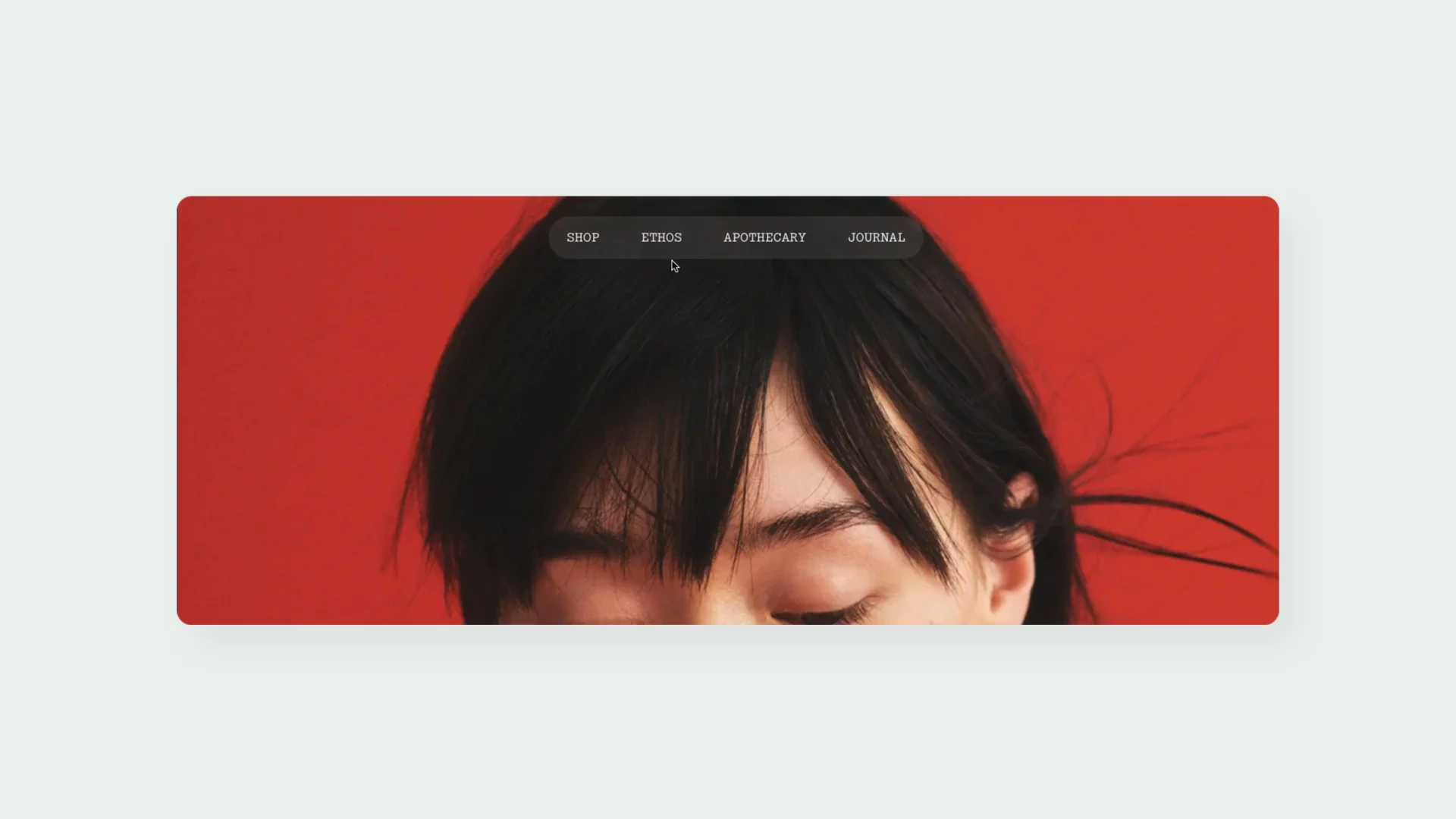
↑ Kits Kind pairs bold colors with well-designed website elements.
Visit site: Kits Kind
But what really gets me excited are their hover videos on product cards. Every time I see a product come to life as I move my cursor over it, I find it hard not to click through!
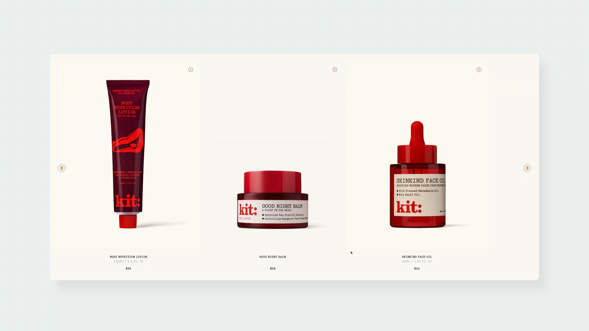
↑ An interesting use of hoover effect on Kits Kind website.
Isla Beauty
What draws me to Isla Beauty's website is their refreshing approach to transparency. Founded by Tracy Dubb, who shares her personal struggles with skin issues, the brand feels genuinely committed to cutting through industry noise.
Their "How it Works" section is a standout feature – I love how they've created this visually engaging, interactive breakdown of each active ingredient, complete with concentration levels and specific benefits. It's exactly the kind of detailed information that helps build trust with skeptical skincare shoppers like myself.
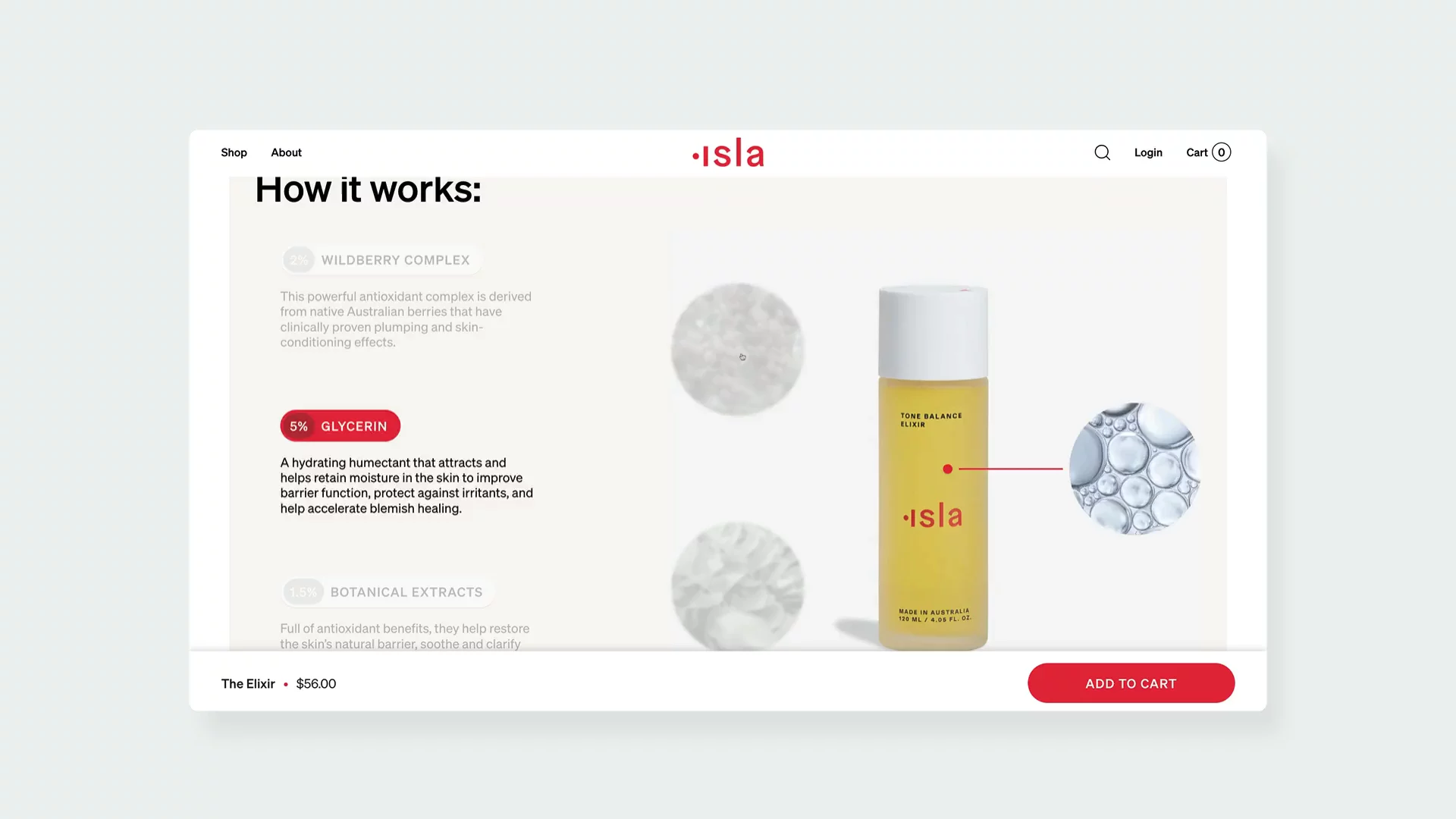
↑ Example of a design made with user in mind – you can discover active ingredients in your chosen cosmetic.
Visit site: Isla Beauty
Respire
Respire enjoyed a meteoric rise in the competitive French beauty market. In just four years, they've accomplished what takes many brands decades – establishing themselves in 3,500 points of sale across France's most prestigious retailers, from Sephora to Nocibé. But what really sets them apart is their innovative approach to product development.
What I find most impressive is their "La Ruche Respire" initiative – a private community of 700 dedicated product testers and co-creators. Imagine having direct input into everything from fragrance selection to packaging design! It's community-driven innovation at its finest, and you can really feel this collaborative spirit throughout their website.
Respire mastered the art of using large, scenic photographs that capture this sense of freshness and active living. I love how these images don't just showcase products – they tell a story about lifestyle and help you envision how these products fit into your daily routine.
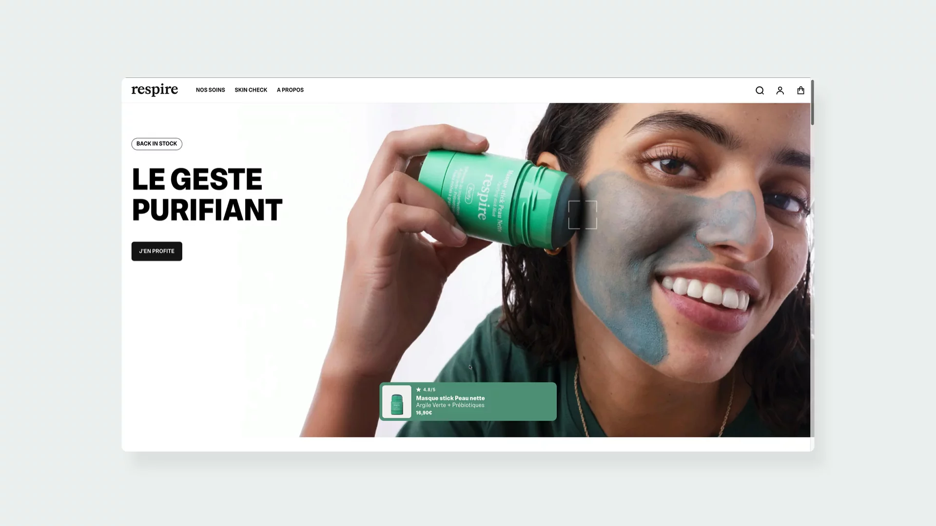
↑ Respire uses green and blue tones to make their brand pop.
Their color palette is particularly clever. The way they weave pops of blue, green, and soft pastels throughout their packaging and website creates this cohesive, nature-inspired identity that feels both fresh and sophisticated. It's a perfect example of how thoughtful design can reinforce a brand's core values.
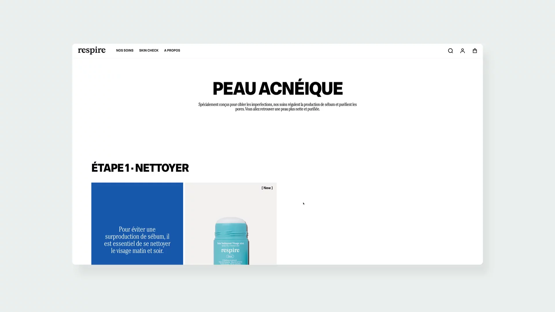
↑ A clean design is one of the distinguishing features of this brand.
Visit site: Respire
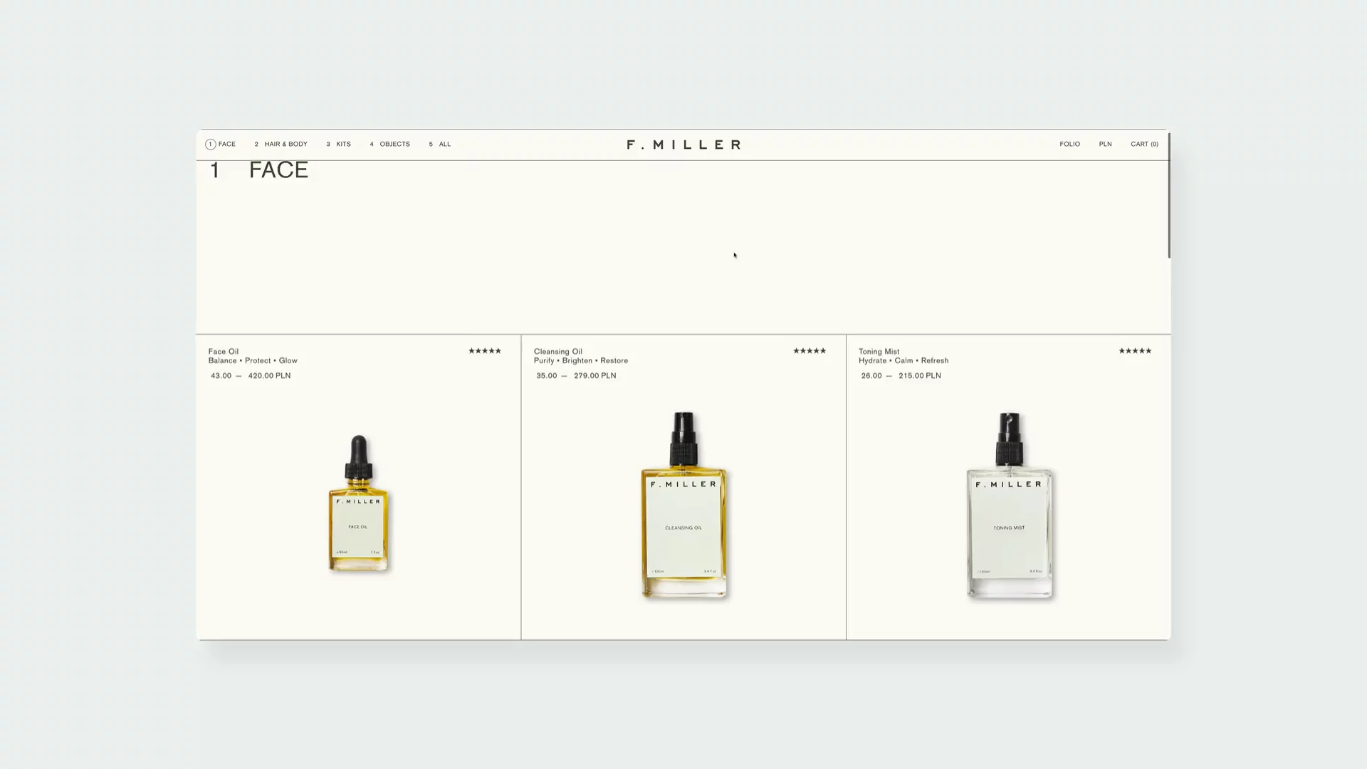
F.Miller
F.Miller was started in 2014. What distinguishes this brand from others is their focus on botanically based products. And they show it not only on their PDPs; they even created a set of Spotify botanically-themed playlists series. The minimal navigation feels deliberate, creating an immersive experience that lets the brand's philosophy shine through. And here's a fun challenge for beauty brand enthusiasts – I'm still trying to figure out if any other brand has composed their own Spotify playlist like F.Miller has.
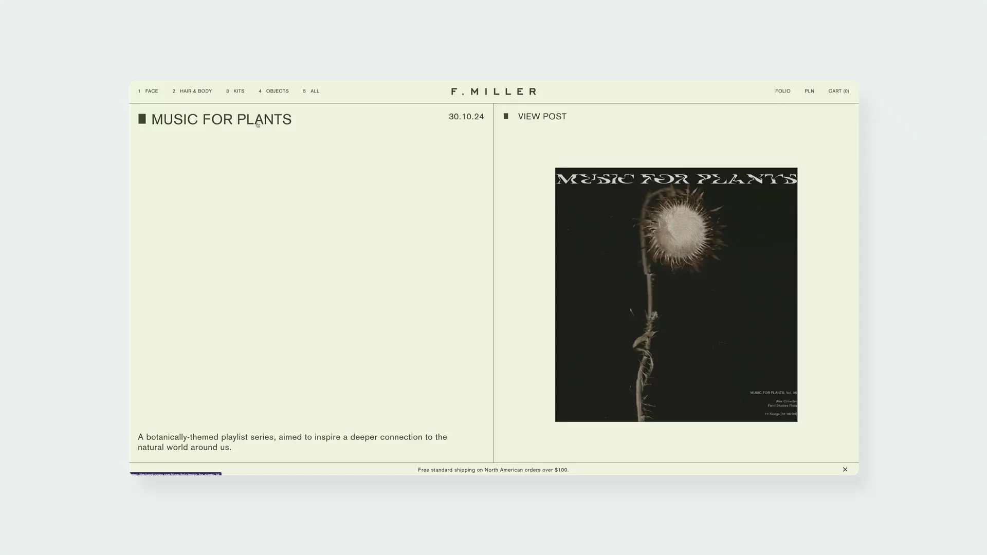
↑ Do you know any other beauty brands that share Spotify playlist on their website?
Visit site: F.Miller
When it comes to design choices, their use of lines creates a scientific, almost apothecary-like aesthetic that immediately sets them apart from typical beauty brands.
The color palette is a masterclass in understated elegance. Soft greens, whites, and neutral tones aren't just colors – they're a statement about the brand's commitment to natural, sustainable skincare.
What immediately caught my attention was their hover effect – a mesmerizing "diffusion" that makes product interactions feel almost ethereal.
↑ A diffusion effect on something one-of-a-kind.
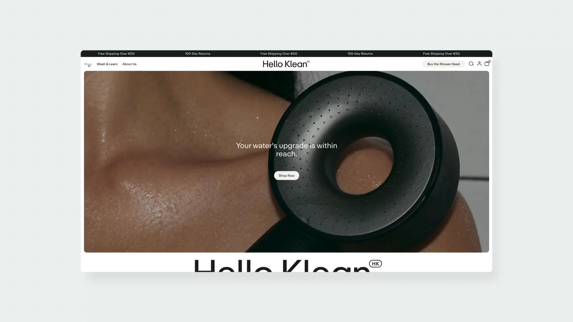
Hello Klean
And last, but not the least – Hello Klean. Apart from hair and body products, Hello Klean offers shower filters for hard water. Their mission is to counteract the negative effects of hard water minerals which can lead to dryness, dullness, and irritation. And customers can order their products and pay for them once the shipment arrives.
What struck me at first glance was their great navigation system. Users can see product thumbnails directly in the menu. This trick makes the products instantly stand out. It’s a an excellent blend of visual and functional navigation.
↑ Hello Klean offers not only beauty products, but also shower heads.
Visit site: Hello Klean
Hello Klean also addresses any doubts potential customers may have by adding the Before/After feature. That’s one of the best ways to present the effectiveness of their products.
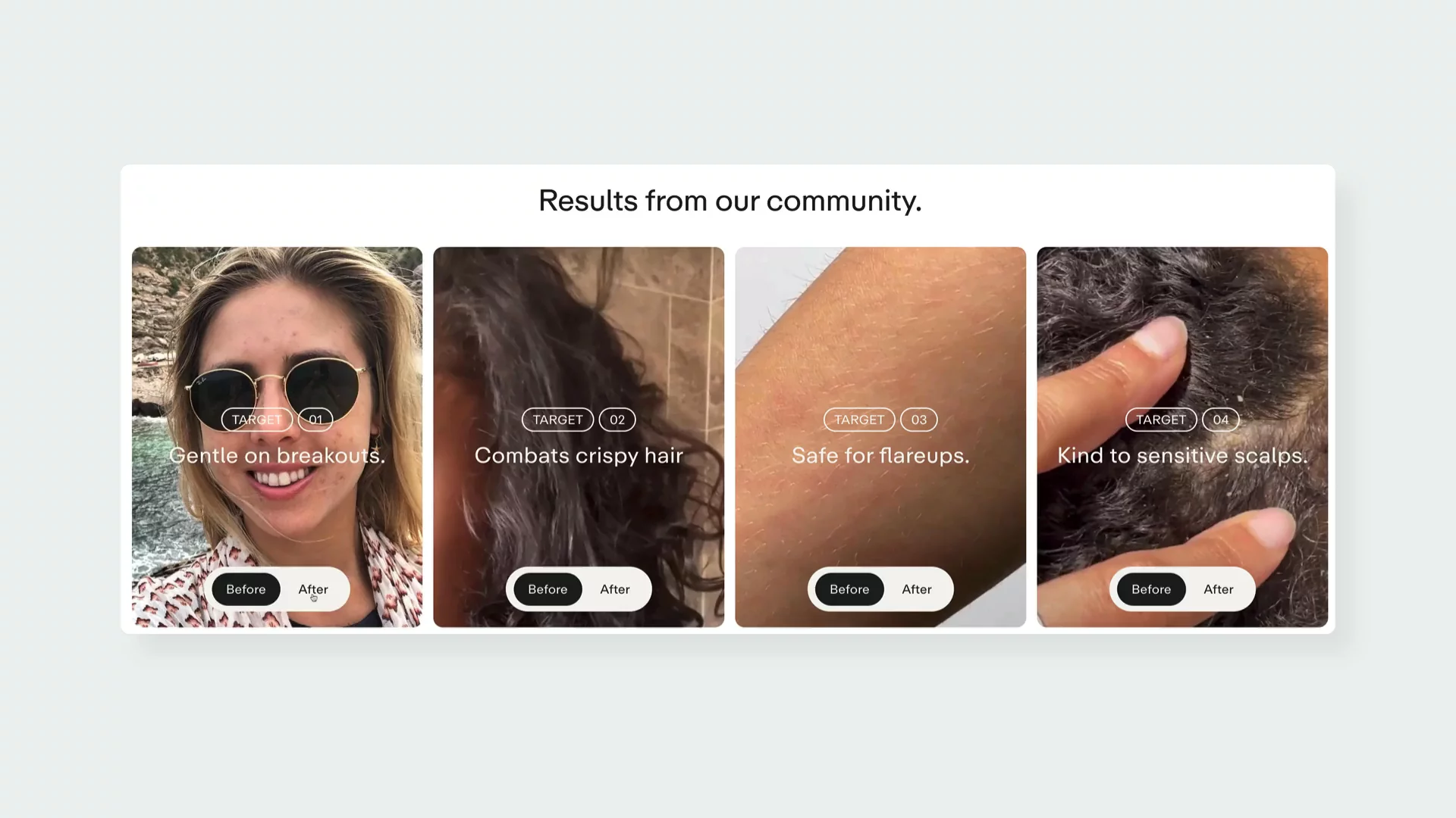
↑ Customers can easily see the effects of Hello Klean products.
Just like The Ordinary, Hello Klean uses diagrams, charts, and ingredients lists to present information in a visually appealing way. Combining scientific charts with lifestyle images translates the solid scientific background of their products to benefits for the end users.
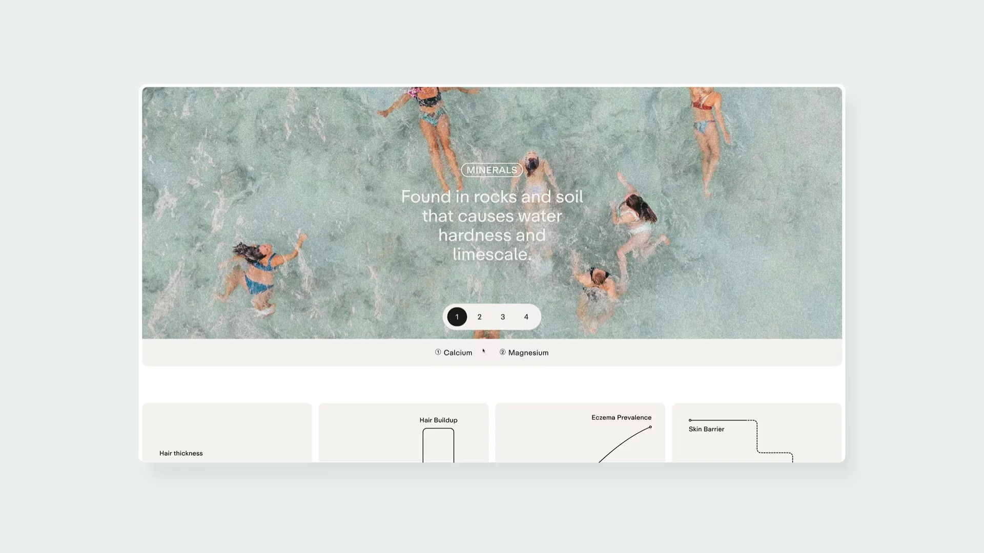
↑ Using line and diagrams makes the brand look more scientific.
How to Make Your Shopify Beauty Brand Stand Out?
As you can see, there are plenty of ways to showcase your beauty products. Basically, the sky is the limit. Or in this case, technology is the limit. What these brands have in common are strong editorial capabilities, artistic, high-resolution imagery, and thoughtful UI and UX. To build this type of website, you need to carefully choose not only your art direction, but also your tech stack. You can start by exploring our guide on how to build a Shopify product details page.
PS. Remember to sign up to our newsletter in order to get actionable eCommerce insights straight to your inbox!


