Best 21 Fashion PDP examples in 2025.
A PDP is a digital representation of the conversation that a client has in the store with a sales assistant, and it’s the most critical milestone in the shopping journey.


Introduction
In the vast landscape of PDP examples, some stand out with their innovative approaches to UX/UI, immersive content, conversion rate optimization (CRO), strategies for increasing average order value (AOV), and mobile UX optimizations.
In the first part of the article "Best Shopify Product Page — A complete guide how to build"., we discussed what a PDP is, why you should invest in it, and what the essential elements of a good product detail page are. Now, let’s dive into our curated selection of best PDP examples that could serve as great inspiration.
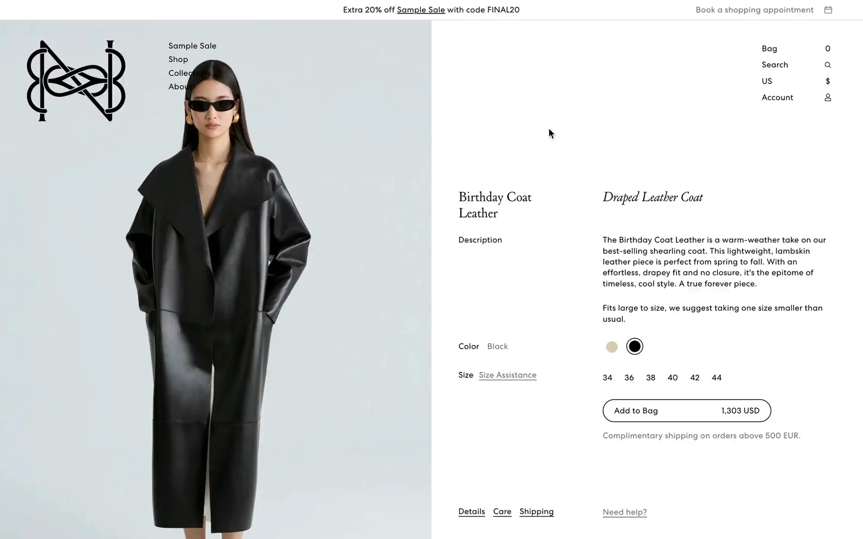
Magda Butrym
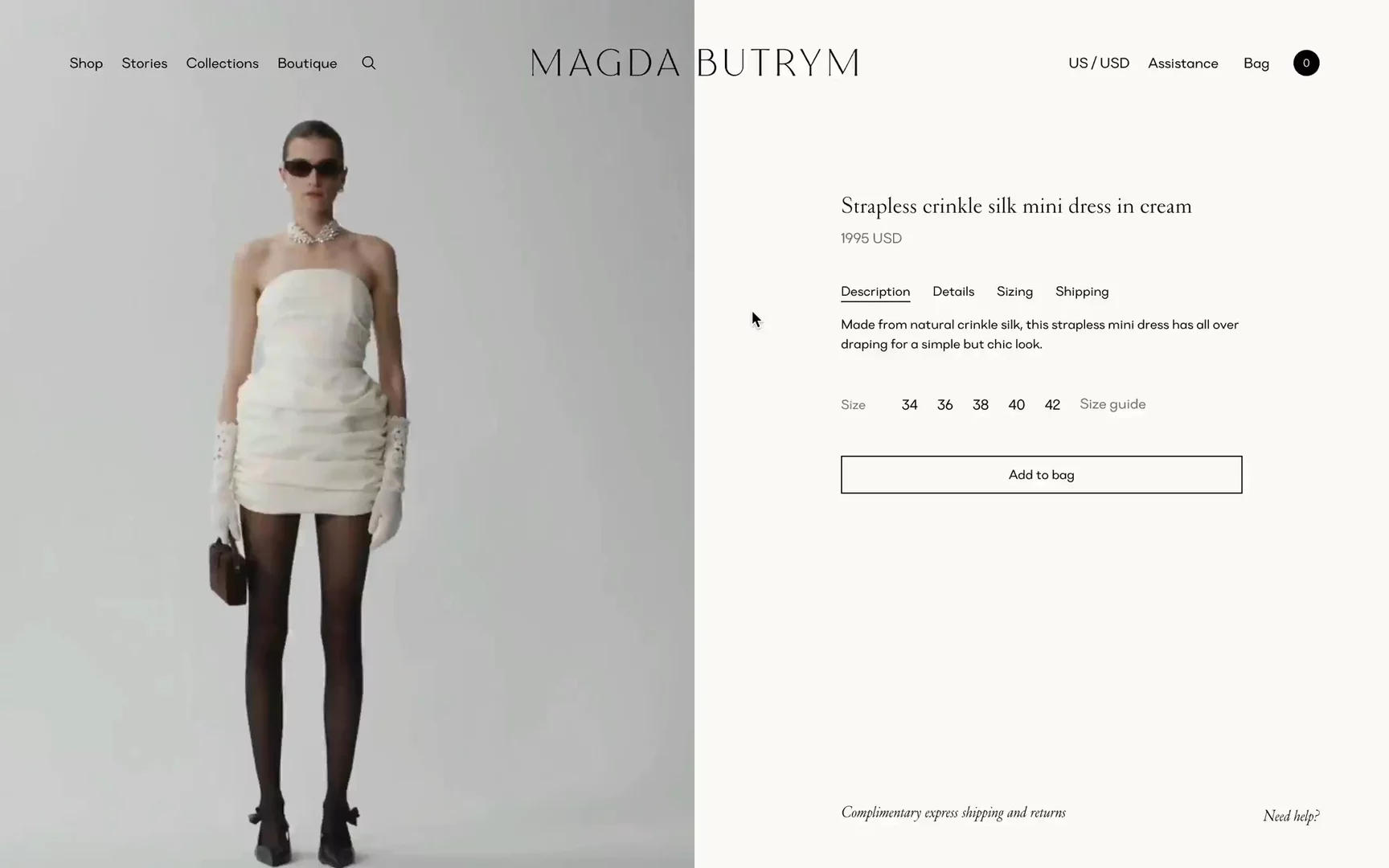
Visit Site: Magda Butrym — Product Detail Page
What stands out:
- Video-first PDP: Magda Butrym is doing an outstanding job creating video content for each item. It’s definitely an investment and effort, but for their price-point, I believe it’s justified.
- Great mobile UX with “add to bag” visible in the first viewport, and an instant modal to choose a size after adding to the bag.
- Informative tabs visible in the first viewport.
- Standard “complete the look” with suggestions of matching items.
- Sizing hints such as “Model is 180 cm and is wearing a size 34.”
- It's definitely often referenced as a great Shopify PDP example.
Aether Apparel
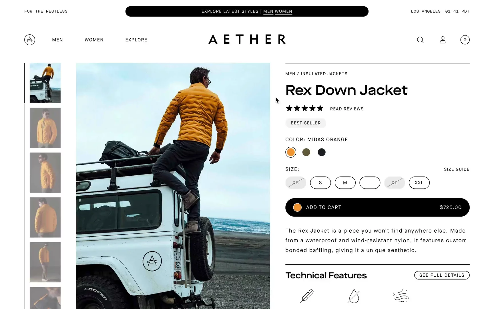
Visit Site: Aether Apparel — Product Detail Page
What stands out:
- Works super fast! It's also a great example of how to build a Shopify PDP in an engaging and informative way.
- I really like the drawer sliding in from the right to provide more technical feature details.
- Aether perfectly blends inspirational content with product information.
- They showcase design details like the interior, zippered pockets, sleeve cuffs, and more.
- They present the temperature range (changeable in Fahrenheit or Celsius) for the jacket.
- Highlighted free returns and free ground shipping.
Rains
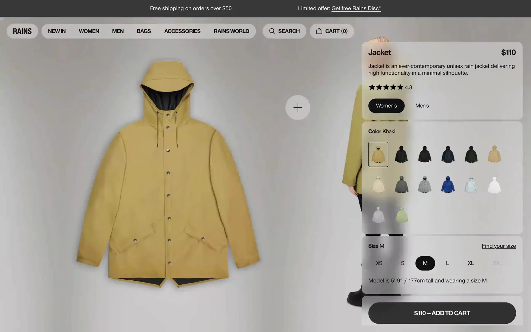
Visit Site: Rains — Product Detail Page
What stands out:
- I really like the idea of a floating gallery with great creative direction.
- Social proof with reviews gives extra confidence to the clients.
- The “Find your size” feature helps reduce the risk of mismatch. After filling out the quiz, there is a prompt saying, “We recommend size S.”
- I love the distinction with the “Water performance level.” I remember how much I researched for a proper rain jacket when planning a hike to Norway.
- Rains highlights that their products come with a 2-year product warranty!
Early Majority
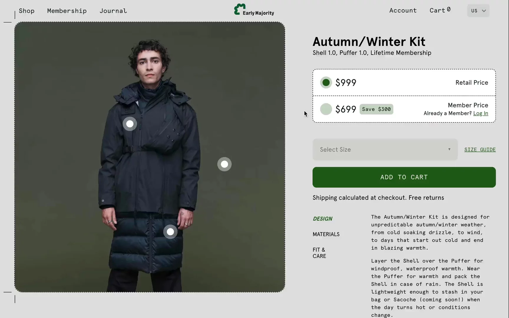
Visit Site: Early Majority — Product Detail Page
What stands out:
- Informative hotspots provide details of the product.
- Incentives for joining their annual membership include free shipping, better pricing, exclusive products, and community events. This is an attractive business model for fashion brands to generate recurring revenue from subscriptions.
- I love the creative direction of the GIF video created from pictures.
- An easy way to upsell by offering kit upgrades.
Nudie Jeans
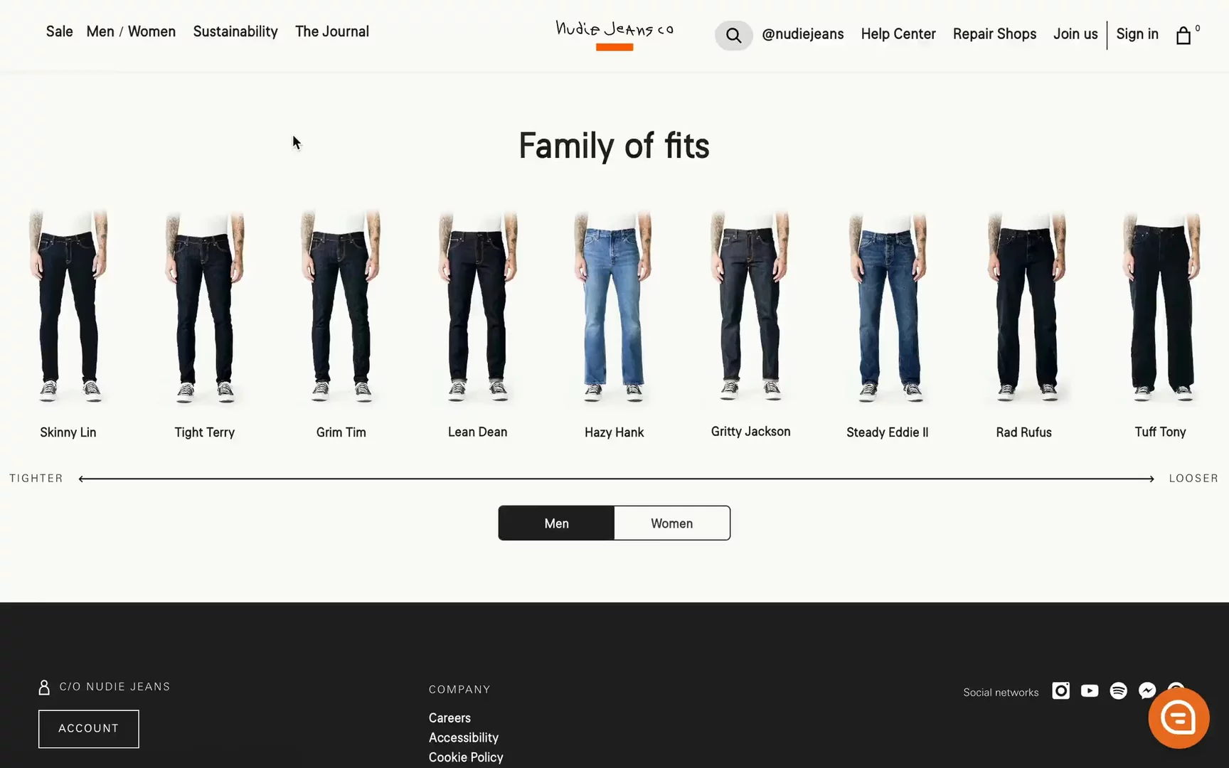
Visit Site: Nudie Jeans — Product Detail Page
What stands out:
- Nudie Jeans features several items from the same line, like “Skinny,” and easily showcases other products from the same line on the right.
- More information, such as Details, Product Transparency, Care Instructions, and Reviews, is available in a drawer sliding in from the right.
- I highly encourage checking the “Product Transparency” section. They highlight every manufacturer, visit those suppliers in person, and calculate the average emission of CO2 and water usage. Wow!
- Smart upsell feature with “Model also wearing.”
- Their “Fit Guide” works phenomenal.
Maap
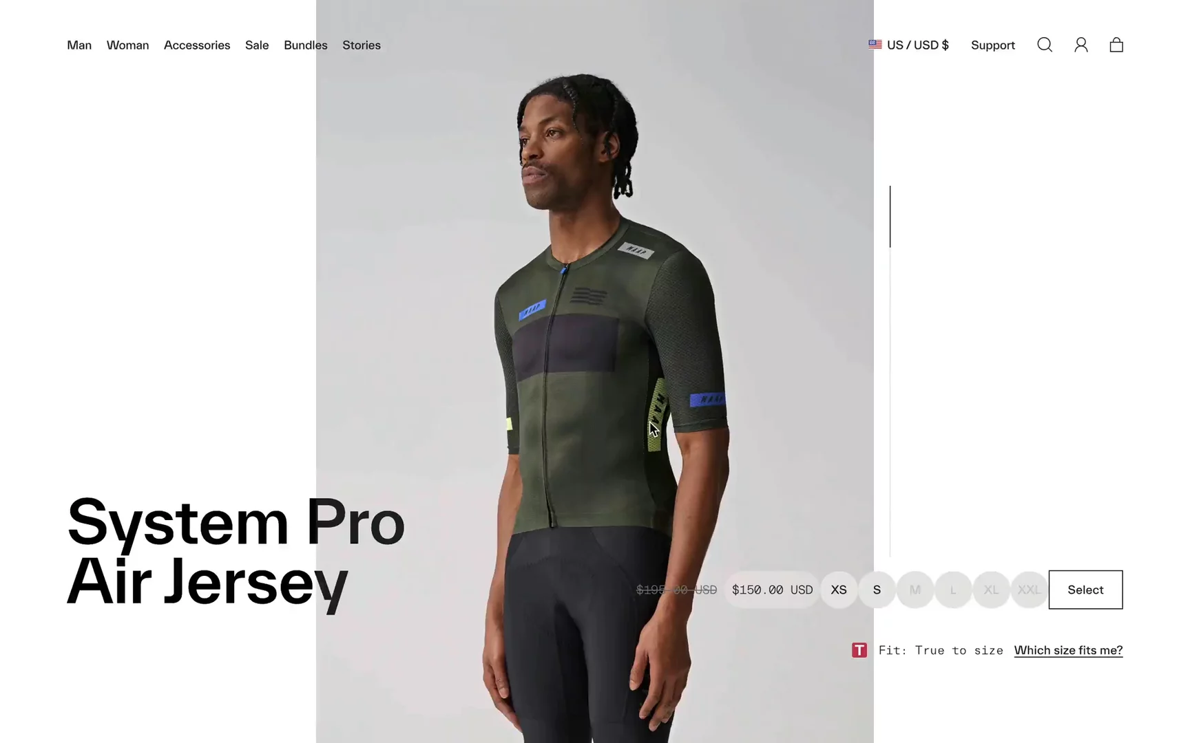
Visit Site: Maap — Product Detail Page
What stands out:
- Love the aesthetics on this PDP and the super clean UX.
- Sticky bar at the top to quickly add the product to the cart.
- Showcasing details of the product (pockets, zippers).
- Specifications like Fabrics, Product Weight (cyclists are obsessed with being lightweight), and Weather Riding Conditions.
- They store data in the browser and show “Recently viewed” items at the bottom.
- I really love their idea of “Crash Replacement,” where they offer a 40% discount on new gear once you send details and photos of your damaged kit. Crashes and slides are real in cycling!
On
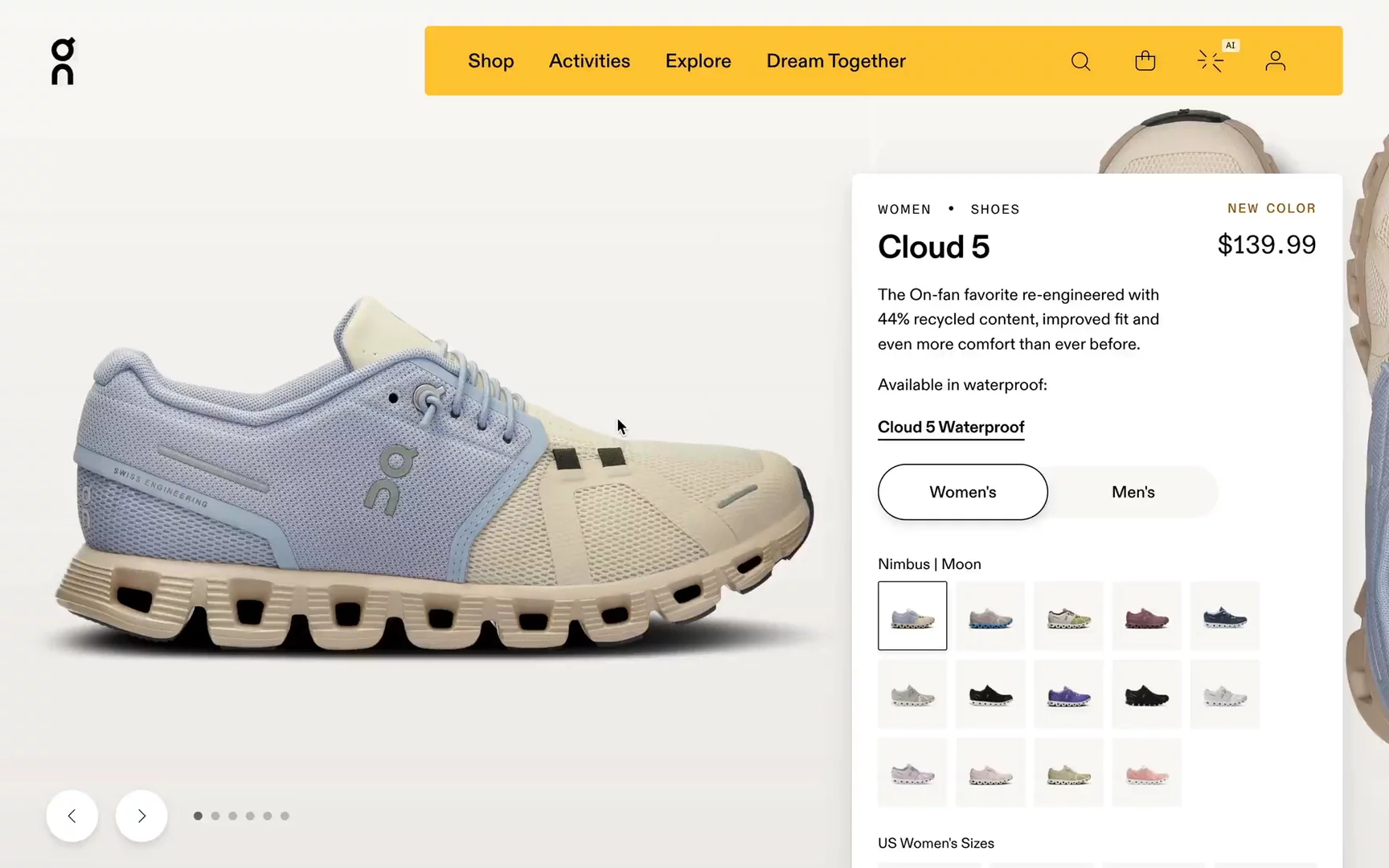
Visit Site: On — Product Detail Page
What stands out:
- I really like this immersive, full-width gallery.
- There is also a quick toggle to change from Men’s to Women’s.
- There is contextual information on the overlay about lacing or drop.
- They have a separate page to explain the advanced cushioning technology used in the shoes, consistent with their claim of "Swiss engineering."
- They upsell matching products like pants, tops, or socks.
- Great mobile UX with a sticky “add to bag” button and a burger menu within thumb reach.
Ace & Tate
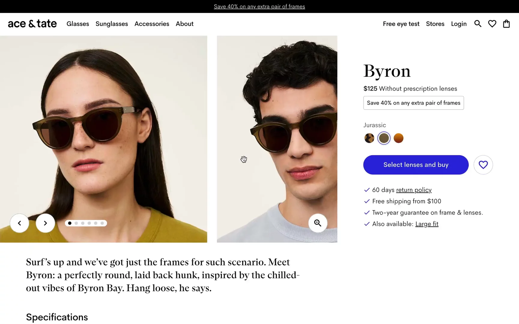
Visit Site: Ace & Tate — Product Detail Page
What stands out:
- Ace & Tate offers different types of sunglasses and lenses, featuring a journey in the drawer to upsell upgraded Polarised Lenses or Accessories. Super smart!
- Simple, 2D sketches with Frame dimensions help reduce the risk of a missed fit.
- Below the fold, there is a section to explore the whole collection in case you don’t like this particular model.
- The gallery slider works really well, with the ability to swipe photos using the keyboard and zoom in on the products.
Polene
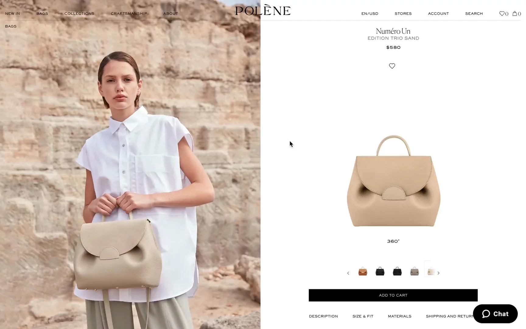
Visit Site: Polene — Product Detail Page
What stands out:
- This is a pretty basic PDP, but the 360-degree view definitely stands out.
- There is a 3D render of the bag with the ability to switch the view to 360 degrees. It’s smooth and allows for expanding to a full-width view for extra zoom.
- The 360-degree view works much better on mobile!
- The PDP is minimalistic and fits the overall brand presence.
- UX optimized sticky bar is always available on scroll to add the item to the cart.
Yu Mei
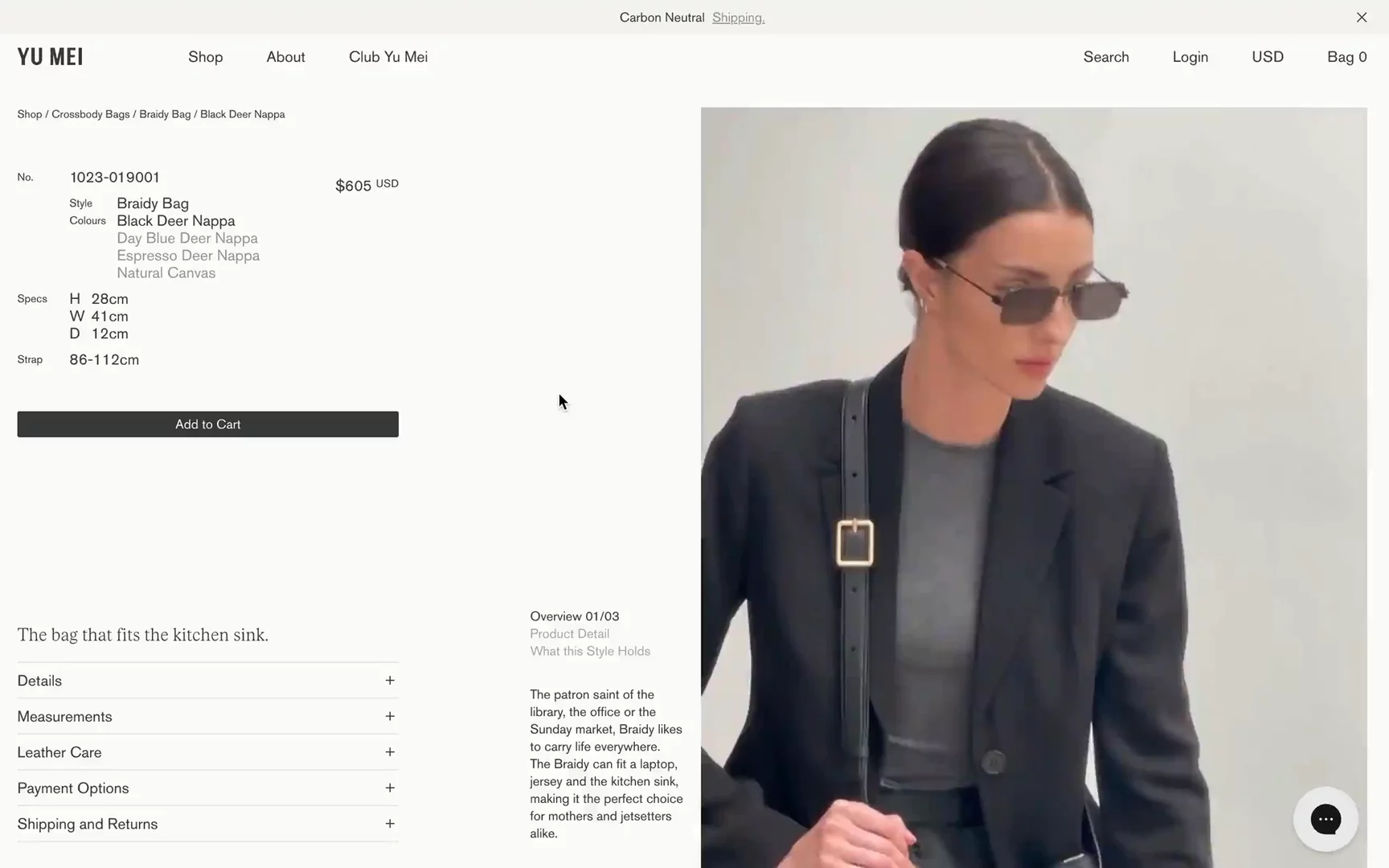
Visit Site: Yu Mei — Product Detail Page
What stands out:
- This PDP seems quite crowded, with a lot of information squeezed into the first viewport.
- I like incorporating video content in the product gallery!
- Minimalistic sizing drawings are enhanced by including an iPhone or MacBook 13” for scale. Hovering over the iPhone highlights it—love this detail!
- Yu Mei upsells “Care products” below. Increased AOV tactics.
- They reinforce their mission and values with elegant copy on top of inspirational video content.
ARK/8
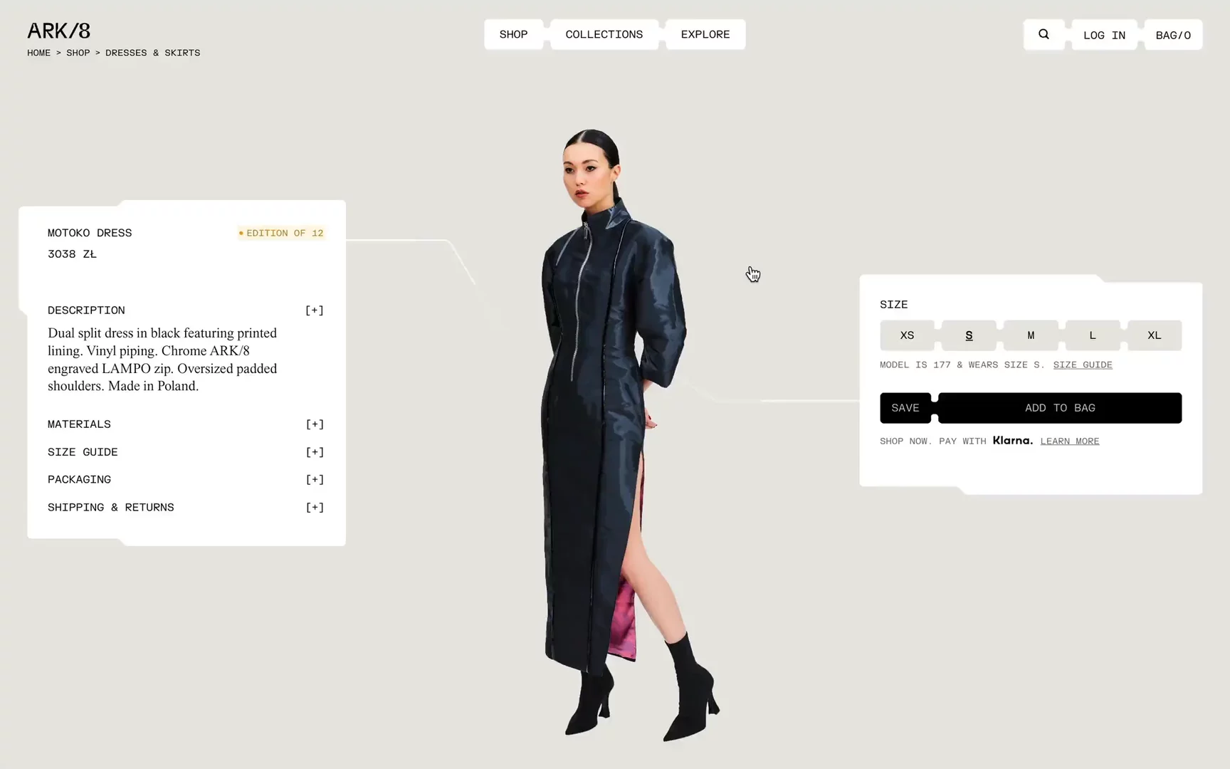
Visit Site: ARK/8 — Product Detail Page
What stands out:
- This PDP design is definitely out of this world! Quite unique across PDPs that I’ve seen.
- Beautifully executed full-screen gallery. I even like the small detail of the white frame that shows which photo of the gallery you’re currently viewing. The content is also great!
- Check out the "Add to bag" notification that has a Cyberpunk vibe.
- Really enjoy the subtle motion of those flowing lines.
- Good UX on mobile with “Add to cart” followed by “Select a size” instantly. However, I don’t understand why I need to close the “Size” and then add to the bag. It should happen instantly.
MR MARVIS
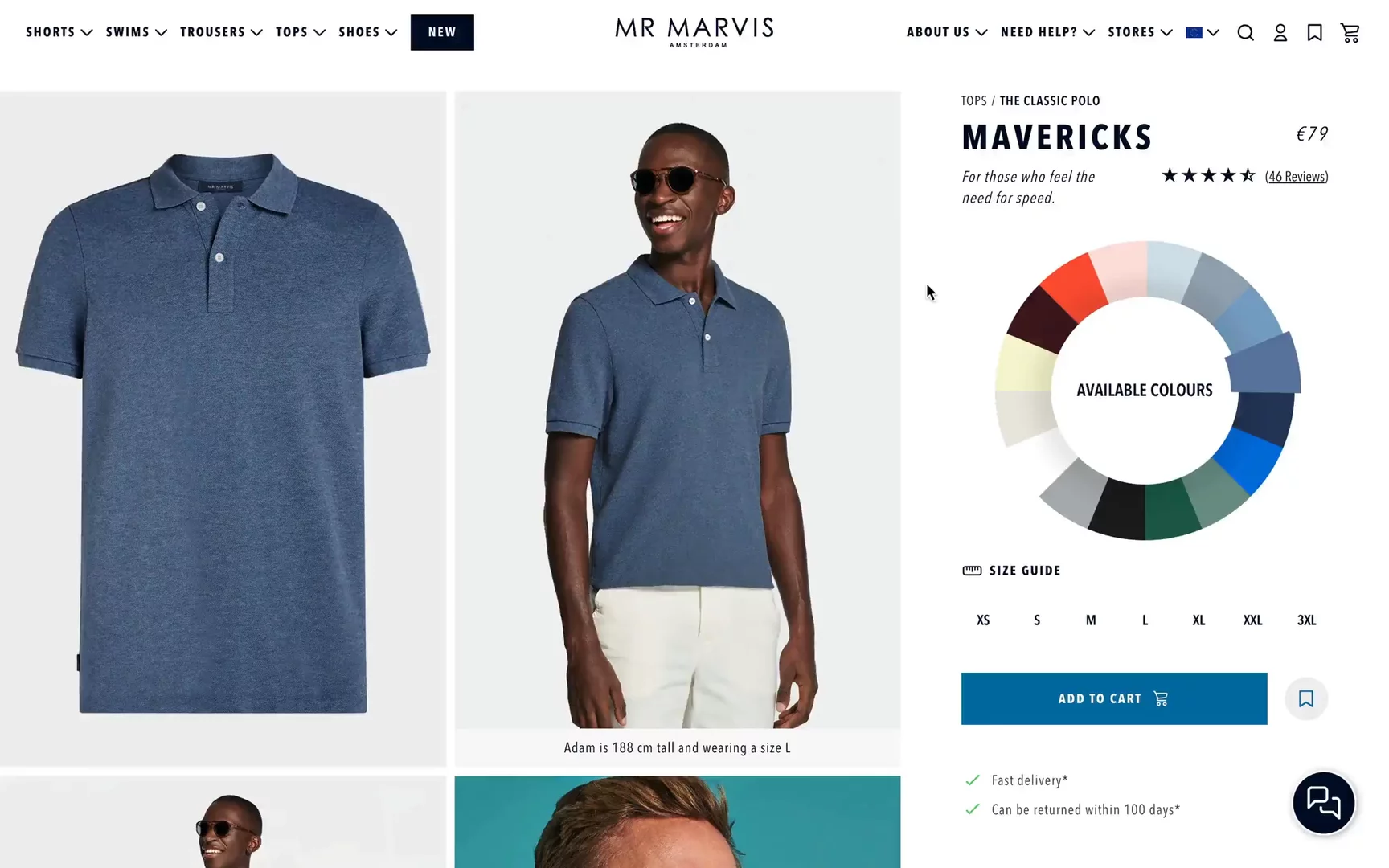
Visit Site: MR MARVIS — Product Detail Page
What stands out:
- Something new that I’ve never seen before is the color wheel for easy switching between colors. It works super fast!
- Customer reviews and testimonials are placed high in the hierarchy to provide social proof.
- Incentive to sign up for emails to get 10% off the first order.
- High-quality images with really good art direction.
- Emphasizing the value that this is “handmade in Portugal.”
- At the bottom, guiding people to explore stores to better experience the brand & products.
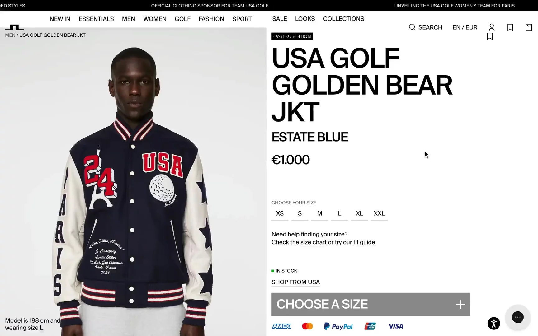
J. Lindenberg
Visit Site: J.Lindenberg — Product Detail Page
What stands out:
- I really like the interface design, with lots of white space and bold, big typography!
- Quite popular indication of the model’s height and the size they are wearing.
- Really like the “Styled with X items” section to showcase other complementary products and increase AOV.
- Interesting UX detail to differentiate the size chart for Europe and the US separately.
- Very informative section showing exactly “how” and “where” to measure your sizes. I’m sure many people don’t clearly know where to measure waist or arm length.
- Super playful bottom section to allow users to explore other categories! It looks even better on mobile ♥️
- This definitely could be one of the best Shopify PDP examples to be inspired with!
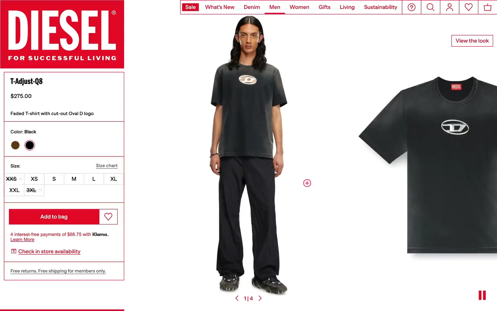
Diesel
Visit Site: Diesel — Product Detail Page
What stands out:
- Diesel decided to put all the information on the left. I’m super curious about the rationale and data behind this decision since most UX patterns typically place information on the right. Do you think this could be an anti-pattern?
- There is a nice slider that automatically swipes.
- I like small details like the transparent logo on the product slider, which you can pause/play. I appreciate how all the photos are nicely blended.
- They incentivize users to join the “House of Diesel” membership program. It’s a popular move to make people create accounts so they can nurture clients via emails and gather more data. Additionally, there is free shipping for members only!
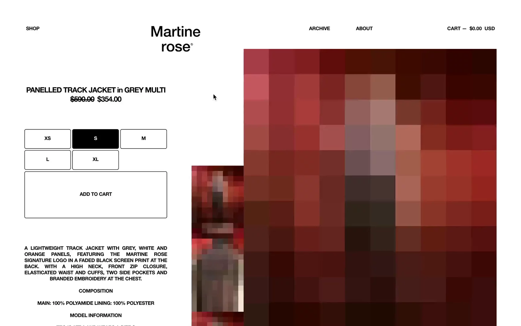
Martine rose
Visit Site: Martine rose — Product Detail Page
What stands out:
- I wanted to highlight this example because it’s something out of the box in terms of design.
- I really like the art direction of the product images; it stands out and matches the brand’s vibe.
- There is a subtle loader that shows pixelated images for a moment. Small detail but super playful.
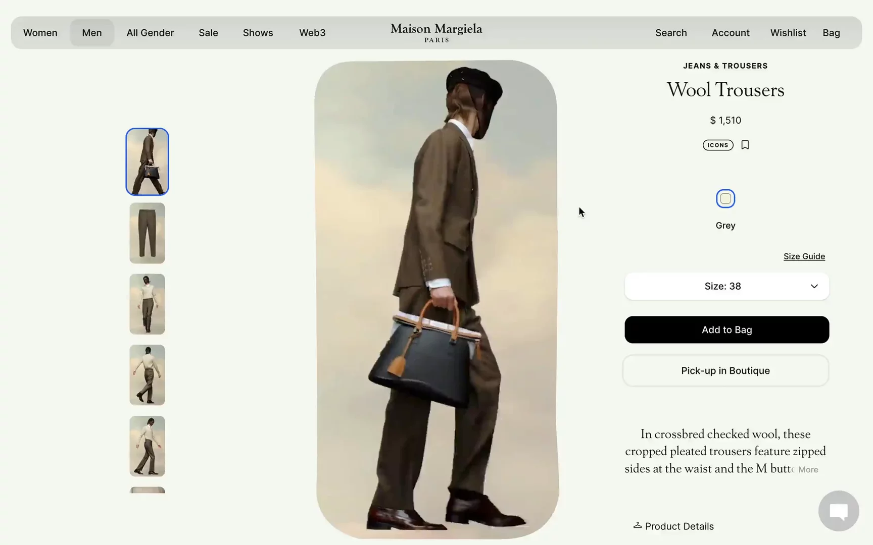
Maison Margiela
Visit Site: Maison Margiela — Product Detail Page
What stands out:
- Maison Margiela introduced a video-first PDP, similar to the Magda Butrym example, which I really like. The unique art direction in the video shows a lot of movement, although the video doesn't seem to be super sharp. Something is off here IMO.
- There is a section to increase AOV, “Style with,” which recommends complementary items.
- The “You May Also Like” section features videos inside the product cards, making me want to explore other products just for the sake of their art direction!
Cubitts
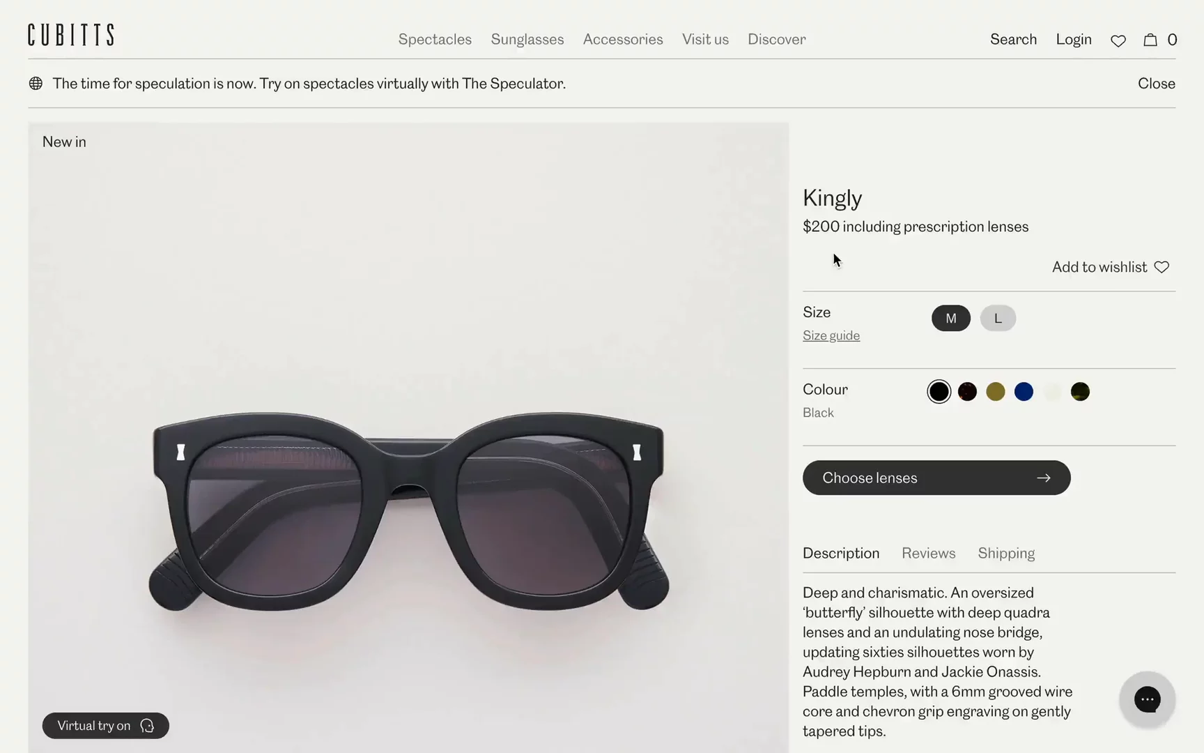
Visit Site: Cubitts — Product Detail Page
What stands out:
- Beautiful product images and/or renders.
- Clear size guide indications comparing M to L sizes.
- I really like how they present the same glasses on different faces, depending on the size of the head and nose.
- I'm a huge fan of adding more content sections on the PDP, like Aether Apparel. Cubitts explains their promise around services, frame quality, etc., and then they showcase beautiful content around design details!
Normal Phenomena
Visit Site: Normal Phenomena — Product Detail Page
What stands out:
- This PDP is definitely outside the box.
- I like the subtle motion when zooming the image, but I would prefer a gallery to slide through other pictures instantly without needing to click each one. However, the quality of the images is top-notch—super sharp!
- What does Size 1 mean? In the size guide, we have the typical S, M, L, so I’m confused.
- Normal Phenomena emphasizes the sustainability aspect and guides users about the recyclable garment.
- They have an entire editorial page that explains their approach towards “bacterially-dyed textiles” — that’s super interesting!
The Attico
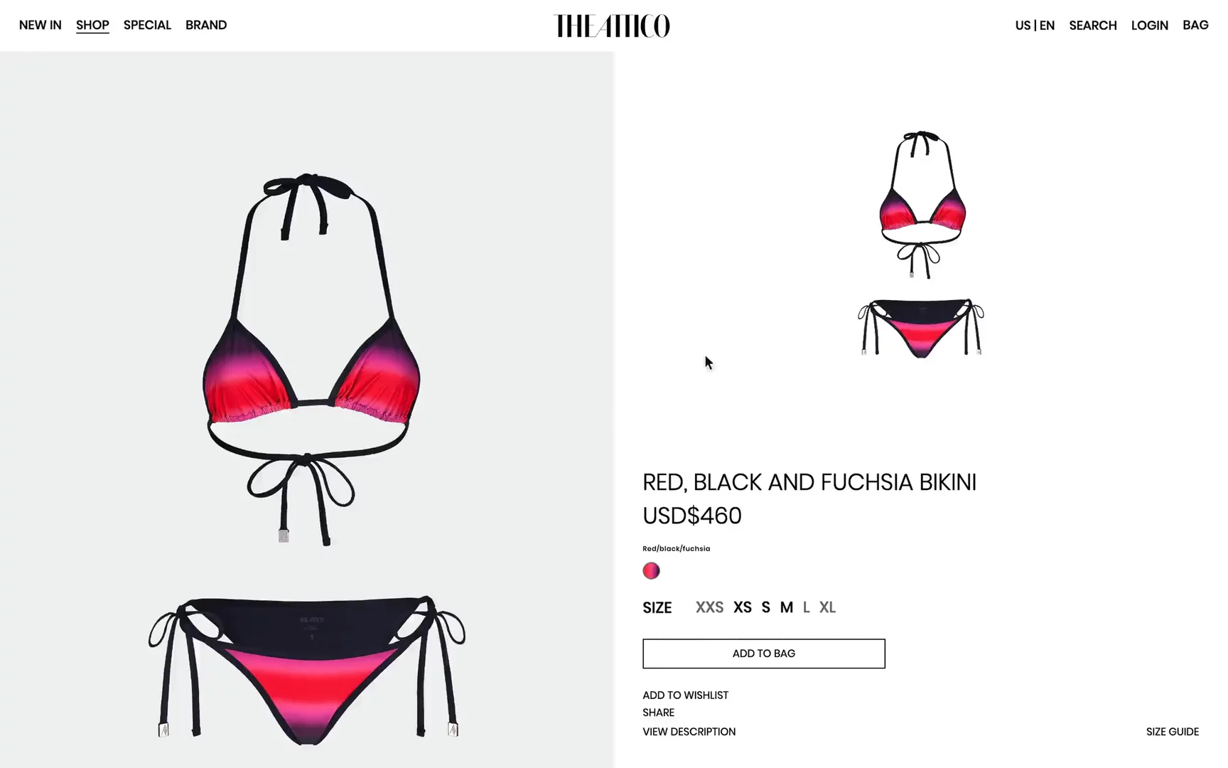
Visit Site: The Attico — Product Detail Page
What stands out:
- Very clean PDP, with only content and typography playing a role here, which is quite common in the high-fashion world.
- The “notify me” feature works super smoothly.
- I haven’t often seen the “share” feature. Curious how many people really use this 🙂
- I really like the “Complete look” area, where they nicely show the same model with the same bikini but with flat thongs on her feet.
Suit Supply
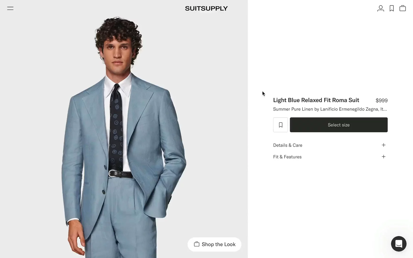
Visit Site: Suit Supply — Product Detail Page
What stands out:
- Suit Supply always provides a strong e-commerce experience for men’s wear.
- The PDP is very minimalistic, featuring high-quality images blended with product details like canvas, origins of the fabric, and fabric structure.
- I really like how they build the “Shop the Look” feature, with a drawer coming from the right showing complementary products that you might need.
- At the bottom of the PDP, they encourage visiting the store, which is definitely helpful when you want to buy your wedding suit and ensure the fit is great. Suit Supply offers small adjustments like shortening, lengthening, tapering, and more, all done in-store by their tailors.
Nour Hammour
Visit Site: Nour Hammour — Product Detail Page
What stands out:
- This project recently won the Shopify award in the category “Best Custom Shopify Hydrogen Storefront.”
- I really like how smoothly the Product Gallery works on the scroll. There is a blend of images on the model and pack shots. Investing in video would be the next step, but video production can be expensive, especially if you have many items.
- All necessary information is provided, such as care, fit, model size, material, and shipping details.
- Mobile is very well optimized in terms of UX, with a sticky “Select a size” button that instantly transforms into “Add to the bag.”
Conclusion
The examples highlighted in this article showcase a variety of approaches to making PDPs more engaging and effective. From video-first PDPs to out-of-the-box playful designs, these PDPs set the benchmark for 2024.
Investing in a high-quality PDP not only provides customers with essential product information but also enhances their overall shopping experience, leading to increased satisfaction and higher conversion rates. I hope you found some inspiration that can help you stand out in this competitive online market.
Before you leave...
I hope you find this piece interesting. If you'd like to receive our insights directly to your inbox, remember to sign up for our newsletter.
Yes, I want your newsletter!


