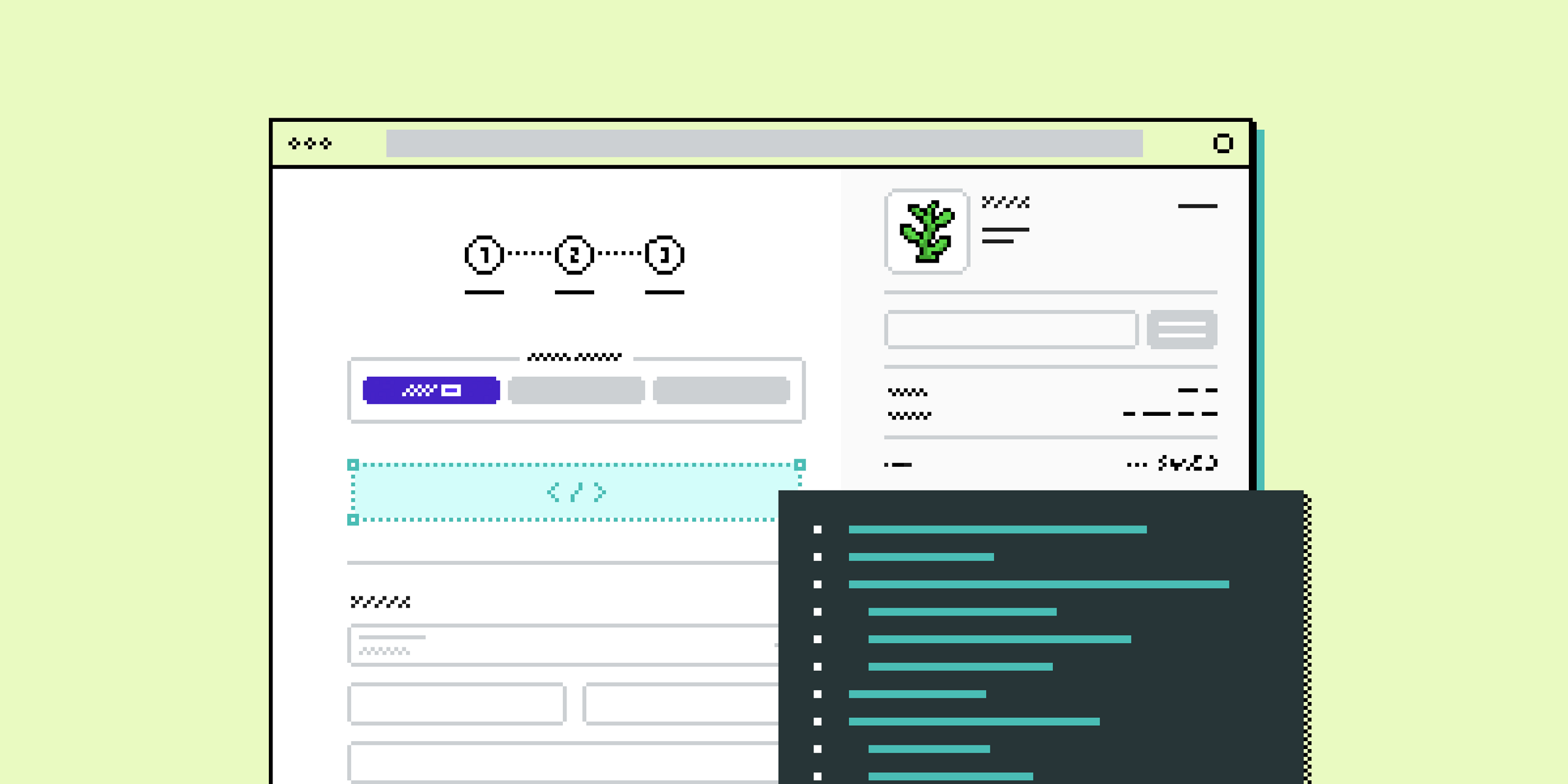
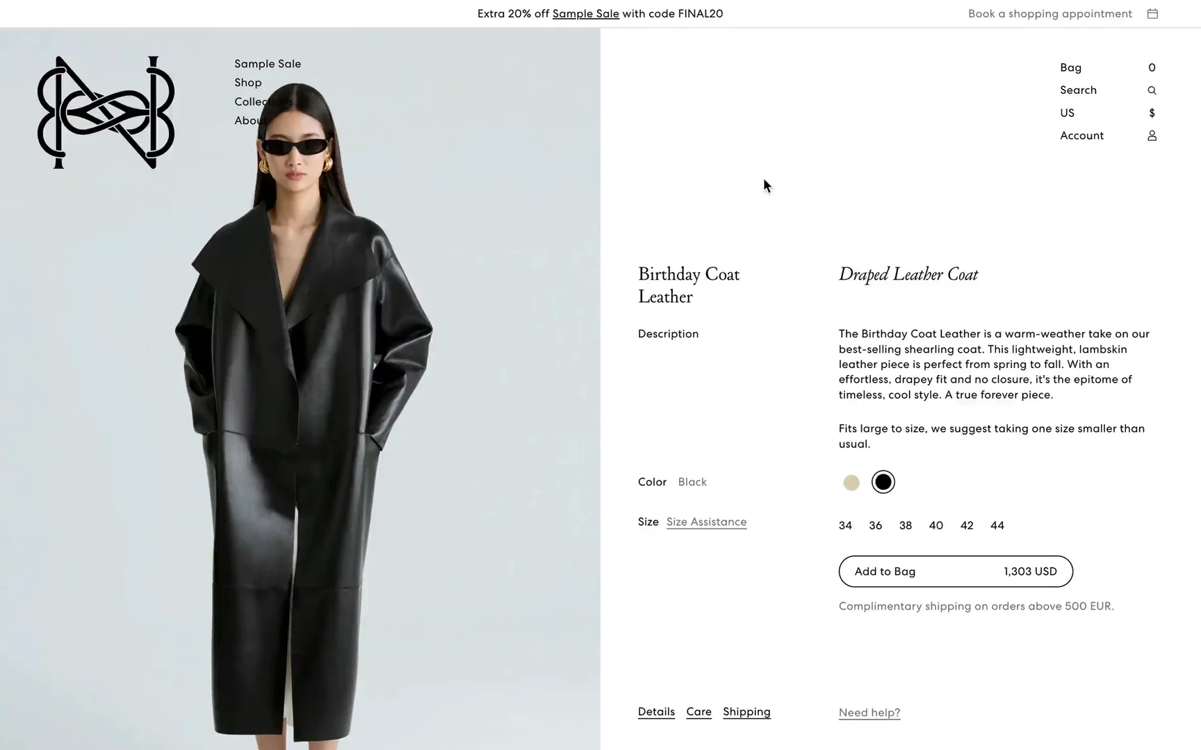
The Best Shopify Product Pages: A Complete Guide About How to Build Your Own


What Is a PDP?
Let’s start with the basics. PDP stands for product detail page. A PDP is a digital representation of the conversation that a client has with a sales assistant in the store. It is a crucial component of an online store because it’s where detailed information about a specific product is displayed.
A PDP is designed to provide potential customers with all the information they need to make a purchase. Additionally, a PDP is a key page in the customer’s purchase funnel, so it needs to be optimized both from a user experience (UX) standpoint and rewarding on the user interface (UI) side.
Why Should You Invest in a PDP?
Imagine you’re in a store and ask the shop assistant about running shoes for your dream marathon. You will probably be asked about how many miles you run in a week, your marathon pace, and if you have any issues with your feet or knees. A proper assistant can tell you exactly which shoe should fit your needs. They will tell you about the weight, fit, materials, cushioning system, lacing, and heel-to-toe drop.
This is exactly what a good PDP should convey. The main goal of a PDP is to shorten the distance to the customer and convert them to make a purchase. That’s especially the case since customers are probably looking at your products through a screen, most likely a small phone screen, and you’re not there to assist.
You should also consider that new customers at the top of the funnel might not be familiar with your brand or website. Because of that, it’s even more important to build credibility and encourage the user to add the product to the cart and proceed to checkout.
A good product page is not necessarily the most creative or unexpected from a design point of view, but it’s the one that is the richest in details to effectively convey the product's qualities and behavior.
In this article, I want to share the best PDP practices to help you create highly converting product pages for your eCommerce site.
What Are the Essential Elements of a Good Product Details Page?
Strong Information Hierarchy
Product information needs to be strategically and logically ordered on the site to make it easy to scan and digest. In order of priority:
- High-quality pictures and videos
- Product details and care
- Product Traceability and “Made In”
- Size guide
- Product dimensions
- Delivery and returns terms
- Find in store
- Recommendation
- UGC
- Reviews
- Comparison mode
High-Quality Pictures and Videos Can Make Your Shopify Product Pages Shine
Customers Need Details
In a physical store, you can evaluate an apparel item that you’re interested in at three different levels. First, you look at it hanging on a hanger, then you approach closer to touch the fabric and experience the details, and finally, you try it on to see the fit, how you look, and how it behaves in motion. The same happens in an online store but through images and video. That’s why you need very detailed product shots or high-resolution videos; the customer cannot touch the garment with their own hands, so it must be conveyed in detail through digital assets. It's also worth thinking about blending different content types, like on-model, pack shots, inspirational, and product details.
Higher Engagement
Well-executed content extends the time spent on the site, which increases the likelihood of conversion. Engaging visuals and informative videos not only captivate visitors but also build trust and confidence in the product, leading to higher sales.
Stand Out
Many eCommerce UX/UI designs often feel quite similar. You don’t want to reinvent the wheel, especially in eCommerce where conversion is the holy grail. That’s why your branding, content, typography, and assets are what make your brand unique!
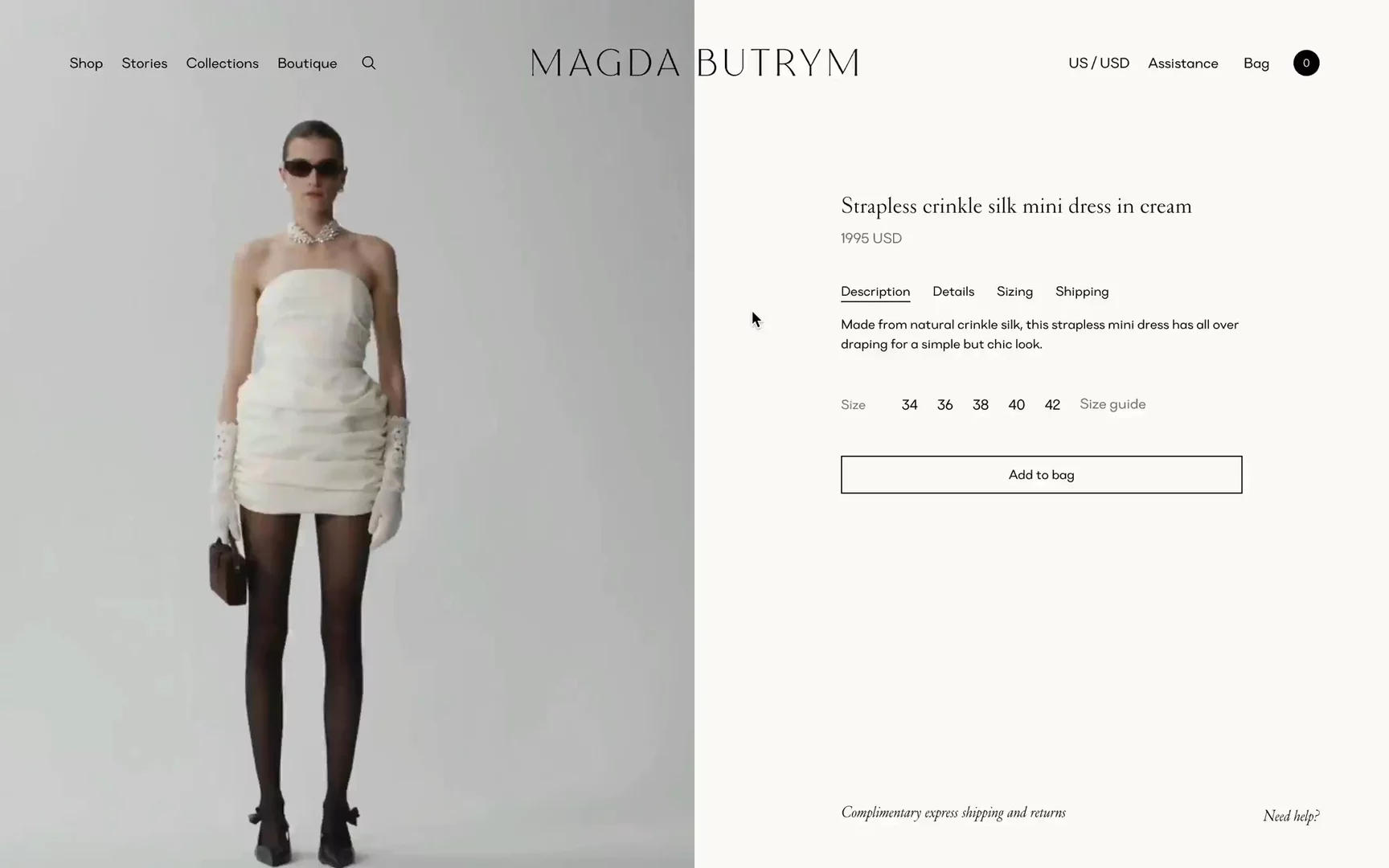
↑ Magda Butrym is one of the best video-first Shopify PDP.
Read more about Magda Butrym's success leveraging headless Shopify
A Size Guide Plus Measurements Guide
Customers often fear that the desired item won’t fit. While ordering the same item in multiple sizes is an option, it comes with the hassle of returns, freezing money, and hoping for free returns, which are not always common. Also, from a sustainability standpoint, ordering the same item in multiple sizes is not a green practice.
In a store, trying on a blazer, dress, or any other item is often the final step before saying, “Ok, I’m taking this.” But how can you assure a user via an online website?
Bra sizing and fit is the biggest challenge for Victoria's Secret when it comes to international customers.
Baptiste Marchis, VP, Digital International
It’s important to provide a clear guide on how and where to take body measurements to identify the corresponding size. For ready-to-wear items, it’s also helpful to add small indications about the model’s measurements. In today’s market, we often see basic notes like, “This model is 186 cm and wearing size M.”
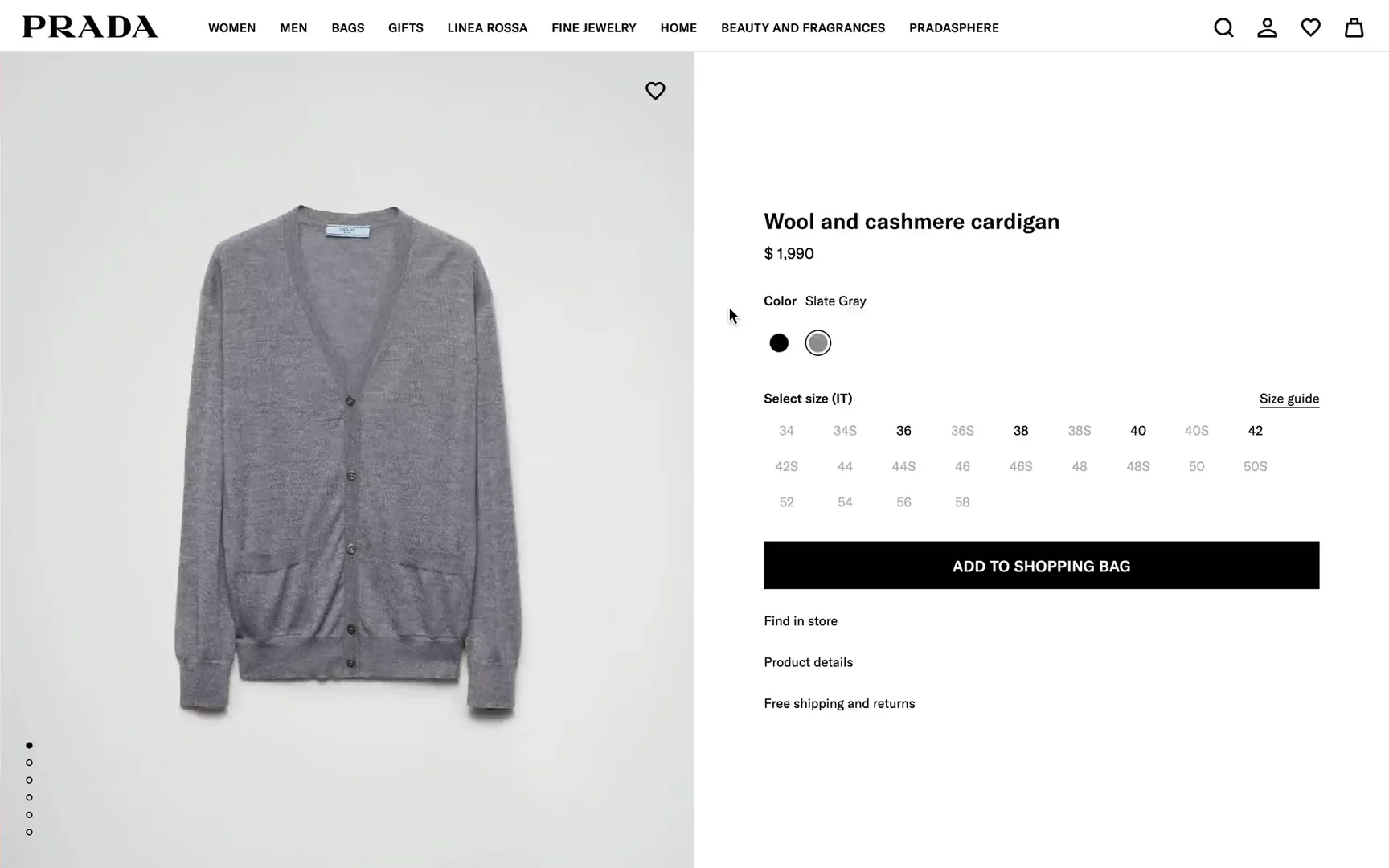
↑ Size and measurements guide section on Prada.
Product Dimensions and 3D/AR View
This is particularly relevant for bags and shoes. Customers want to know exactly what will fit in the bag. That’s why it’s important to indicate the dimensions of the product, such as base, height, and depth, and list typical items that would fit into it, whether it’s a hiking backpack or a mini bag.

↑ Burberry's three-dimensional bag. (Photo: Courtesy of Burberry)
3D and augmented reality (AR) is something we see more often now. It adds an element of playfulness and creates a “wow” effect. In 2022, Burberry launched AR capabilities on their website to “simulate the in-store experience” by allowing customers to position the bag in various live scenarios, such as against their outfit or placed on a table next to other personal items, to give a sense of its size.
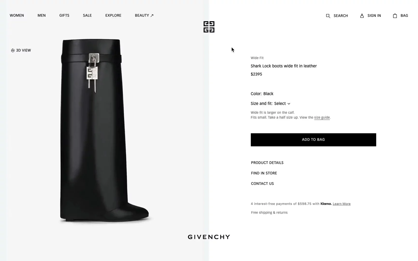
↑ 3D view of Givenchy boots

↑ Yumei shows for scale how items like a 13” Macbook, wallet, or iPhone would fit into the bag. It’s super helpful!
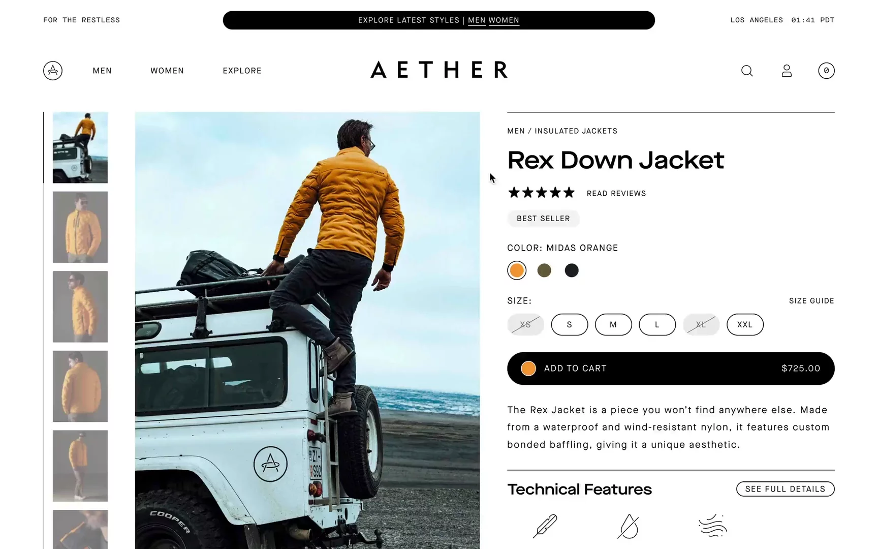
Product Details and Care
Particularly for technical garments but also for garments made of fine fabrics, product details provide the customer with information about the care of the material and its performance.

↑ Moncler care instructions.
Some brands also include zoomed-in photos of specific details, like zippers, pockets, and sleeves. These close-up shots help customers get a better understanding of the garment’s construction and quality, which is especially important when shopping online. Detailed care instructions and information about the materials used can educate clients about how to maintain their items properly.

↑ I really like how Aether shows the details of their items.

↑ Maap product details.
Delivery and Return Terms and Installment Payments
Unable to try out items online, customers are likely to order multiple sizes and colors and then return the items they don’t want. Customers are accustomed to “free returns,” but this can be painful for the brand. Repeatedly exploiting high delivery service fees is costly, and it also has a negative impact on the environment by increasing CO2 emissions.
Clear information about delivery costs, estimated shipping times, and taxes for international orders is a must. Tax issues, in particular, are often not properly addressed. Recently, I ordered an Opal C1 camera, and customs called me to fill out and sign some forms with a lot of required information. That experience was far from ideal.
Buy now pay later (BNPL) services have emerged in recent years. Brands introduce installments to make it even easier for customers to commit to a purchase. Services like Klarna, AfterPay, or Affirm handle this to allow customers to spread out their payments over time.
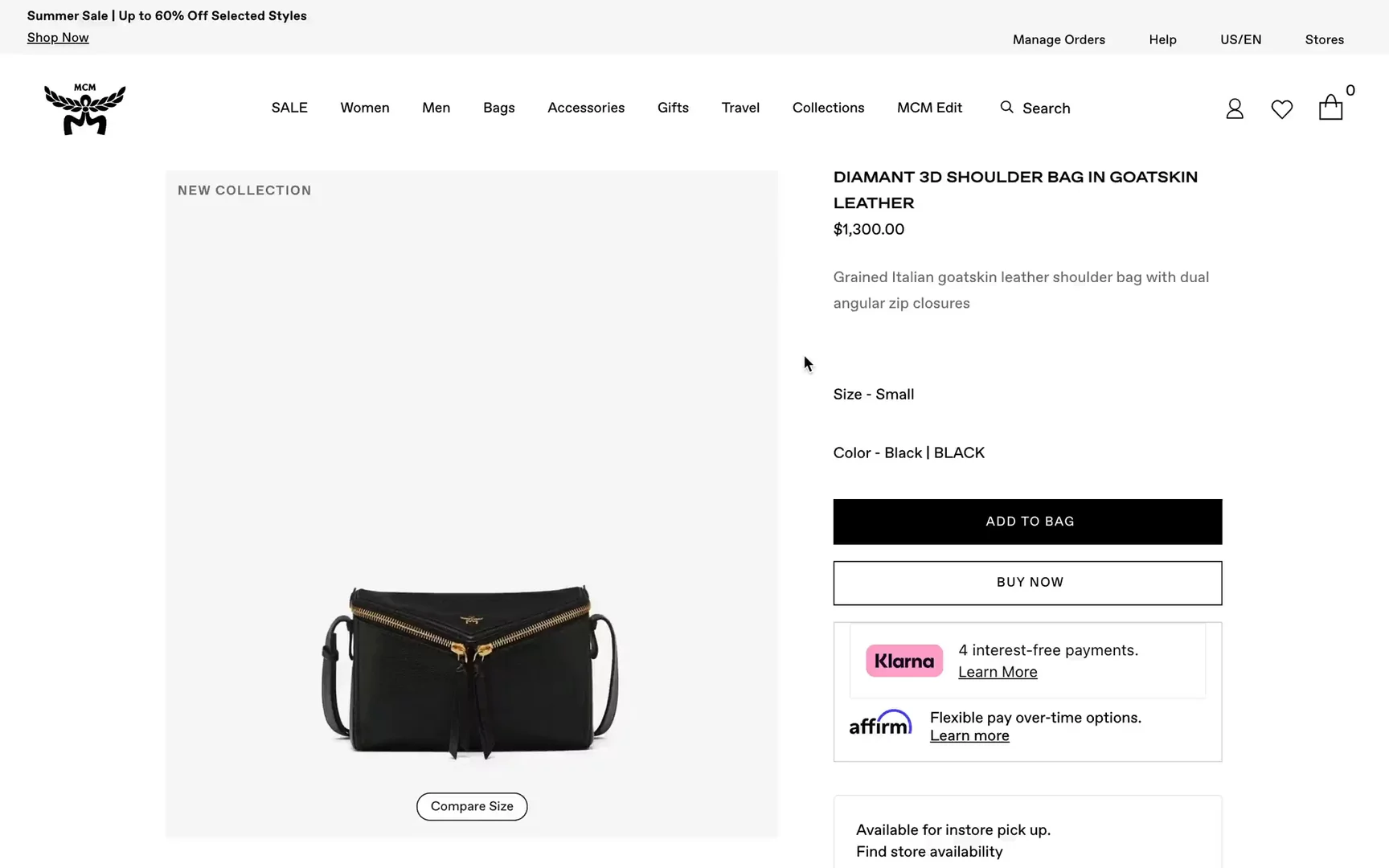
↑ Buy now pay later feature on MCM eCommerce.
Blending Your Shopify Product Page With the Offline Store.
In an omnichannel strategy, this is a key functionality. Many customers use the online store to quickly browse hundreds of products to get an idea of what they might want and then prefer to check out the product in a physical shop. This is especially true for high-price items where the whole shopping experience is an essential part of the purchase. That’s why it is useful to direct users to the nearest store where the item is available to allow them to chat with an assistant.
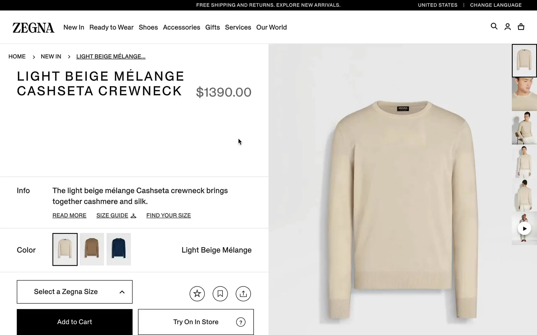
↑ Try-on store feature on Zegna eCommerce
Product Traceability and “Made In”
Currently, people are much more aware of sustainability, the climate impact of production, where products are made, and what kind of materials are used.
Some brands, like ASKET or Nudie Jeans, are on a different level when it comes to transparency. They share the entire production process and the names of their suppliers. Additionally, they visit these suppliers in person to validate the quality and process. That’s really impressive.
This level of transparency increases credibility and loyalty to the brand for people who care about the environment.

↑ Nudie Jeans shows production transparency.

↑ Full-transparency statement on Asket.
Product Recommendations on Product Pages
Tactics to cross-sell additional items and instantly increase the average order value (AOV) are nothing new. The bottom of the PDP is a great place to show users how other items would complete their look. Think of it as the online equivalent of a store assistant saying, “Maybe you could pair this top with this bottom? Give me a second, I’ll bring it to you so you can decide.”

↑ How-to-wear section on On eCommerce.
For example, if a man is looking for a suit for a wedding, there are multiple complementary items he might need, such as a bow tie, tie, belt, cufflinks, socks, shoes, and pocket squares. It's a great opportunity to propose items in the right context to enhance the shopping experience and boost sales.

↑ Pangaia styling in section.
UGC
User-generated content (UGC) leverages real content made by customers. In the context of eCommerce, UGC can include customer reviews, photos, video testimonials, and social media posts. This type of content is valuable because:
- It builds authenticity and trust: Consumers tend to trust other consumers more than they trust brands.
- Social proof: UGC content shows potential customers that others are buying and enjoying the product. This can significantly influence purchasing decisions.
- Cost-effective content: UGC is essentially free content for brands. Instead of investing heavily in professional photoshoots or video production, brands can leverage content created by their users.

↑ Overall product rating section on Asket.
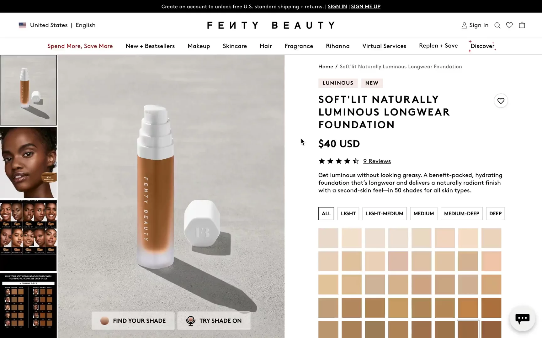
↑ See-in-action section on Fenty Beauty.
Reviews
I have mixed feelings about reviews. The best possible answer is, it depends. If you’re a luxury brand selling a dress for $2,000 or more, reviews might not be appropriate because they could detract from the high-end image.
However, we can’t deny that people want to read reviews, and in the majority of cases, they’re relevant. I see a significant impact in the beauty space where people can share the effects on their skin and other important factors, like in this Shopify Hydrogen example Face Theory.
Reviews provide social proof and add transparency and authenticity (if they’re not AI-generated or bought 😂). They also serve as a good metric to see which products are popular among customers.
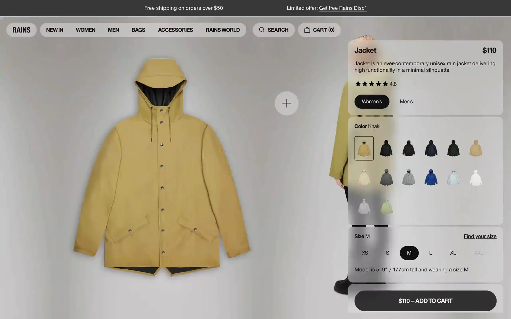
Comparison Mode
It’s not a must for every brand, and probably not super popular in the fashion world, but there are some use cases where comparing different products can be very helpful. For instance, electronics and technical gear often have many specifications that customers want to evaluate side by side. Providing a comparison feature allows customers to make informed decisions to ensure they choose the product that best meets their needs.
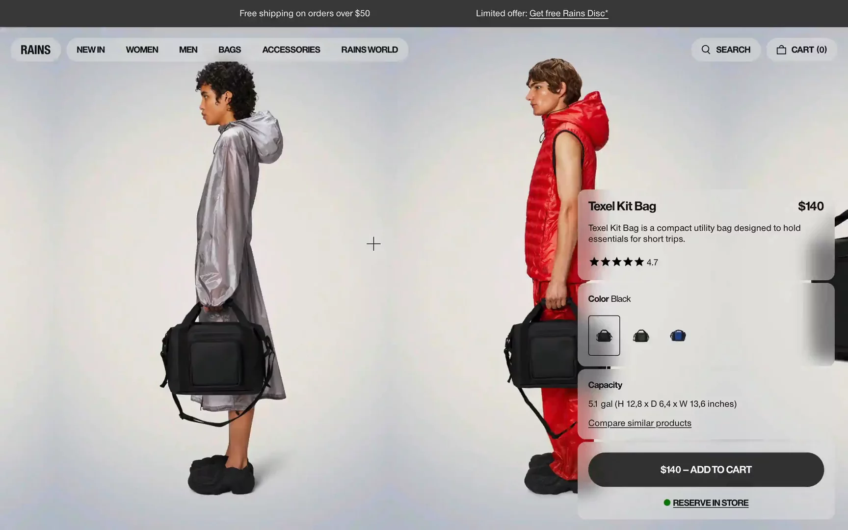
↑ Rains is one of the best Shopify PDPs I’ve seen.
Bonus: The Best Shopify Product Page Examples
If you want to have more PDP inspirations, check out our article“The Best 21 Fashion PDP Examples in 2024."
Magda Butrym
Aether Apparel
Rains
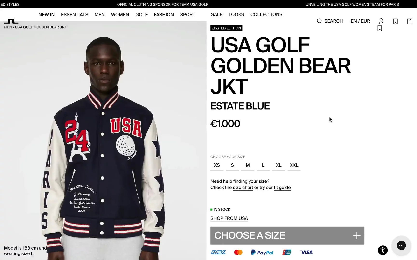
J. Lindenberg
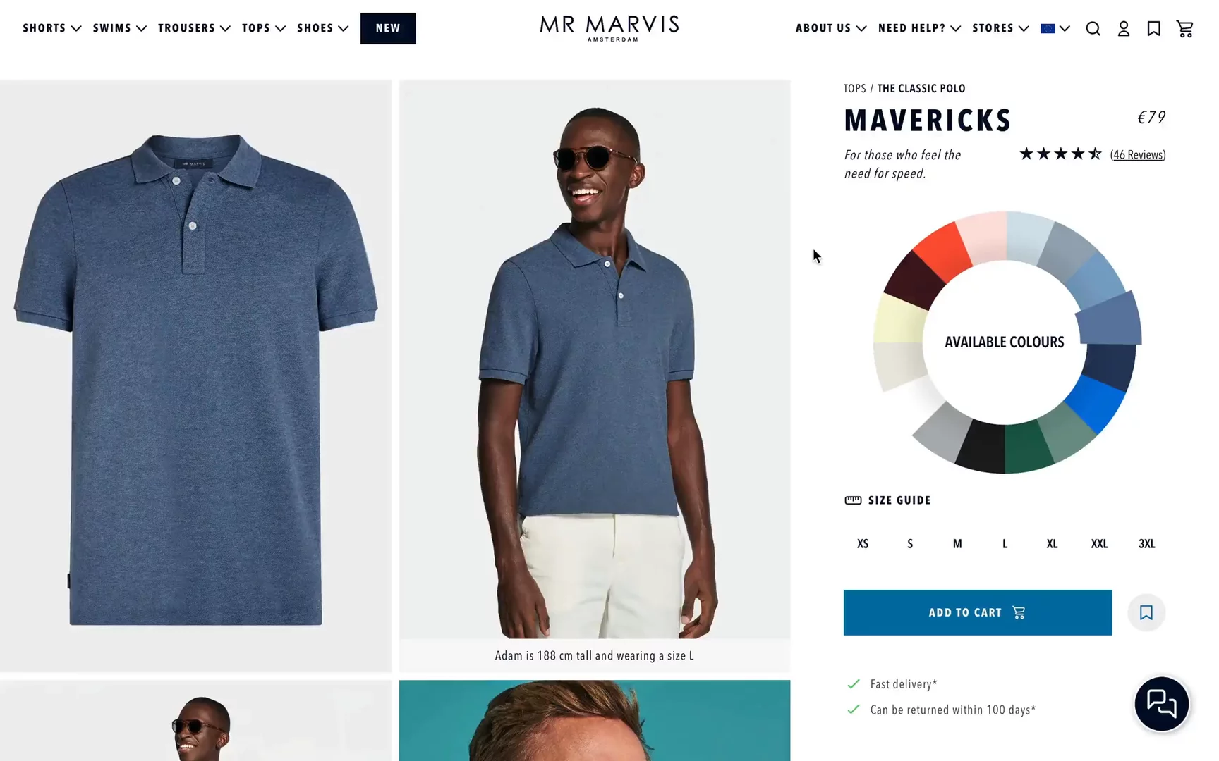
MR. Marvis
Nour Hammour
Mobile-First Approach
We wanted to stress this point. On average, over 75% of users access fashion websites via mobile devices. This means it’s critical to design a mobile-first PDP and find adaptive solutions for smaller screens. Often, we see PDPs designed for desktop first and then squeezed into mobile. We always recommend the opposite: start with the mobile viewport first.
Our key recommendations:
- Optimize the “above-the-fold” screen: This is the very first viewport that users see. Show product images, color variants, price, and the “add to bag” button upfront when users land on the page.
- Sticky CTAs: Since mobile users have limited screen space, a sticky add-to-cart feature becomes particularly valuable as a conversion tactic. Without this feature, scrolling through the page may disrupt the purchasing journey, potentially leading to distractions and, ultimately, higher cart abandonment rates.
- Define a proper information hierarchy: Make sure to prioritize what’s most important for your users. Consider turning off some features on mobile that may harm the experience.
- Analyze mobile apps: A good practice is to analyze mobile apps that introduce more refined and optimized UX patterns.
- Optimize performance: Remember that your users don’t always have the newest iPhone or a blazing-fast internet connection. Optimize all assets and code bundles to make your site performant.
Conclusion
In today's competitive eCommerce landscape, a well-crafted product detail page is essential for converting browsers into buyers. A PDP acts as a digital sales assistant by providing potential customers with all the information they need to make purchase decisions. Whether you're using Shopify or any other platform, these best PDP practices can help you stand out.
If you have any questions about building a PDP or you just want to get some inspiration, we’re available for a short call. No strings attached!