11 Best Sports eCommerce Websites Examples in 2025
Ever wondered what makes a running T-shirt worth 200 euros or a technical jacket command a price tag that rivals a weekend getaway? For high-performance apparel brands like Soar Running, Mammut, and Pas Normal Studios, the answer lies far beyond the fabric itself; the justification is built directly into the power of the brand. In the hyper-competitive world of eCommerce, a website cannot afford to be merely a catalog; it must function as a brand temple that blends aspirational lifestyle content with technical detail. This transition from transactional to immersive brand platform is precisely what separates the leaders from the rest.
Maybe that’s why this topic feels close to me. I’ve run marathons, ultramarathons, and Ironman-distance triathlons – and when you’ve spent that much time chasing endurance, you start to notice the small things: a seam that doesn’t rub, a zipper that never fails, a fabric that feels right at mile 80.
This list isn’t about who has the flashiest animations or the biggest ad budgets. It’s about execution – how design supports performance, how stories justify the price tag, and how these brands make you feel something before you ever hit “add to cart.”


Aether Apparel
Premium outdoor brand with a cinematic Shopify eCommerce experience.
Aether Apparel immediately stands out because its approach to content is just fantastic. The company puts a huge amount of effort and investment into its visual storytelling. This makes sense when you consider the founders used to work in Hollywood productions; the result is highly curated, high-quality content that’s truly impressive.

↑ Aether Apparel's Journal view.
A major element I love about the website is their Journal and how they produce these articles. The quality of content production here is remarkable. When you look at their articles, it feels like they’ve transformed a beautifully printed fashion or travel magazine into the digital realm. Their content team uses irregular layouts, combining video with static imagery that makes those stories incredibly engaging.
Beyond the visuals, the website’s technical performance is top-tier. Videos load fast with zero lag, which is crucial for delivering that high-level experience. I really like the intentional way the design team displays content across the site. For instance, on the Product Listing Pages (PLPs), they offer a helpful gallery view so you can quickly preview each garment with a 3D hover animation.

↑ Aether Apparel Product Detail Pages
When you get to the Product Detail Pages (PDPs), you see why they succeed in the performance segment. The pages are very information-heavy, which is exactly what customers buying technical gear need. They use structured, detailed flyouts so you can quickly learn about the product. Because Aether doesn’t have a massive inventory (fewer SKUs), they focus on telling a comprehensive story about every specific item they carry. It’s a masterclass in product focus.
I did an interview to lay out how Aether creates and manages content in fashion eCommerce, feel free to read it here.
Optimistic Runners
Minimalist running brand redefining sportswear aesthetics online.
https://optimisticrunners.com/
Optimistic Runners offers an aesthetic that feels incredibly refreshing because it leans into an almost “non-design” approach. What that really means is they strip away the clutter, using clean typography without complicated hierarchies, ensuring the product is always front and center.

↑ Optimistic Runners' Magazine.
The art direction is modern and performance-driven, yet they introduce a striking contrast by mixing that clean, almost sterile layout with lifestyle imagery full of texture and granularity, a direction more fitness eCommerce websites should take note of. Looking at their Magazine section reinforces that they’re aiming to establish themselves as a serious lifestyle brand. They use film photography and strong graphic design, and honestly, some of the editorial shots are stunning: the one with the tiny tornado next to the runner is incredible. This use of film adds another layer of depth and texture to the brand.

↑ Optimistic Runners - PDP view.
I also appreciate that they’re not afraid to experiment with untraditional layouts. For instance, on their Product Detail Pages (PDPs), the color selection and swatches are positioned on the left, which is a nice change of pace. They’ve even added subtle micro animations to the swatches, making the interaction a bit more engaging. Overall, the sense of intentionality and alignment throughout the site gives it a very clean, professional feel. It feels like a smaller brand, but the art direction is strong, and even their Berlin store reflects the same visual language in its interior design.
J.Lindeberg
Scandinavian sports-fashion brand blending lifestyle and outdoor functionality.
I first came across this brand on a golf course: a 70-year-old man in a refined, modern look, moving with effortless precision across the fresh-cut fairway. J.Lindeberg is a Scandinavian brand that recently went through a major rebrand, and it wasn’t just a logo tweak. It was a strategic shift that included a full refresh of the eCommerce platform.
Right away, it felt intentional. Both the rebrand and the digital design look cohesive. They introduced a new symbol — a super-simplified “JNL” — and paired it with a bold typeface that appears consistently across the entire website. To me, that’s proof that whoever built the platform followed the brand guidelines meticulously.
The site absolutely earns an editorial patch because the content production is on a very high level.

↑ J.Lindeberg navigation menu.
I’m particularly interested in how they manage their collections. The navigation, for instance, is segmented and designed like a two-column setup, which works nicely. On the homepage, they offer a clear overview of their collections. I especially liked a module that features a fixed lifestyle image (it can appear on either side) while the products scroll beside it – a great way to present a collection.
I’m also a fan of their gallery view. It’s the kind you often see in editorial layouts, where the elements are allowed to jump around. It adds a cool visual rhythm because they don’t fuss over the aspect ratio of the images, and that’s precisely why it works.

↑ J.Lindeberg PLPs.
Now, let’s talk about the product pages. They sell suits and tailoring, among other things. On the Product Listing Pages (PLPs), you can choose between three layout options: three products side by side, four side by side, or an intriguing view showing eight thumbnails at once.
The eight-thumbnail view is my favorite. Why? Because they don’t show product names — just the collection. It reads like a spec sheet from a photo shoot, making it incredibly easy to scan the range quickly and take in everything at a glance.
Roa Hiking
Technical outdoor footwear brand with a rugged Shopify website.
http://roa-hiking.com/collections/roa-x-and-wander
I’ve been studying ROA Hiking, and this brand nails its message. While it’s gear for hiking, the art direction is distinctly edgy. They use a highly restrained color palette, sticking mostly to brown and black tones — even the footer has a warm brown hue. This systematic use of color creates a strong and immediate first impression.

↑ Roa Hiking PLPs.
I like their unique navigation setup because it’s divided, allowing you to jump straight from the main menu directly to the Product Detail Page (PDP). It’s efficient and well thought out. The Product Listing Pages (PLPs) are relatively standard, but they cleverly display non-interactive color options and available sizes right on the thumbnail. My only suggestion would be to add arrows to the PLP cards so shoppers could preview the product from more angles without clicking away.

↑ Roa Hiking PDPs.
The PDPs are particularly interesting due to their systematic structure. The title placement mirrors the navigation’s layered look, and the scrollable images make browsing smooth and intuitive — you don’t have to click to explore the product properly. The large call to action also stands out; you don’t often see CTAs that bold. From a technical standpoint, they use the exclusion effect on the menu and logos to guarantee legibility against any background color.
Norse Projects
Danish apparel brand focused on craftsmanship and timeless outdoor design.
https://www.norseprojects.com/
Norse Projects is another brand I find really compelling. It’s a Danish label that’s intensely product-focused. They take real pride in the development of their garments and the quality of their materials, with a clear focus on craftsmanship and sourcing.
While I know their flagship store in Copenhagen has great interior design, the website experience could match it a little more. Given how much they invest in content production, the site should ideally feel more premium. I will give them credit, though: they’ve kept their eCommerce site consistent for years, which in itself is a form of identity.
They truly invest in content creation. They shoot extensive imagery and video for each product, all set within their signature Scandinavian environment. The clear strategy here is to make the product the absolute centerpiece.

↑ Norse Projects PDP design.
You can see this product focus reflected in their Product Detail Pages (PDPs). The layout is distinct: the images are centered, with the information on the left and the selection options on the right. This small, intentional detail ensures the product remains at the very center of the brand experience.
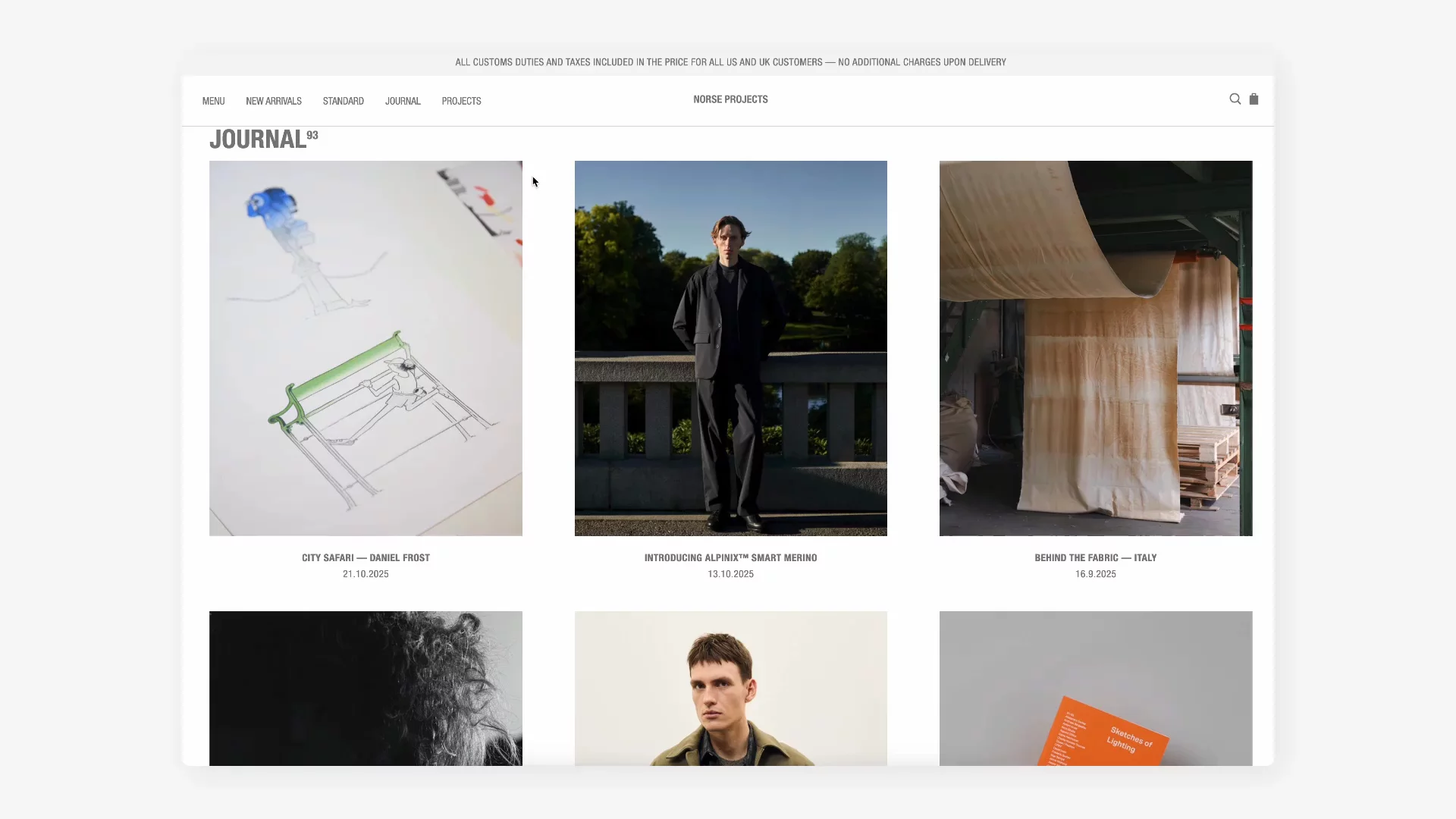
↑ Norse Projects Journal content hub.
Beyond the eCommerce structure itself, I really enjoy their journal content. For a brand like Norse Projects, which is intensely product-focused, the editorial hub is crucial. I remember one article that offered a behind-the-scenes look at their fabric supplier in Italy and detailed the entire creation process. Features like this give a closer view of the factories and mills that shape their collections. That kind of transparency builds trust and credibility, and ultimately helps justify the higher price point for garments they’re so proud of.
Satisfy Running
High-performance running label with avant-garde aesthetics and cult-level brand energy.
If you’ve ever passed a running club sipping espresso and eating pistachio croissants before (or after) their “morning miles,” you’ve probably seen someone wearing a T-shirt full of holes retailing for 120 euros. That’s Satisfy. And honestly, it’s fascinating how well they’ve managed to make that look aspirational.
This is gear for the cool kids, and you have to be ready for their aesthetic: they use a lot of graphics on their tees.

↑ Satisfy Running PDPs.
When I look at their eCommerce experience, there are things I genuinely love, especially how they handle the Product Detail Pages (PDPs) – it’s easily one of the most distinctive sportswear website examples in the running world.
Here’s where they really shine:
Storytelling in the Gallery: I haven’t seen this done quite this way before. They build the entire product narrative within the product gallery – the section that typically occupies the left two-thirds of the screen. This approach to product storytelling feels natural and genuinely engaging.
They’ve also taken the PDP to another level with advanced visual techniques. For example, they use 3D renders and image sequences to display products, particularly for their first running shoe, the Rocker. As you scroll, the 3D render rotates while information pops up about the product. The result looks fantastic and feels deeply product-focused, putting the item right at the center of the brand experience.

↑ Here's what Satisfy Running's store looks like on mobile devices.
Satisfy, however, falls short in one area: its Magazine. The brand has bold art direction, striking covers, and a strong visual identity, but once you click into a story, it falls flat. The content feels minimal – almost placeholder-level – compared to the sophistication of their products and campaign visuals. They could take cues from Aether Apparel or Optimistic Runners, both of which treat editorial as a genuine extension of their brand: storytelling that deepens the emotional connection, not just fills a menu link.
Mammut
Established outdoor and climbing brand with world-class eCommerce UX.
While it’s true that Mammut is a very commercial brand, their eCommerce experience is one of the best I’ve seen. If you look at the site’s performance, design patterns, content, and features, it’s all executed at a really high level. I also own a few Mammut pieces myself, and if I ever found myself lost in the mountains below zero degrees, I’d want their gear with me.

↑ Mammut PLPs.
You can click through all the images in the gallery right there on the Product Listing Page (PLP). It’s highly convenient because you can preview every product image without navigating to the Product Detail Page (PDP). This saves time if the product isn’t what you’re looking for, and shoppers can even switch between color variations directly from the product card.
They also use micro animations throughout the product section and in PLP headlines, which I find really interesting. Subtle micro interactions appear on hover: when you hover over text, the type changes to italics. I suspect this is done with variable fonts, which is still relatively new technology. The same detail appears in the menu, and it’s a great touch. These small moments make the whole experience feel more refined.
On the PDP, I really like that the product information occupies the left two-thirds of the screen, while the conversion area stays fixed on the right. It’s super convenient because you can make a purchase the moment you’re convinced, without losing your place as you scroll through details.

↑ We loved the Mammut comparison module.
Mammut also features an impressive comparison module. You can click “compare” on the PDP or PLP, which takes you to a separate page with beautiful graphics that help you evaluate products side by side. It’s a great example of how functional design can also look visually engaging.
Pas Normal Studios
Danish cycling brand turning performance gear into high-design Shopify storytelling.
https://pasnormalstudios.com/eu
Fashion is an important part of cycling, especially road cycling. There are unwritten rules: white socks (never short), white shoes, and zero tolerance for mismatched kits. People can easily spend $10,000 on a bike that’s half a kilo lighter because they’re convinced it’ll help them climb faster. Realistically, it’d be cheaper to lose that half a kilo of body weight, but hey, style points matter. I’ve been around the cycling scene enough to know there’s a cult around Rapha, Pas Normal Studios, and MAAP. Let’s talk about two of them.
This brand immediately stands out as a primarily cycling apparel company that makes a serious investment in both garment production and garment design. They have an entire department dedicated to investing heavily in the design of their apparel so it performs well, but also in the choice of fabrics and colors. You can almost always tell what someone is wearing is Pas Normal because of their colors, which are often very earthy and distinctly Scandinavian (as it is a Danish brand).

↑ Pas Normal Studios - homepage view.
On the homepage, there is an overview of the collections presented in a very interesting way. It can be either product-focused, allowing you to go directly to the Product Listing Pages (PLPs), or you can click on the collections to learn more about them, such as their “Mechanism” or “Essential” collections.
These branded collections – for instance, the “Mechanism” collection – only talk about that specific mechanism. They even incorporate branding onto the garments themselves, writing “Essential” or “Mechanism” in a big type on the back of the clothing.

↑ Pas Normal Studios PDPs.
PDP: They introduced a horizontal scroll of images, similar to On Running. The product selection is contained within an expandable small container. You can expand this container to make your selection. Since their products are very technical, they need to invest in how they talk about the specifications.
They display some top specs right from the get-go, and if you click into the full specification, a nice drawer opens up with all the detailed information inside. This is a very effective way to handle technical details when customers want to learn more. They have an interesting way to display the features of the product. On the left, you have a feature selection, and as you click on those, the images change on the right side to focus on the element you are talking about. I haven’t seen this specific implementation before, so I found it pretty interesting.
Cycling is community. Pas Normal Studios understands that better than most; though to be fair, Rapha does it really well too. Both are standout sports website examples. They organize group rides, weekend meetups, and events where the line between customer and teammate disappears. You can sign up for rides directly through their Strava link, but what they’re really building is belonging.
MAAP
Melbourne’s cycling label where precision design meets performance.
MAAP is a cycling performance brand that, compared to Pas Normal Studios, leans even more toward the technical side of things. You can see this reflected in their design choices, especially in their use of a monospace typeface, typically associated with precision and technology. Their imagery follows the same logic: minimal compositions, neutral backgrounds, and an overall aesthetic that speaks performance.

↑ MAAP - PDP view.
I found their Product Detail Pages (PDPs) particularly interesting because they prioritize a dynamic, performance-focused experience:
The PDP opens with a video header that plays instantly, without any lag. The content is presented in the center of the screen, placing the product at the absolute focus of the experience. As you scroll through the images and videos, the price and selection/add-to-cart area remain overlaid, creating a seamless flow. Even the product name uses the exclusion effect, ensuring it’s always legible – a subtle but clever touch. As you continue downward, the product descriptions and details maintain the monospace typeface, reinforcing that technical, engineered feeling. You’ll also find product renders paired with illustrations: a thoughtful mix that stays consistent with the brand’s design language.
A few other details stand out about MAAP’s site structure and brand presentation:
Nested navigation: Their navigation is clean and consistent. When an arrow points down, it indicates a nested menu, revealing additional elements when clicked.
Brand collaborations: Although MAAP’s core aesthetic is minimal and technical – with their stores almost clinical in appearance – they occasionally collaborate with streetwear brands, creating an interesting intersection between sport and culture.
Editorial content: Their editorial stories use a serif typeface for contrast, giving them a more traditional, magazine-like feel. These pieces are often shot on location and, like other forward-thinking brands, help build community and position MAAP as more than just a product company.

↑ MAAP Stories.
Bandit Running
NYC running brand building a fitness community through street culture.
Let’s take a closer look at Bandit Running, a brand that was founded in October 2020 by members of the NYC running community; Bandit has built an identity that feels deeply rooted in its city.
Most of the content they produce is shot in New York or framed through a distinct New York lens, incorporating the city’s streets, buildings, and unmistakable energy.

↑ Bandit Running - homepage view.
One small but brilliant detail caught my eye in both the navigation and the footer: a progress indicator that shows how far you’ve scrolled. It’s such a clever touch: the kind of feature that makes you smile and, honestly, makes the whole internet a better place. Shout-out to whoever built that.

↑ Bandit Running - PDP design.
The Product Detail Page (PDP) breaks from the standard photo grid and opens with a full-screen video, with supporting images appearing in the next section. They do a great job of displaying product specifications using clear data visualization, which makes technical details easier to digest.
Bandit also builds loyalty through its membership club, offering early access to drops, product discounts, annual gifts, and partner perks with brands like ASICS, Cadence, and Therabody – a model that shows how fitness eCommerce websites can evolve into lifestyle platforms.
They even publish educational content, including structured plans like a 14-week marathon program – a nice way to add value beyond apparel.
Soar Running
London-born running label redefining performance apparel.
https://www.soarrunning.com/en-pl
When I joked earlier about 120-euro running T-shirts, I didn’t realize we could take it even further.
I recently took a close look at Soar Running, a brand that leans heavily into the technical side of performance apparel. When I see a running shirt priced at around 200 euros, I immediately start asking one question: does the eCommerce experience actually justify that price?

↑ SOAR - product listing view.
My first walkthrough of the site, particularly the Product Detail Page (PDP), revealed some clear points of critique.
First, let’s talk presentation. Soar Running uses a strategy I’ve also seen at Bandit, though I’m not sure who did it first, featuring a video in the first fold of the PDP instead of static product images. It’s a dynamic choice, but as I scrolled down, the layout started to feel less intentional. I also noticed they use a different UX pattern for some products, typically with the gallery on the right and the title, price, and add-to-cart button on the left, so they’re probably testing what converts better.

↑ SOAR - PDP view.
The product selection area, where you choose size and add to cart, could be more intentional. The visual hierarchy feels confusing, and the add-to-cart button in particular feels misplaced. For such expensive garments, I expected more depth behind the product. While the feature section starts strong with some data visualization, the cards that follow don’t really deliver. There’s simply not that much information. If I’m paying a premium, I want the technical details to justify the investment.
Where Soar Running truly succeeds is in its “Designer Notes” section. The designer speaks directly about the construction and materials, giving the product story real weight. This kind of content is what actually adds credibility and justifies the steep price point. It brings the expertise and authenticity that separate a 200-euro shirt from a 50-euro one.
Conclusion
What’s clear from these eleven sites is that performance brands today aren’t just selling apparel, but they’re designing belief systems. Every headline, image, and interaction serves a purpose: to make you trust the gear before you ever touch it.
The best of them, like Aether, MAAP, or Satisfy, understand that product experience doesn’t start with fabric; it starts with feeling and the subtle pull of being part of the tribe. When design and storytelling align, you stop comparing specs and start imagining yourself inside the brand’s world.
As someone who’s already spent far too much money on running and cycling apparel, I can tell you: great gear doesn’t just perform, it motivates. And the best eCommerce experiences do the same. They remind us why we run, climb, ride, or push a little further.
And let’s be honest, it just feels better when you’re suffering in a good-looking outfit.
Special thanks to our Head of Design Róbert Toman for reviewing my inspirations and sharing some of his own.
Before you leave...
I hope you've found this piece interesting. If you'd like to receive our insights directly to your inbox, remember to sign up to our newsletter.
Sign up


