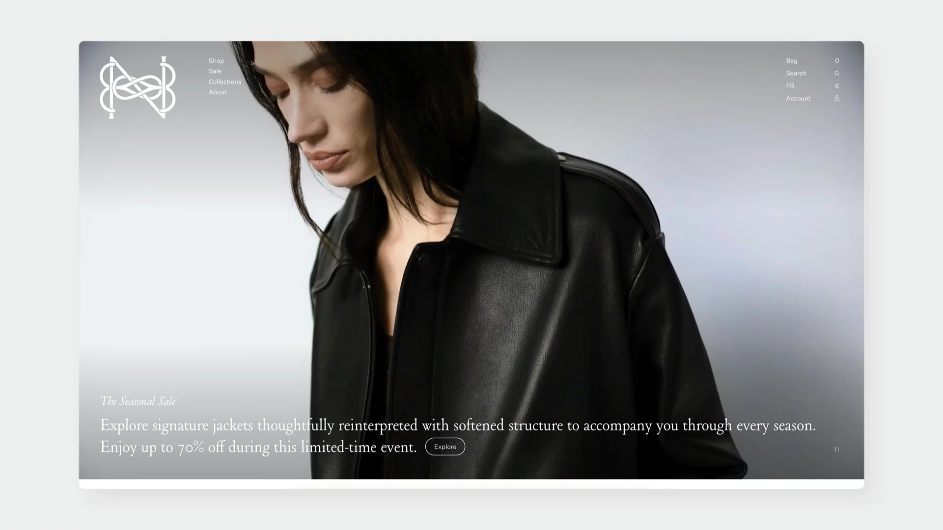
Motion in eCommerce Part: 1 – Microinteractions
The current state of eCommerce is redefining how we use the web. With smartphones getting more powerful every year, it is easier than ever to leverage motion design and interactivity even in our mobile websites. The real question is, are we helping the customer make the right decision? Or are we adding interactions just for the sake of them?
Contents


What Are Microinteractions?
Micro interactions are small, subtle animations or responses that occur in response to user actions. They help customers understand what’s happening, guide them through tasks, and create a sense of responsiveness and delight.
The Difference Between Microinteractions and Motion Design
Before we delve into the nitty-gritty of microinteractions, we should make a distinction between microinteractions and motion design.
Motion design, in the context of UI design, is a broader discipline that includes any movement-based visual element. It can encompass transitions between states, navigation animations, storytelling sequences, and more. Think of motion design as the big picture choreography of your site’s movement, while microinteractions are the individual dance steps. A well-crafted experience will use both: motion design to guide and impress, microinteractions to support and delight.
In this article, we curated categories of elements commonly used on eCommerce websites. They greatly benefit from having an interactive element as part of the experience to help customers guide their decision making and delight them during the process.
The Anatomy of Microinteractions
According to Dan Saffer, author of Microinteractions: Designing with Details, each microinteraction comprises four components:
- Trigger: Initiates the interaction. This could be user-initiated (clicking a button) or system-initiated (receiving a notification).
- Rules: Define what happens once the interaction is triggered.
- Feedback: Communicates the outcome of the interaction to the user.
- Loops and Modes: Determine the duration of the interaction and how it adapts over time.
Understanding these components helps designers craft interactions that are both functional and delightful.
Why Microinteractions Matter (More Than You Think)
While seemingly minute, the cumulative impact of microinteractions on the user experience is substantial. They function as critical supporting elements within a digital interface, and their absence can detract significantly from overall usability and engagement.
Here's a breakdown of why microinteractions are strategically important:
They Show Off Your Brand's Personality
A loading spinner doesn't have to be boring. It can be a chance to wink at your users with your brand's style. Whether your brand is fun, bold, or sleek, microinteractions give you small moments to show that off.
They Guide You Without Being Pushy
Instead of throwing a manual at people, good microinteractions gently show them what to do. For example, a button might wiggle slightly when it’s ready to be clicked, drawing your eye naturally – no need for extra instructions.
It’s a Matter of Delight
Let's be honest, a little bit of delight goes a long way. A clever animation or a satisfying response to a tap can turn a basic task into a little moment of joy. These small wins add up to make people really like using your site.
Examples of Microinteractions in eCommerce
To really understand the power of microinteractions, let's look at some great examples in action across different e-commerce sites:
Product Cards
Product cards are the new shopping windows. It is the crucial point in deciding if the customer goes to the PDP or not. Here, we have a challenge and an opportunity to display contextually relevant information. The challenge is to not overdo it and show only what is important for the customer while still showing the product in all its glory.
Axel Arigato
A good example is Axel Arigato. While hovering on the product card, the customer gets relevant information about colors available and size picker. What is neat about this solution, is that it’s aligned vertically on the right and left edges, keeping the product in the middle intact. It also displays the product in a 45° angle to show more than just a silhouette.
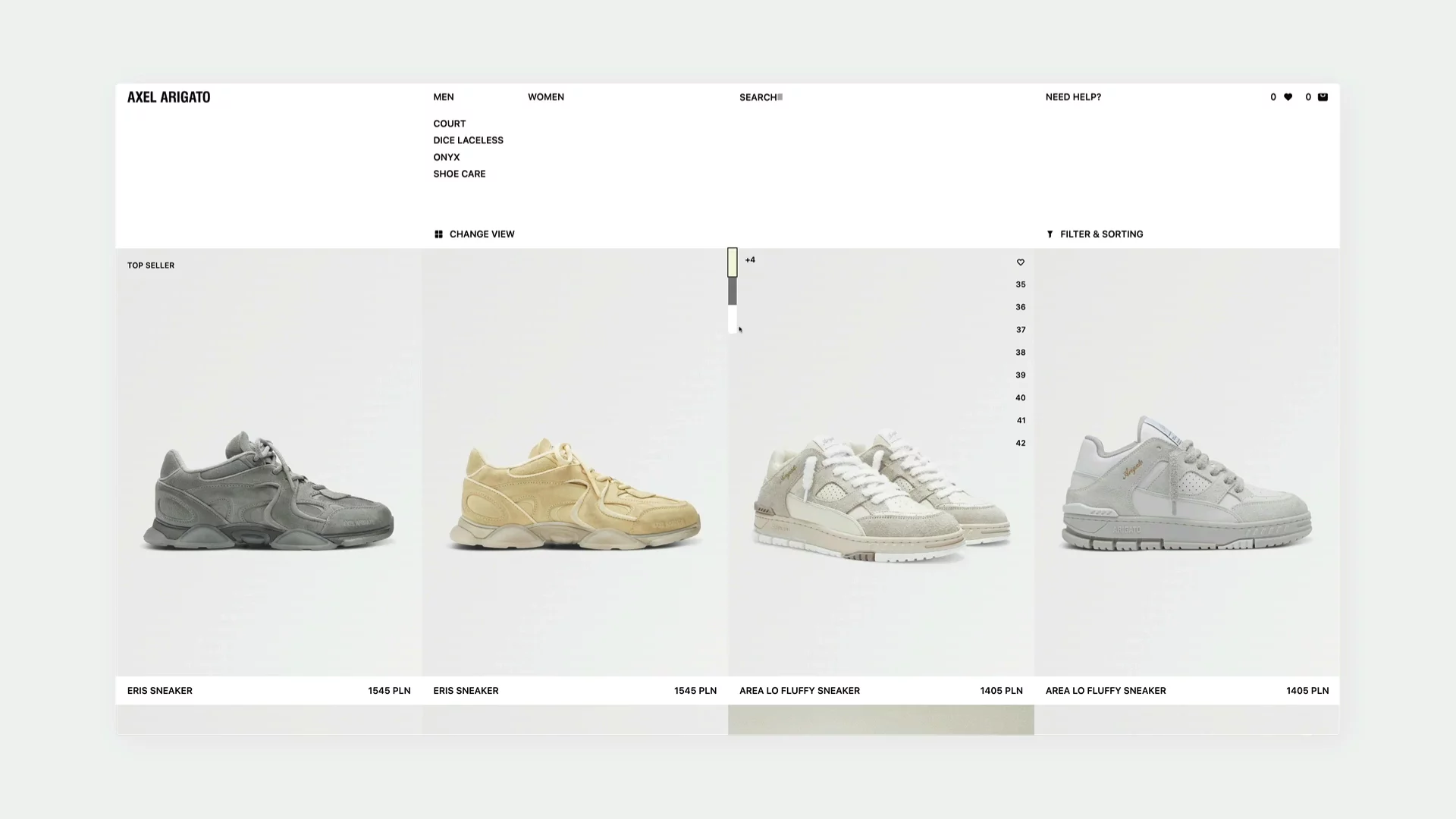
↑ https://axelarigato.com/women/footwear
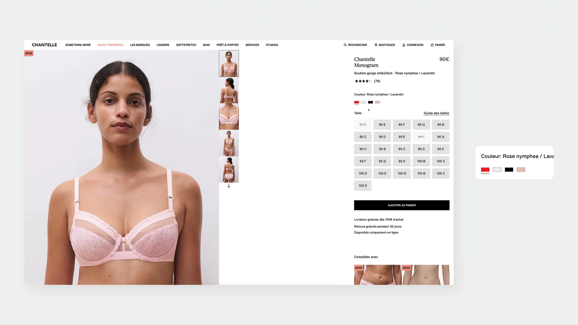
Chantelle
Choosing the right underwear can be a challenge, especially with bras as their general return rate is the one of the highest. One key aspect of what the customers are looking for, is the overall fit to the body. That’s why Chantelle displays on hover the back side of the model, to see how exactly the bra fits in the back.

↑ https://chantelle.com/fr/categorie/campagne-something-more/lingerie-invisible
Oakame Furniture
On hover, action elements - frame with the “Discover” button slides into view precisely without disrupting the clean composition. The action items box have a structured layout that brings the feel of a refined workshop, communicating quality and original touch.
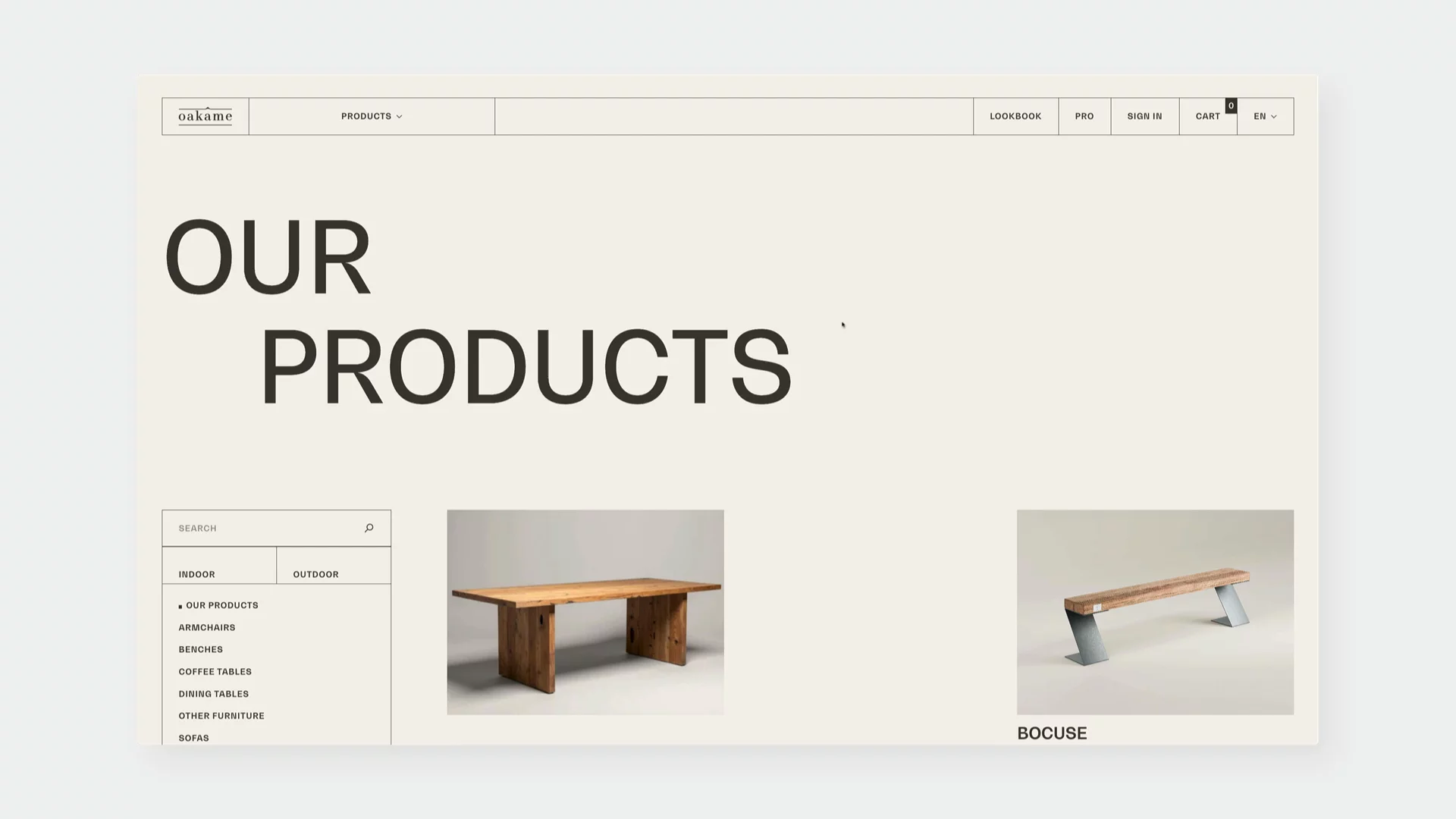
↑ https://www.oakame.com/en/products/
Switches
Switches in eCommerce can totally change the experience of the website. We can go far beyond the simple, yet slightly outdated dark mode switch and we can change the entire content with flipping a single switch.
X-Bionic
X-Bionic does the switch very well with giving the customer the option to switch between men and women models so they know exactly how the product fits and looks on different models. Interestingly, there is a combination of in-situ photography with clean renderings giving the customer a comprehensive view of the product, no matter the gender.

↑ https://terraskin.x-bionic.com/en-pl
In Common With
Leveraging the fact that In Common With is a lighting company, by flipping the “light” switch, the product imagery changes into lights being turned on. The whole website dims down as well to give you the cosy feeling of the lamp being in your home.
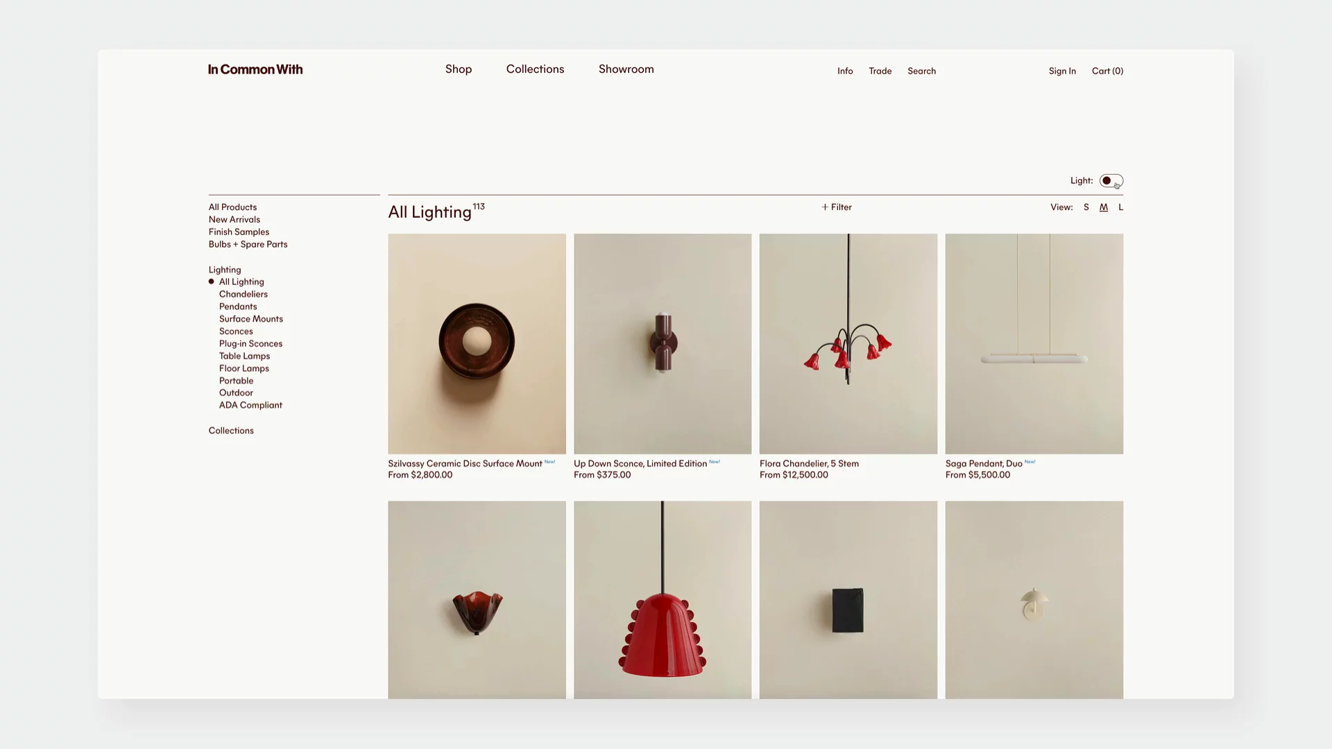
↑ https://www.incommonwith.com/collections/all-lighting
Media Gallery
The way product images and videos are presented can significantly impact a user's understanding and desire for a product. Microinteractions within the media gallery can elevate this experience from simple viewing to active engagement. They can provide context, highlight details, and even create a sense of discovery
Consider how subtle animations on thumbnail hover can hint at the content within, perhaps a slight zoom or a quick transition to a different angle. This encourages exploration without requiring a click. The transition between images in the main gallery is another opportunity. A smooth fade or a subtle slide can feel more polished and less jarring than an abrupt change.
The examples we looked at showcase different approaches:
Lady Gaga
This is a smart variation on typical e-commerce galleries – the close (X) icon appears in place of the original zoom-in button, rather than in the top-right corner. This small change simplifies the interaction, making it faster and more intuitive for the customer.
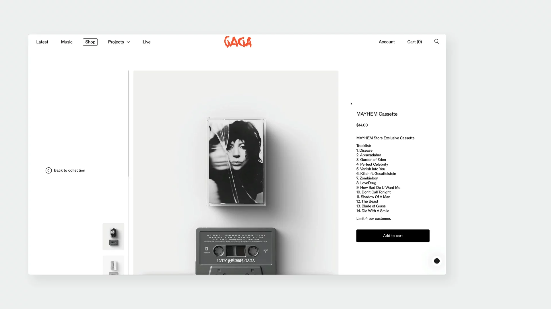
↑ https://www.ladygaga.com/us-en/
Nour Hammour
The transition from a close-up material detail to full-body context gives users a tactile and functional understanding of the product. The use of video right away in the miniatures of each gallery item is an interesting, not obvious choice. The hover zoom is subtle but effective, aligning with the brand’s luxury feel.
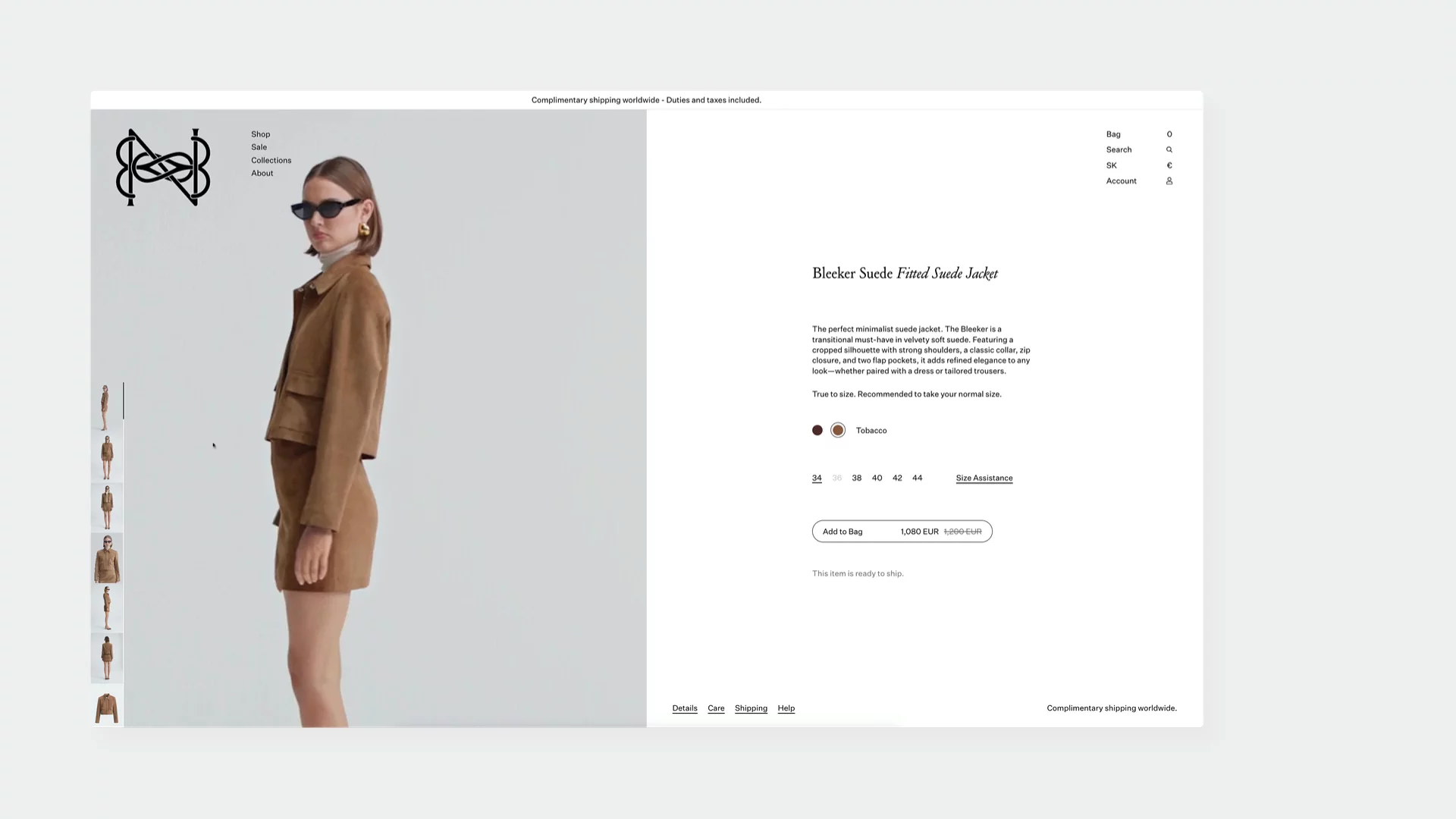
↑ https://nour-hammour.com/sk-en/products/bleeker-suede-tobacco?Size=34
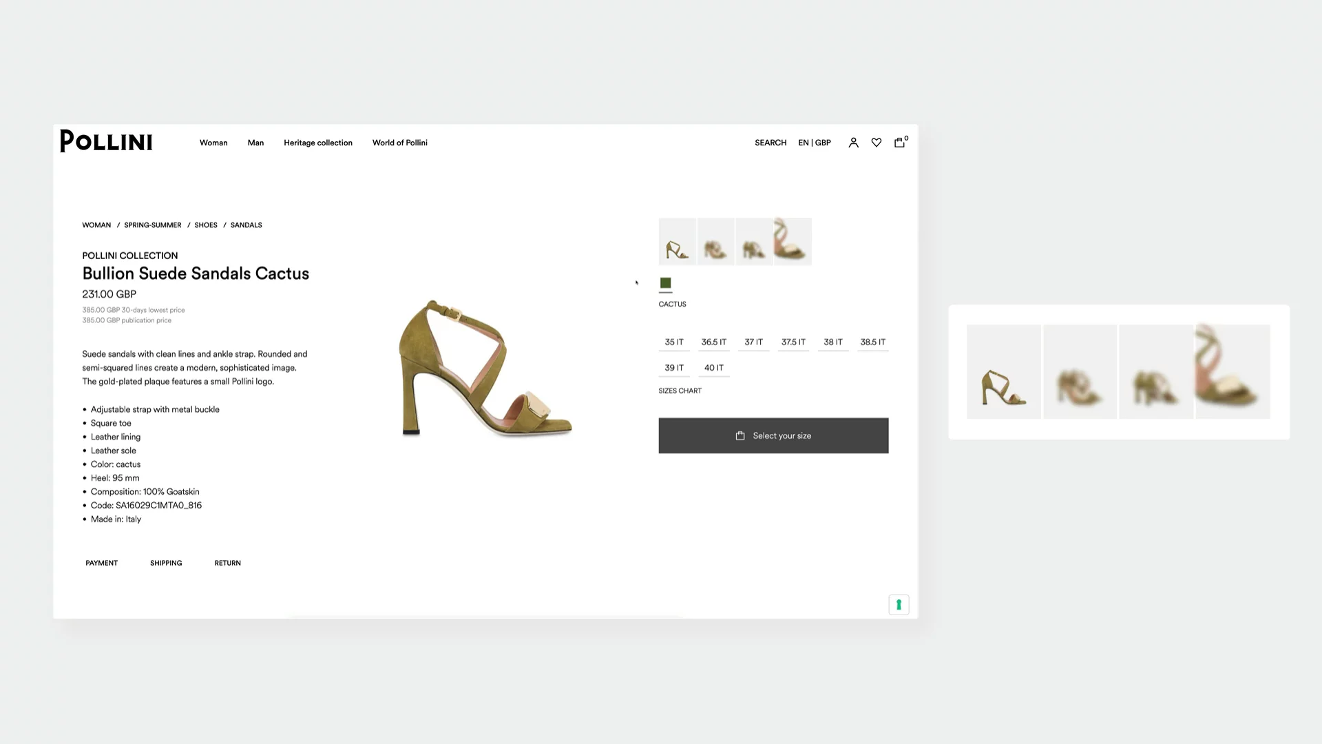
Pollini
There’s a lack of lifestyle imagery which positions the sandal as a design object, highlighting craftsmanship and form. The blurred gallery thumbnails add intrigue and subtly encourage deeper exploration through scrolling down the page.
↑ https://www.pollini.com/en
Navigation & Filtering
Navigation and filtering are crucial for helping users find what they're looking for quickly and efficiently. Microinteractions can transform these essential functions from mere tools into engaging parts of the user journey. Subtle animations, clear feedback, and intuitive transitions can make browsing feel less like a task and more like a guided exploration.
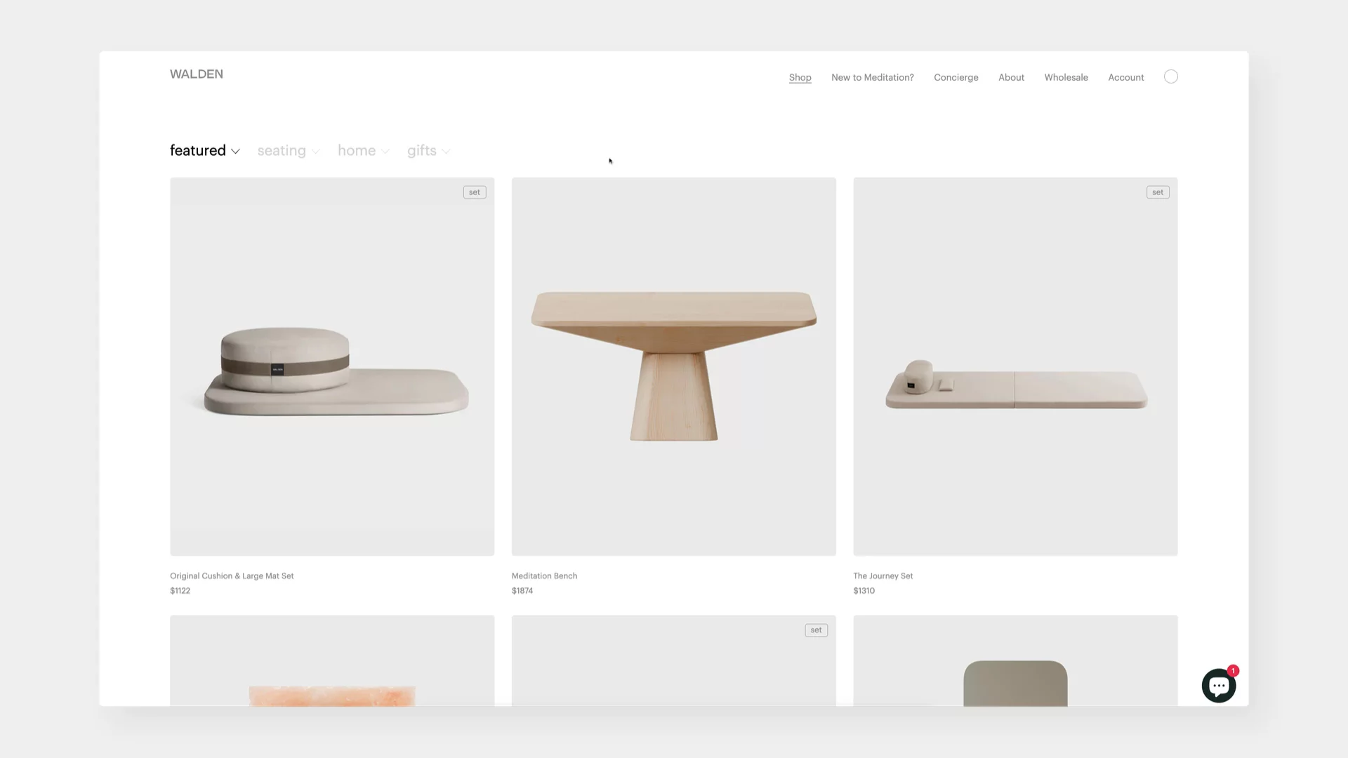
Consider how hovering over main navigation items can reveal subcategories with a smooth dropdown animation, as seen on Walden. This provides immediate access to more specific sections without a jarring page load. The subtle expansion keeps the user oriented and allows for quick scanning of options.
↑ https://walden.us/pages/shop-all
Filtering, often a necessary but sometimes cumbersome process, can also benefit greatly from microinteractions. When a user applies a filter, immediate visual feedback, such as a subtle highlight on the applied filter or a smooth update of the product grid, assures them that their action has been registered.
The examples we examined highlight different ways microinteractions can elevate navigation and filtering:
Zelienski & Rozen
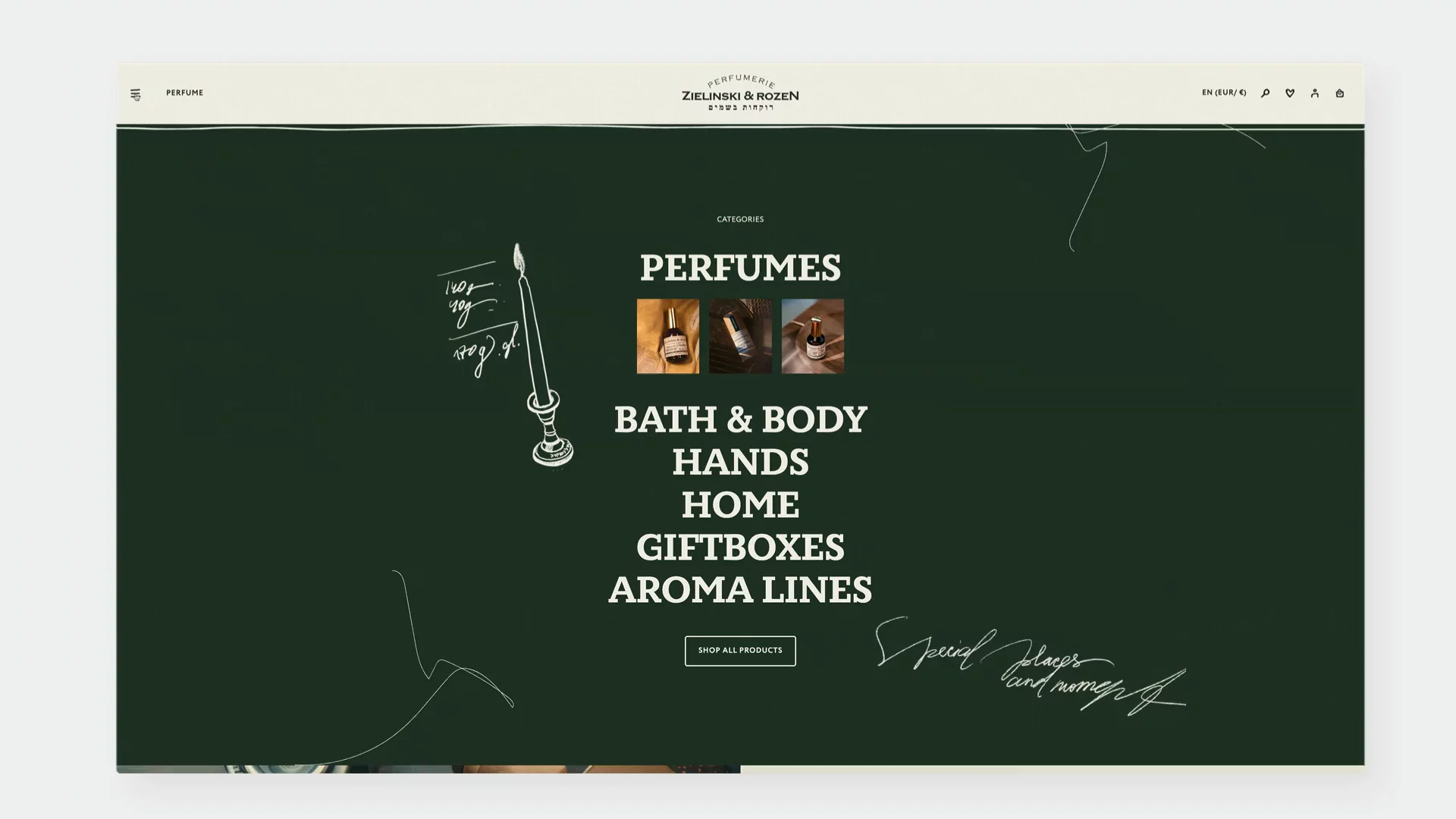
Animation on hover of the menu items and cursor drawing across the whole website. Important to mention here that we are leveraging micro interactions of the cursor, hovers, hand-drawn illustrations as part of the branding because the brand positions itself as “handmade”, “artisanal”.
↑ https://zielinskiandrozen.com/
Nour Hammour
Instead of a typical click-to-open menu, the overlay appears on hover – offering an immediate, responsive interaction. The half-screen overlay is structured like an editorial spread, clearly dividing collections and reinforcing the premium feel.
↑ https://nour-hammour.com/fr-en/
Swatches: Adding Interactivity to Choices
Color swatches and other variant selectors are crucial for allowing customers to personalize their product selections. Microinteractions can transform these simple choices into moments of delightful engagement and clear feedback. Instead of static blocks of color, subtle animations and dynamic information can enhance the user's confidence in their selection.
Consider how a gentle pulse or a subtle enlargement on hover can indicate that a swatch is interactive. When a swatch is selected, immediate visual feedback, like a checkmark animation or a subtle border change, confirms the choice. This provides reassurance to the user that their selection has been registered.
The examples we've looked at showcase different ways to enhance swatches with microinteractions:
Glossier
The color swatches represent different scents rather than shades, using a playful visual system to distinguish each variant. Most importantly, clicking a swatch updates the product details without reloading the page, making exploration fast and frictionless.
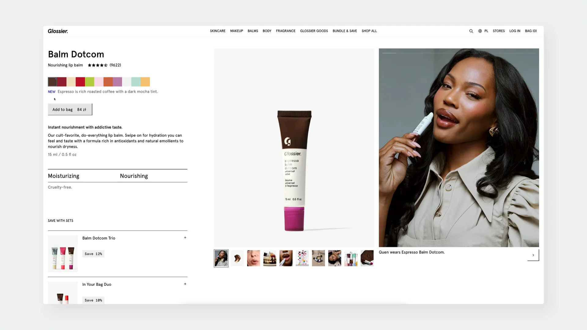
↑ https://www.glossier.com/en-sk/products/balm-dotcom?variant=46543508898037
Chantelle
Color swatches are presented without labels underneath, maintaining a minimal layout. Instead, the swatch name appears dynamically on hover at one spot, allowing users to identify each variant without adding visual clutter.
↑ https://chantelle.com/fr/produit/Chantelle-Softstretch-Culotte-taille-haute-C26470-01N
The Tiny Details with Monumental Impact
In the realm of eCommerce design, it's easy to get caught up in the grand schemes and overarching user flows. However, as we've explored, the subtle art of microinteractions plays a surprisingly significant role in shaping the overall user experience. These small moments of engagement, often overlooked, are the unsung heroes that contribute to a more intuitive, responsive, and even delightful online shopping journey.
From the subtle feedback on a button press to the smooth transitions within a product gallery, microinteractions inject life and personality into otherwise static interfaces. They guide users without being intrusive, provide crucial feedback that builds trust and reduces frustration, and offer valuable opportunities to reinforce brand identity.
As we've seen through examples like Axel Arigato's informative product card hovers, X-Bionic's gender-switching product views, Glossier's interactive scent swatches, and Nour Hammour's elegant navigation, thoughtful microinteractions are not merely cosmetic additions. They are strategic design elements that can enhance usability, improve conversion rates, and ultimately foster greater customer satisfaction and loyalty.
By paying close attention to these seemingly minor details, eCommerce designers can elevate their platforms from functional marketplaces to engaging and memorable experiences. The key takeaway is clear: in the world of digital commerce, the smallest interactions can indeed have the most profound impact.
PS. Remember to sign up to our newsletter in order to get actionable eCommerce insights straight to your inbox!


